
TL;DR
To choose a paint color you’ll love, clear visual noise, define the mood, curate a 3–5 color shortlist, test big samples in real light, then commit. This 5-step method shows how to test paint samples on walls and how to choose a paint color for a north-facing or south-facing room with fewer swatches and more confidence.
Stop Swatching Forever: Why Paint Looks Different At Home
Sampling large paint swatches in your actual room reveals how light and surroundings affect color perception.
Choosing a paint color is easier when you control the test conditions, read the light, and sample at scale in your actual room. The right workflow beats guesswork every time, whether you’re eyeing sage green paint or a classic warm white for your living room.
Here’s the thing: your walls, trim, floors, and daylight all team up to change what you see. A color that looked airy in the store can feel dull at home because beige walls around it are skewing undertones, or because a north-facing room cools everything down. With a simple, repeatable process, you can cut through the noise and land on a color that feels like you.
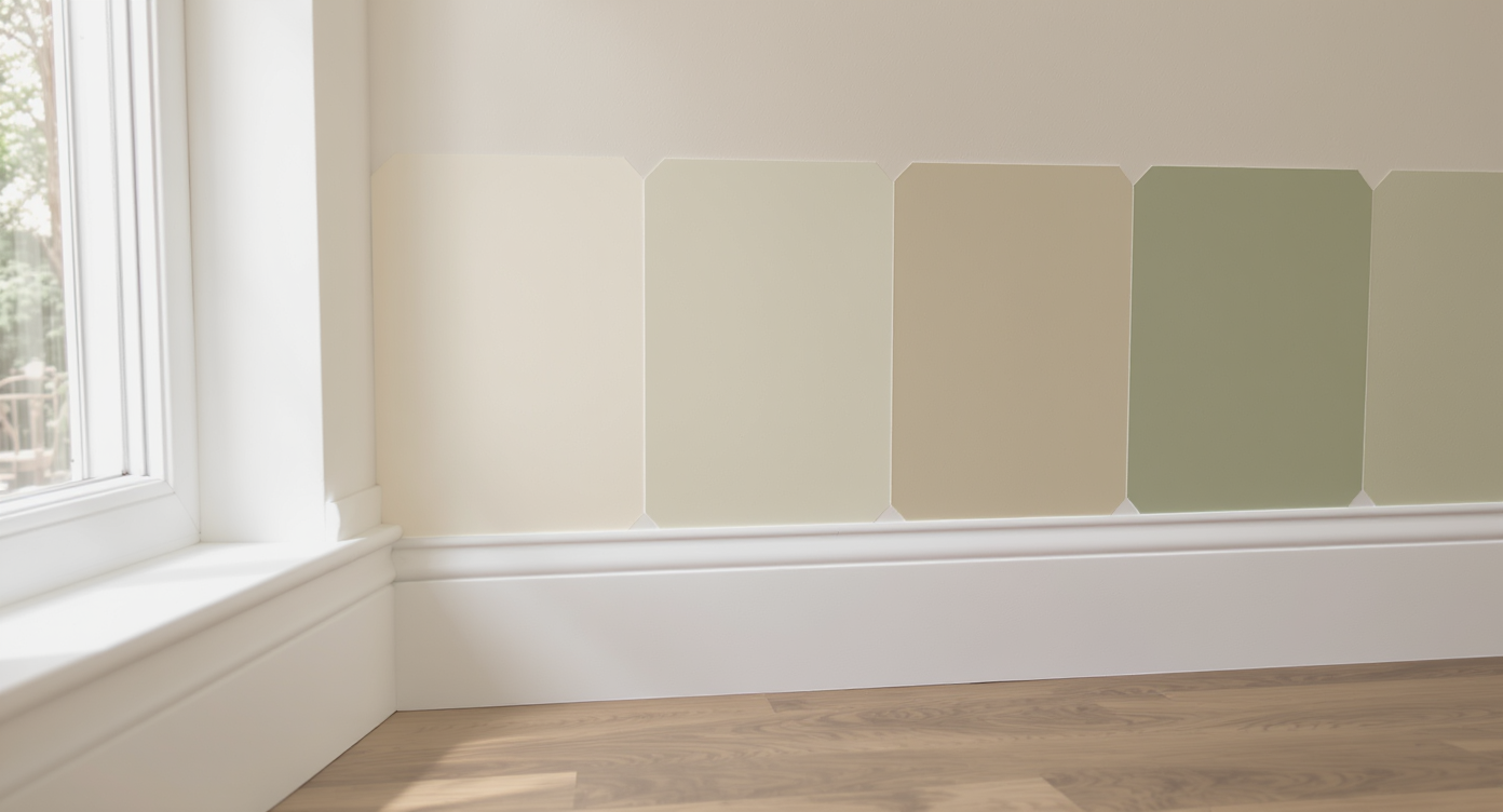
Suggested image caption: Testing paint colors like a pro with 24 x 24 inch swatches on primed white shows true undertones next to real floors and trim. Suggested image alt text: Large sage green, olive, and beige wall swatches in a bright living room with light wood floors and white trim.
The 5‑Step System To Choose A Paint Color
The fastest way to choose a paint color is to test large samples on a neutral ground, compare them across walls, and judge them at three to four times of day.
1) Clear the visual noise. Paint 22 x 28 inch white poster boards or a primed wall patch and leave a 1 inch white border around each sample. That border resets your eye so undertones read accurately. If you must sample on the wall, prime a 2 x 3 foot area first to neutralize the existing color.
2) Define the mood, then the hue. Decide on the feeling first: cozy, calm, airy, grounded. As a rule of thumb, dark floors pair best with lighter wall color to keep a space from feeling heavy, and bright white trim will make colors appear deeper and more saturated. North and east light is cool, so warmer greens or greige soften it; south and west light is warm, so cooler greens keep rooms from going yellow.
3) Customize your shortlist. Create a 3–5 color shortlist that fits the mood and your light. Ask for intensity tweaks like 70 percent or 120 percent if you love a hue but want it softer or stronger. Designer-loved sage green paints include Benjamin Moore Soft Fern, Sherwood Green, Clary Sage or Softened Green, and Behr Urban Nature at 50 percent for a sophisticated gray-green.
4) Test smart: big, broad, and in real light. Paint at least 24 x 24 inch samples and move them to multiple walls. Evaluate morning, midday, late afternoon, and evening under your actual lamps. Two coats on samples mimic real coverage and show the true finish. If you’re torn between two finalists, put both on the wall side by side and live with them for 24–48 hours.
5) Commit and build the palette around it. Once a winner emerges, set the supporting cast. For trim and ceilings, pros often aim for a clean white in the same color family, and for accents, materials like terracotta, unlacquered brass, oak, and cream fabrics play beautifully with sage green. Plan layered lighting so undertones hold steady day and night.
User insight: Many homeowners discover they don’t dislike a color; they dislike how they tested it. Large samples with a white border convert indecision into clarity.
Anecdote
Anecdotes and real stories:
- A couple swore every green skewed babyish in their small living room. Once they sampled 24 x 24 inch boards on a primed wall with a white border, Sherwood Green at 70 percent read calm and tailored, not juvenile. They hosted the next weekend.
- A renter tested three warm whites directly on tan walls and hated them all. On white poster board, the same paints looked elegant. She chose the softest option, paired it with cream curtains, and the room finally felt bright.
- A designer friend starts with the floor. In a home with espresso planks, she floated a cooler gray-green on big boards and watched it turn icy by noon. Switching to a warmer sage with higher LRV kept the room balanced all day.
- One homeowner mixed bulbs. Daylight LEDs upstairs, warm LEDs downstairs. Their chosen color looked perfect in the afternoon but harsh at night. Swapping to 2700K bulbs made the paint read as intended without repainting.
Common Paint Color Mistakes And How To Avoid Them
Small swatches, colored backgrounds, and single-wall tests are the fastest way to misread undertones and depth.
- Tiny swatches tell lies. A 2 x 3 inch chip looks lighter than the same color on a whole wall due to the simultaneous contrast effect. Go 24 x 24 inches minimum.
- Sampling on beige or gray walls skews everything. Surround colors push undertones cooler or warmer. Neutralize with primer or use white poster board with a border.
- Ignoring room orientation leads to surprises. North-facing rooms cool colors by roughly one undertone step; south-facing rooms warm them. Adjust toward the opposite temperature.
- Over-collecting samples creates analysis paralysis. Limit to 3–5 aligned options. If you need more, swap one out rather than adding a sixth or seventh.
- Choosing the color before the lighting plan. Lighting changes color. Mix ambient, task, and accent fixtures, and test under 2700–3000K bulbs for warm residential settings.
Pro Tips Designers Use To Nail Wall Color
Designers often advise testing paints in the finish you’ll actually use, at the intensity you actually want, under the bulbs you actually own.
- Track LRV to plan contrast. Light Reflectance Value indicates how light or dark a color is. Pair a mid-tone wall (LRV 40–60) with bright white trim (LRV 80–90) for crisp definition, or keep trim 10–15 LRV points lighter for a softer, tonal look.
- Use the 60-30-10 palette rule. Let the wall color carry roughly 60 percent of the room, secondary textiles and furniture 30 percent, and accent hues 10 percent to keep the scheme cohesive.
- Ask for split tints. If a favorite green reads too blue in your light, ask the paint desk to reduce the black or blue colorant by a small percentage. A 5–10 percent tweak can rescue a near-miss.
- Mind the sheen. Eggshell or matte hides wall texture; satin emphasizes it and is easier to wipe. Many pros choose matte in living rooms and eggshell in halls and kitchens.
- Sample on corners. Wrap a large sample around an inside corner to see how a color behaves on faces with different light incidence.
Reflection: The magic moment is when the room’s light, your flooring, and the paint finally agree; that harmony, not the chip name, is what you fall in love with.
Tools, Resources, And A Visual Walkthrough
Virtual previews, oversized swatches, and a simple scenario test can shorten your path to the right wall color.
- Try a virtual paint tool. Upload your room to ReimagineHome to visualize sage green paint, warm whites, or moody charcoal on your actual walls before you buy samples.
- Make boards portable. Poster boards let you move samples next to floors, cabinets, and fabrics. This reveals clash points you will not catch on a single wall.
- Keep a light log. Snap phone photos of each sample at 9 am, 1 pm, 5 pm, and 8 pm. Reviewing side by side makes undertone shifts obvious.
Visualization scenario: Imagine a living room with dark walnut floors, white trim, and late-afternoon sun. You test four 24 x 24 inch swatches: a warm sage, a cooler gray-green, a greige, and a creamy white. At 9 am, the cooler gray-green feels steely; at 5 pm, the warm sage glows without going yellow. With white trim raising contrast and walnut floors absorbing light, the sage at 70 percent intensity lands as grounded yet airy. Decision made.
Suggested image caption: Four poster-board swatches taped on adjacent walls, photographed morning and evening with the same lamp on. Suggested image alt text: Large paint samples on multiple walls showing undertone changes in different light temperatures.
Visualization Scenario
Picture moving a 24 x 24 inch sage green board from a shaded corner to the sunlit wall by the window. In the corner, it feels grounded and restful; by the window, it reads fresh and lively. The white border keeps your eye honest. You compare phone photos at four times of day, see the winner hold steady, and text the paint store for a gallon while your roller tray is filling. That is the moment you know you chose right and can build the room around it with confidence, not second-guessing.
FAQ: How Do I Pick The Right Paint Color?
How should I test paint samples on walls? Paint at least 24 x 24 inch samples on primed white or on white poster board with a 1 inch border, view on multiple walls, and check morning, afternoon, and evening under your actual lighting.
What’s the best way to choose a paint color for a north-facing room? North-facing rooms favor warmer paint colors to offset cool light; choose warm greens, greige, or creams and sample in morning and afternoon to confirm undertones.
How do you pick a sage green paint for a living room? Shortlist 3–5 sage greens with mid LRV, test big on multiple walls, and adjust intensity to 70–120 percent to fine-tune depth in your specific light and next to your flooring.
Should wall color be lighter or darker than dark floors? Designers often advise lighter wall colors with dark floors to maintain visual lift, then balance with layered lighting and bright white trim for crisp contrast.
Can I ask for custom percentages like 70 percent of a paint color? Yes. Most paint stores can tint a color lighter or darker by percentage; a 70 percent mix softens saturation while keeping the original hue’s character.
Make The Choice, Then Make It Yours
Paint paralysis ends when you trust a process. Clear the background, define the mood, shortlist with intention, test big in real light, and then commit. Remember, paint is one of the easiest design elements to change. Aim for right enough, then layer in textiles, art, and lighting until the room feels like your life, not a showroom. If you want to preview options without lifting a roller, explore them in your space with ReimagineHome and walk into the paint store already confident.