
TL;DR
If you think your house looks embarrassing or dated, focus on intent, not trends. Keep the craftsmanship, unify your color palette, and swap a few high-impact elements like lighting and art scale for a quick glow-up. This guide shows how to update a dated home without remodeling, including ways to refresh red walls with wood trim while keeping its warmth and personality.
When your home feels “embarrassing”
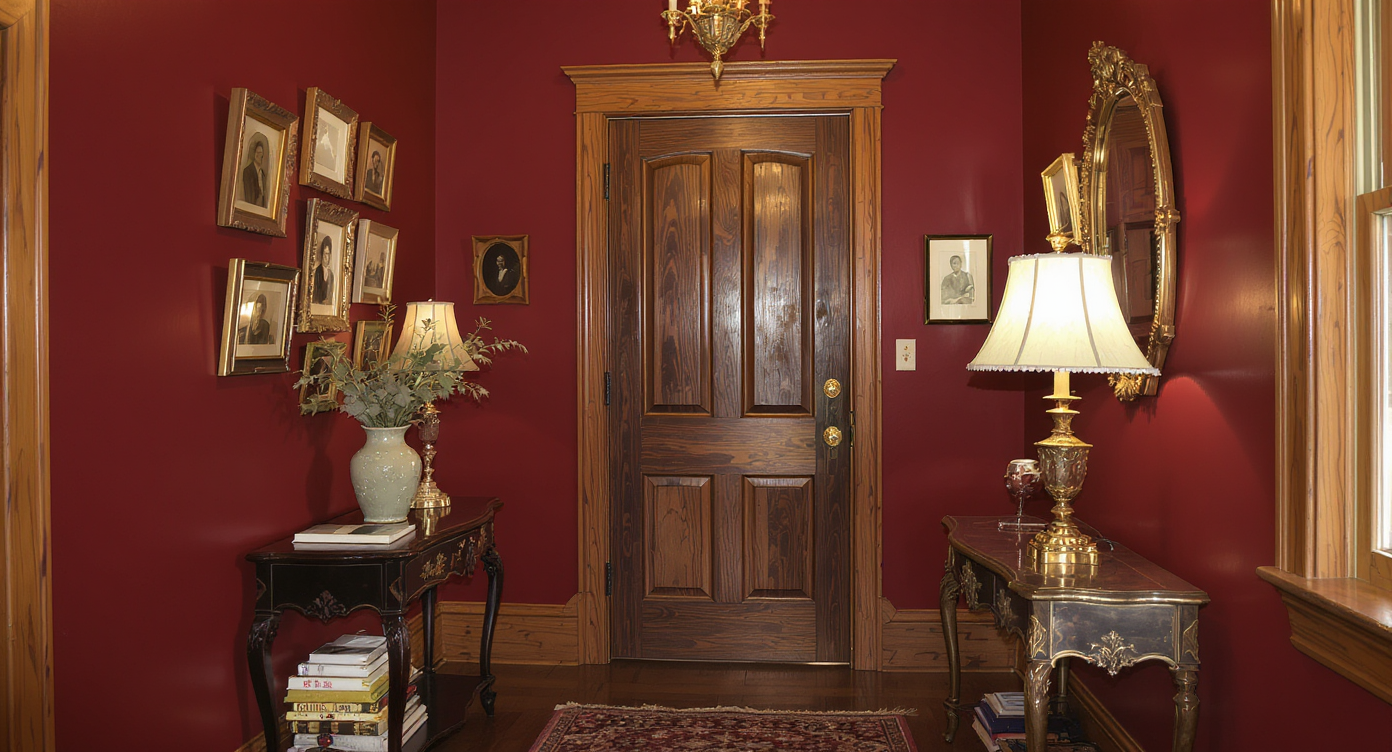
A warm entryway with red walls and original wood trim, showcasing how character can be preserved and refreshed.
Here’s the thing: what most people call an “embarrassing” house is usually a house with character that hasn’t been edited in a while. Maybe you inherited red walls, strong wood trim, and a wallpaper border. Maybe you leaned in. Now you’re wondering if guests will walk out murmuring yech.
Designers see this all the time. Homes with solid bones and charming details feel “dated” only when the palette, lighting, and scale aren’t working together. The fix is not to strip the personality, but to make the choices deliberate. Done right, a traditional home can feel collected, cozy, and confidently current in a weekend.
Short-tail keywords to guide your search: interior design, home decor, paint color, wood trim, lighting. Long-tail focus: how to update a dated home without remodeling, how to refresh red walls with wood trim, how to modernize a traditional dining room.
Suggested image and alt text: A warm entry with burgundy walls and unpainted oak trim; alt: “Entryway with red walls, original woodwork, and portrait gallery.”
The essential strategy: make it intentional
To make a dated home feel current, keep the craftsmanship, simplify the palette, and update lighting for warmth and clarity.
1) Edit the color story, not the history. Choose a 60-30-10 palette and stick to 3 to 5 hues. With red walls and oak trim, try a desaturated oxblood or cordovan for depth, or pivot to olive-sage or Delft navy that flatters golden wood. Rule of thumb: if your trim reads warm, pick paint with warm undertones; aim for an LRV in the 20-40 range for cozy rooms with strong trim. Experts recommend testing at least three samples on poster boards and checking them morning, noon, and night.
2) Relight for mood and clarity. Layer ambient, task, and accent lighting. Use 2700 K bulbs at CRI 90+ for living areas to keep wood tones rich. Swap any “boob light” for a statement fixture sized by this formula: fixture diameter in inches = room length + room width in feet. Over a dining table, hang the chandelier 30-34 inches above the tabletop. Add dimmers everywhere.
3) Right-size the art. Tall walls need bigger pieces. Hang artwork with the center at 57-60 inches from the floor, and make art above a console 60-80 percent of the console width. For a gallery wall, use generous mats (2-3 inches) to make smaller pieces feel intentional and cohesive.
4) Ground with textiles. A vintage-style runner in the entry instantly softens strong paint colors. In dining rooms, choose a rug that extends 24 inches beyond the table on all sides so chairs stay on the pile when pulled back. Repeating a thread of red or olive in textiles helps tie old and new together.
5) Edit, then lean in. Remove visual noise first: plastic bins, mismatched outlet plates, and tired lampshades. Keep the charming one-offs that make guests smile, like a witty animal portrait or a tiny hand-painted mouse. Cohesion comes from repetition of color and shape, not from sanding away personality.
Why this works: Designers often advise that guests remember how a home made them feel, not the exact paint name. Warm light, comfortable seating, and a deliberate palette do most of the heavy lifting.
Anecdote
A homeowner kept a beloved hand-painted mouse near the front door but felt the red walls were shouting. We shifted the red to a deeper cordovan, swapped in a brass lantern with 2700 K bulbs, and added a vintage runner. Friends started commenting on the craftsmanship, not the color, and the house finally felt like a choice rather than a compromise.
Avoid these common pitfalls
Five easy-to-miss mistakes make a traditional home feel dated when it doesn’t have to.
- Painting wood trim by default. If the trim is in good condition, celebrate it. Warm wood paired with a complementary paint color outlasts trend cycles.
- All recessed lighting, no layers. Relying on cans alone flattens rooms. Add sconces at 60-66 inches high, table lamps at eye level when seated, and a dimmable focal fixture.
- Tiny art on vast walls. Scale up. One 30x40 piece often beats six small frames scattering across a 10-foot wall.
- Wallpaper borders. Borders date quickly. Replace with a chair rail or wainscoting at 32-36 inches high and paint the lower portion a darker tone for depth.
- Undertone clashes. Mixing cool gray with orange-leaning oak makes both look off. Map undertones first, then choose paints and textiles that harmonize.
Expert design insights you can use today
Quick, high-impact moves can modernize a “stuffy” space in a day, no demolition required.
- Swap switch plates and dimmers. Inexpensive black or brass plates instantly feel tailored and help dated paint read intentional.
- Upgrade two light fixtures. Changing the entry and dining fixtures often shifts the whole read of a home. Designers recommend starting there for the best return on effort.
- Consider wainscoting in lieu of a border. MDF panels topped with a simple cap can be installed in an afternoon and painted in a moody olive or inky blue.
- Mirror math. A mirror near the entry should be 2/3 the width of the console and hung so the top sits 6-8 inches below the molding, bouncing light without crowding the trim.
- Plants are punctuation. A trailing pothos or a sculptural ficus adds life and breaks up heavy color fields. Think one living plant per major zone.
Field note: I’ve seen homeowners keep one quirky detail as the North Star and refresh around it. A client once kept a hand-painted mouse by the doorway, toned the red to a deeper cordovan, added a brass lantern, and laid down a vintage runner. The whole entry went from “theme-y” to “storybook” in a single Saturday.
Tools, ideas, and fast inspiration
These resources make it easier to reimagine without starting over.
- Visual planning: Try mood boards and room renders with ReimagineHome to test paint colors, rugs, and lighting before you buy.
- Paint calculators and samples: Order large-format peel-and-stick samples; plan 1 gallon per 350-400 sq ft for walls.
- Lighting checklist: Aim for 20 lumens per sq ft in living rooms and 30-40 in dining rooms; prioritize 2700 K, CRI 90+.
- Hardware refresh: New knobs, outlet covers, and vent grilles in a consistent finish echo modern-traditional style.
Suggested image and alt text: Cozy dining room with wainscoting replacing a wallpaper border; alt: “Traditional dining updated with chair rail, olive lower walls, brass chandelier.”
Visualization Scenario
Picture your entry at dusk. The new lantern throws warm light over the unpainted trim. A vintage runner softens footsteps. On the wall, a large, matted portrait anchors a tidy gallery. The tiny painted mouse is still there, a wink as guests step in, and the space reads as intentional, storied, and warmly yours.
FAQ
- How do I update red walls with wood trim without losing character? Keep the wood, deepen or desaturate the red, and add warm 2700 K lighting to flatter the grain. Designers often advise testing olive, russet, or Delft blue accents to balance the palette.
- Should I paint my wood trim white in a traditional home? Only if it’s damaged or you prefer the look; quality wood trim is a feature, not a flaw. Complementary paint color and layered lighting modernize trim without paint.
- What lighting updates make a dated house feel modern? Replace flush-mounts with a statement fixture sized to the room, add dimmers, and aim for CRI 90+ bulbs. Layer ambient, task, and accent lighting for depth.
- How high should I hang a chandelier over a dining table? Hang the fixture 30-34 inches above the tabletop, or slightly higher if the fixture is visually heavy. The chandelier diameter should be roughly the room length plus width in feet.
- How do you make eclectic decor feel cohesive? Limit the color palette to 3-5 hues, repeat materials, and scale up the art. A consistent 57-60 inch eye-line for artwork helps a mix of pieces read as one story.
What really matters when people walk in
The fastest way to stop feeling embarrassed about your house is to make three choices on purpose: a cohesive color story, layered lighting, and right-sized art. Keep the craftsmanship and the charm pieces that make your place uniquely yours. Edit a little, update a little, then lean in a lot.
Most guests don’t crave perfection. They want light they look good in, a seat that feels welcoming, and a conversation starter or two. That tiny mouse by the door. The fox in glasses. The hand-painted ceiling. Those are the things they’ll remember—and the reason your home will never feel like everyone else’s.
Ready to test new looks without lifting a brush? Spin up a few options with ReimagineHome and see which version of your home feels most like you.