.svg)

.svg)
.jpg)

TL;DR
Learn the art of hanging art with practical picture hanging rules, gallery wall layouts, and color-smart tips. From the best height for art over a sofa to how to hang on dark walls, this guide blends expert measurements with lived-in ideas and easy DIY home decor projects for small spaces.
Why hanging art matters now

Art transforms a simple corner, adding warmth and personality beyond mere decoration.
Beautiful rooms often feel unfinished until the artwork is up; it’s the moment a space stops looking staged and starts feeling lived in. Hanging art is less about perfection and more about creating a conversation between pieces, paint, furniture, and you. Here’s the thing: art and interiors should dance together, not copy each other. I’ve seen a vintage beach photograph, bought for a bedroom, end up above a home bar where its sandy tones unexpectedly harmonized with the room’s wood and glass. Serendipity can outdo meticulous matching. And if a piece is large, measure the wall first—but choose with your heart before your floor plan. DIY is booming because budgets are real, sustainability matters, and personalization is the point. When you learn a few dependable picture hanging rules, you gain the confidence to break them with style.
A shared philosophy for honest walls
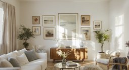
The best art placement feels collected over time, not arranged in one afternoon. Designers often advise balancing reliable measurements with intuitive moves. Early in any plan, consider core short-tail ideas like hanging art, gallery wall, picture hanging, and art placement. Color counts too. In my own living room, I painted the walls a tobacco-brown linen and watched frames glow at dusk. Dark, earthy tones can be remarkably forgiving; crisp mats and generous borders help art pop. On the flip side, I once worried a stark white room was too cold—until the furniture found its rhythm and the pictures landed on the right walls. The moral: the right wall can trump the wall color.
Anecdote
A client’s stairwell felt like a vertical shaft until we lined it with family photos marching up the incline; suddenly, the climb told a story. In my own place, a tobacco-brown wall turned modest prints luminous at night—proof that the right color can make humble frames sing.
DIY hacks and tricks for hanging art that sings
Below are six field-tested, search-ready ideas that blend rule-of-thumb precision with real-world warmth.
01. The 57-inch Rule: How high to hang art on a wall
Experts recommend centering single works at 57 to 60 inches from the floor to align with average eye level.What it is: A go-to measurement that instantly makes art feel intentional in hallways, entries, and living rooms.
How it works: Measure 57 to 60 inches from the floor to find the vertical center of the artwork; that point meets your hook. Over a sofa or console, drop slightly: aim to hang 6 to 8 inches above the furniture and choose art that’s roughly two-thirds the furniture width so the composition feels anchored. When stacking two pieces, treat them as one unit and keep the combined center at eye level. Designers often advise stepping back after each nail—your eyes will catch slumps and tilts faster than a level sometimes.
- Tip 1: For heavy frames, use a French cleat or two hooks 8 to 12 inches apart to prevent shifting.
- Tip 2: Use museum putty on lower corners to keep frames plumb.
- Tip 3: Above mantels, keep 4 to 8 inches of breathing room.
02. Grid, Gallery, or Salon: Choosing a gallery wall layout
For gallery walls, maintain 2 to 3 inches between frames; consistency is the secret to cohesion.What it is: Three classic layouts—tight grid, loose gallery, or floor-to-ceiling salon—each tells a different story.
How it works: A grid suits modern spaces: equal frames, equal spacing, laser-straight alignment. A loose gallery wall feels collected: mix sizes but keep one constant (frame color, mat style, or a black-and-white photo theme). Salon walls go maximal, climbing from baseboard to ceiling—best when pieces are truly collected, not purchased in a single haul. Plan with paper templates or painter’s tape. Start with the anchor at eye level, then build outward. A good rule: place the visually heaviest or most important piece near center.
- Tip 1: Lay everything on the floor first; shoot a photo and follow it as a map.
- Tip 2: Unify with a common thread like white mats or antique brass frames.
- Tip 3: For staircases, follow the rise—keep the centerline at 57 inches along the slope.
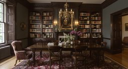
03. Color-Smart Hanging: How to hang art on dark walls
On dark or patterned walls, oversized white mats and slimmer profiles increase contrast and clarity.What it is: A color strategy that lets pictures glow on Havana browns, pea greens, florals, and other saturated backdrops.
How it works: Dark walls wrap a room in warmth, turning frames into jewel-like accents. Use larger mats (3 to 4 inches) and glass or acrylic with low glare. Patterned wallpaper can handle art, too—just space pieces so motifs peek through. If your walls are stark white and feel flat, don’t panic; sometimes the “right wall” for each work solves it. I’ve watched a chilly room come alive once the furniture aligned and the boldest canvas claimed a quiet wall.
- Tip 1: Try creamier whites instead of bright white paint to soften nighttime contrast.
- Tip 2: Match frame tone to room metals—black, brass, or natural wood—to tie elements together.
- Tip 3: Add a picture light sized at roughly half to three-quarters the frame width.
04. Sightlines and Surprise: The long-view placement trick
Placing a strong piece at the end of a corridor or aligned with a doorway visually extends a room.What it is: Strategic art placement that rewards a glance through openings and down halls.
How it works: I once moved a favorite painting from a sitting room to a narrow passage; suddenly, the study felt deeper because the eye chased the image beyond the threshold. Use this with mirrors, too: hang the focal work where it’s visible from your favorite chair. The key is proportion—downsized spaces often benefit from a single striking piece rather than clutter. Experts recommend testing long-view placements with painter’s tape outlines before committing.
- Tip 1: Stand in the main seats and note what you see through doors; target those walls.
- Tip 2: Choose bolder color or scale for distant walls to read from afar.
- Tip 3: Keep frames flush to avoid glare at oblique angles.
05. Stair Stories: Gallery wall layout for staircases
Follow the stair angle and maintain 2 to 3 inches between frames for a rhythm that feels intentional.What it is: A narrative wall that turns an “elevator shaft” stairwell into a memory lane.
How it works: Start with an anchor halfway up the run, then step pieces along the incline. Keep top and bottom edges loosely parallel to the handrail so the collection climbs gracefully. Family photos excel here—yearly portraits, travel shots, even Instax grids. If you’re renting, picture ledges make it easy to swap without more holes. Designers often advise mixing orientations—portrait and landscape—to break monotony.
- Tip 1: Use removable strips rated for at least 1.5x the frame weight.
- Tip 2: Print in consistent black-and-white to unify mixed frames.
- Tip 3: Keep the lowest frame 48 inches from the tread for clearance.
06. Scale Play: Big-over-small and the power of proportion
Combining one oversized piece with smaller companions creates tension and charm without clutter.What it is: A scale strategy that pairs a “hero” work with tiny pieces or a grid to keep rooms lively.
How it works: Try a large canvas in a barn-like room, then float a miniature drawing above the mantel where it feels almost secret. Over a sofa, a single large photograph at two-thirds sofa width often beats a cluster of undersized frames. For maximalists, hang floor to ceiling—but let collections evolve. You can feel the difference between walls “propped out” with filler and walls layered slowly over time.
- Tip 1: Over furniture, leave 6 to 8 inches of air; let big works breathe.
- Tip 2: Mix frame depths for subtle shadow play.
- Tip 3: Use cohesive mats to link small pieces to a large focal work.
What ties these ideas together
What ties these moves together is a spirit of reuse, warmth, and intention. Good hanging isn’t about matching; it’s about listening for harmony. Pictures should be mobile. Even if they rarely move, plan as if they will: avoid decorating a room around one piece, and you’ll feel freer to shift things when life shifts, too.
Visualize before you hammer
Previewing color, scale, and gallery wall spacing on a screen saves time, money, and holes. Before you pick up a hammer, test ideas digitally. Upload a photo of your space to ReimagineHome, try a grid or salon layout, check 57-inch centers, experiment with frame colors, and even see how a dark wall changes contrast. It’s a fast way to compare “big single over sofa” versus “loose gallery,” or to preview stair layouts and picture lighting. Think of it as a confidence tool between inspiration and action.
Visualization Scenario
Drag-and-drop two competing ideas into ReimagineHome: a single oversized photograph versus a nine-piece grid above your sofa. Toggle wall colors from cream to deep brown, switch frames from black to brass, and check the 57-inch rule with a digital ruler. Save the favorite mock-up and take it to the wall with confidence.
FAQ: People also ask about hanging art
How high should I hang art on a wall?
Center single pieces at 57 to 60 inches from the floor; this eye-level height is widely recommended for consistent picture hanging.
What is the best way to plan a gallery wall layout?
Map it with paper templates, keep 2 to 3 inches between frames, and start from a central anchor at eye level for balance.
What size should art be over a sofa or bed?
Aim for artwork about two-thirds the width of the furniture and hang it 6 to 8 inches above to keep the composition grounded.
Can I hang art on dark walls or patterned wallpaper?
Yes—use larger white or cream mats, slimmer frames, and adequate lighting to create contrast on dark or patterned walls.
How do you hang art in a rental without damage?
Use adhesive hooks or picture ledges rated for the frame’s weight, lean larger pieces on consoles, and plan grids with removable strips.
How do I light artwork at home?
Choose picture lights roughly half to three-quarters the frame width, or aim adjustable sconces at a 30-degree angle to reduce glare.
Let your walls breathe with you
In the end, truthful hanging is about tempo. Some pieces whisper from a quiet wall; others belt a chorus over the bar you never planned to feature. Let your eye-level rules and spacing guides steady your hand—and let a little luck in the door. Rooms feel more welcoming when the art reflects who lives there, not just what’s trending. If you buy what you love and honor a few measurements, your home becomes the kind of place where walls tell stories and every glance lands on something that matters. When you’re ready to rehearse the dance, rehearse it on screen—then let the art lead.


.png)