
TL;DR
The best exterior paint color for a house with cedar shake and vinyl siding balances undertones, contrast, and climate. In cloudy PNW light, a deep teal or vine green body color with cream trim ties to beige vinyl, while a playful patchwork around the entry adds personality without overwhelming the facade.
Why mixed-material exteriors need a smarter color plan
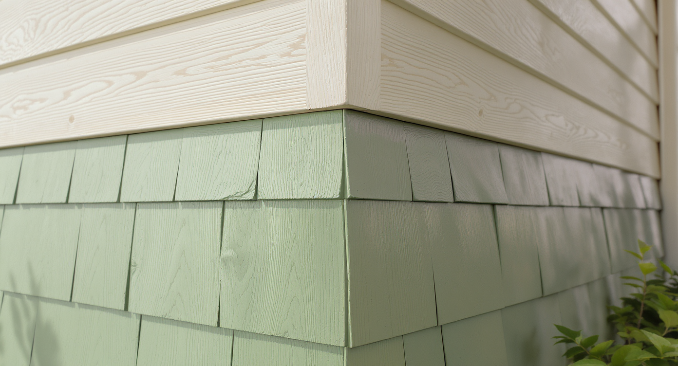
Close-up of cedar shake in vine green paired with warm beige vinyl siding highlights texture and color contrast.
Choosing an exterior house color for cedar shake and vinyl siding is all about undertones, contrast, and climate. Here’s how to get it right.
If you’ve got a cottage or bungalow where vinyl on the upper story is staying for now, you’re not stuck with “good enough.” You can still pick a body color for the cedar shake that flatters the existing vinyl and roof, boosts curb appeal, and survives a wet season. The goal: a palette that feels intentional, not like a budget compromise.
In the PNW, where skies skew gray for months, homeowners often debate between vine greens and jewel-toned teals. Here’s the thing: both can work. The secret is reading the vinyl’s undertone (often warm cream or beige), then dialing contrast so the house doesn’t disappear into the landscape. Below, a simple plan that works on mixed materials—plus a playful patchwork idea for the entry alcove if you want whimsy without going full rainbow.
The color strategy that actually works
The color strategy that actually works
The fastest route to a cohesive mixed-material exterior is a 60-30-10 palette: 60% body color (cedar), 30% trim/secondary, 10% door and accents. Designers often advise aiming for 30–40% contrast between body and trim for crisp definition from the street.
- Start with what won’t change. The vinyl siding, roof, and masonry set the undertone. If the vinyl reads warm beige/ecru, a deep teal, blue-green, or olive with a similar warm base will harmonize; a cool bluish gray can look chalky next to it.
- Pick your contrast level. In leafy lots, greens recede and teals pop. If you want the cottage to stand out from lawn and shrubs, choose a saturated teal or blue-green (LRV 15–25). Prefer a woodsy vibe? A vine green (LRV 10–20) looks calm and classic.
- Let light guide you. In cloudy climates, going one step lighter than the chip prevents a color from reading black outdoors. Many painters recommend ordering the body color 10–20% lighter for cedar shingles that absorb light.
- Upgrade the entry. A recessed alcove can read dim. Paint the alcove walls and ceiling the same warm cream as the vinyl to bounce light, then use the bold body color on the surrounding shingles. This concentrates drama where guests arrive.
- Consider a patchwork accent. If you love multiple samples, confine them to the entry bay: 3–4 hues max, matched in saturation, repeated in a simple checker or band. Keep the main field one solid color so it still reads like architecture, not art project.
- Finish matters. On cedar shake, a high-quality solid-color stain or breathable exterior paint cuts future peeling. In rainy zones, expect 5–7 years from a solid stain on shingles and 7–10 years from premium paint with proper prep.
- About vinyl paint. If you ever paint the vinyl, use manufacturer “vinyl-safe” formulations and avoid colors significantly darker than the original to reduce heat-related warping; when in doubt, match value or go lighter.
User insight: I’ve seen Portland homeowners test seven swatches on their cedar—community favorites leaned deep green and teal. The winner? A balanced blue-green that made the beige vinyl feel intentional instead of dated.
Anecdote
Alt-text and caption suggestions for your project gallery:
- Alt: Portland cottage with cedar shake body painted deep teal and cream trim; Caption: Deep teal body color makes beige vinyl feel intentional.
- Alt: Entry alcove patchwork accent using three greens and an aqua tile; Caption: Patchwork confined to the alcove keeps whimsy controlled.
- Alt: Large swatch boards on cedar shingles in morning and evening light; Caption: Test 24×24 inch samples at multiple times of day.
Common mistakes when painting cedar shake next to vinyl siding
Common mistakes when painting cedar shake next to vinyl siding
The most common exterior color mistakes come from ignoring undertones, light, and scale. Experts recommend testing large samples at multiple times of day and viewing from 30–50 feet.
- Going too dark overall. A near-black green can swallow detail under PNW skies. If your sample reads moody indoors, lighten it 15–20% for exterior use.
- One-note cream everywhere. Matching the cedar to beige vinyl seems safe but flattens character. Instead, match the vinyl only in the entry recess or trim, then choose a contrasting body color.
- Patchwork overload. Spreading six or seven colors across the whole facade looks chaotic. Keep multicolor moments to the alcove or a single gable, with 3–4 hues max.
- Ignoring the roof. Dark brown or charcoal roofing calls for warmer greens/teals; a cool roof pairs better with cooler blues. A quick rule: echo the roof’s temperature in your body color’s undertone.
- Skipping sample scale. Postcard-sized chips lie. Paint at least 24 by 24 inch swatches on sun and shade sides, two coats, and check at 8 a.m., 1 p.m., and 6 p.m.
Pro tips from designers and painters
Pro tips from designers and painters
For small cottages, 2–3 exterior colors plus a door accent is the sweet spot; the classic 60-30-10 rule keeps the eye organized and boosts curb appeal.
- Prime for success. On weathered cedar shingles, use a stain-blocking primer before a solid stain or paint to prevent tannin bleed.
- Shape the facade with color. Paint gutters to match the body to reduce visual clutter; keep window trim one step lighter for a crisp picture-frame effect.
- Door drama that lasts. Pick a front door hue with an LRV 10–20 points higher or lower than the body color for readable contrast. Jewel-tone teal with a tomato red or russet door is a time-tested combo.
- Tune the teal. If a bold blue-green feels loud, add 5–10% gray to desaturate without losing personality.
- Lighten the entry ceiling. A warm cream ceiling in the alcove can add the equivalent of one “bulb’s” worth of perceived brightness during short winter days.
Reflection: Every time I walk past a small house with a strong body color and disciplined trim, it looks cared for. Color, not size, is what makes passersby smile.
Real-world stories from homeowners
Real-world stories from homeowners
Small shifts in color placement can change how a home feels from the sidewalk. Designers often advise testing one conservative and one daring option side by side.
- The teal that lifted the gray. A Portland couple with beige vinyl chose a deep teal body on the cedar. In winter, the house reads cheerful against bare branches; in summer, hydrangeas and roses pop like a postcard.
- Patchwork, but make it chic. One owner kept the field color a vine green and used three friends of that hue in the entry recess: lighter leaf, muted olive, and a single aqua square by the mailbox. Neighbors called it a fairy-tale wink, not a circus.
- Too dark, lesson learned. Another homeowner painted cedar a near-black green to match lofty evergreens. On overcast days the facade vanished. Lightening the formula by 20% restored depth and charm.
- Vinyl cautionary tale. A DIYer painted vinyl a much darker gray without a vinyl-safe formula. South wall panels warped by the first heat wave. Matching the original value with a vinyl-rated paint fixed it.
Visualization Scenario
Picture late afternoon in July. The cedar shingles glow a saturated blue-green, the cream entry recess pulls light into the porch, and a tomato-red door smiles from the sidewalk. Window trim traces clean lines, the gutters disappear, and the garden reads brighter against the body color. It’s still your quirky cottage—just sharper, friendlier, and unmistakably yours.
FAQ: exterior house color, cedar shake, vinyl siding
How do I choose an exterior house color for cedar shake and vinyl siding?
Match the vinyl’s undertone, then build a 60-30-10 palette: saturated body color on cedar, light trim tied to the vinyl, and a contrasting door. Designers recommend 30–40% contrast between body and trim for clarity from the street.
Can I paint vinyl siding safely?
Yes, but use manufacturer “vinyl-safe” exterior paints and avoid going significantly darker than the original to reduce heat-related warping. When uncertain, match the existing value or go lighter.
What exterior paint colors work with beige vinyl siding?
Warm-leaning teals, blue-greens, and vine greens pair well with beige vinyl, especially with soft cream trim. A deep teal body color with cream trim is a proven combination for mixed-material facades.
Is dark green or teal better in the PNW?
Teal and blue-green pop against lush landscapes, while dark green blends into foliage for a woodsy feel. In cloudy light, many experts lighten formulas 10–20% to keep depth without losing detail.
How many exterior colors should a small cottage use?
Two to three tones plus a door accent is ideal, following the 60-30-10 rule. More than four colors can read busy on compact elevations.
Bring it together with three colors and a clear focal point
Bring it together with three colors and a clear focal point
The winning exterior house color for cedar shake and vinyl siding uses a simple recipe: a saturated, warm-leaning teal or green on the cedar, the vinyl’s cream carried into the entry recess and trim, and a joyful door. Aim for 30–40% body-to-trim contrast and keep your palette to 2–3 colors plus an accent.
If you’re torn, test big, view from the street, and let your entry tell the story. A little patchwork in the alcove is a charming way to keep personality high and costs low.