.svg)

.svg)
.jpg)

TL;DR
Winter interiors skew tactile and intentional: think deep blues with burnished metals, creamy layered neutrals, and spice-toned accents. Expect the latest interior design trends 2025 to mix cozy textures, natural materials, and optimistic color. Use these modern home décor ideas to warm up living rooms, bedrooms, and small spaces—without waiting for spring.
Why Winter Color Schemes Matter Now
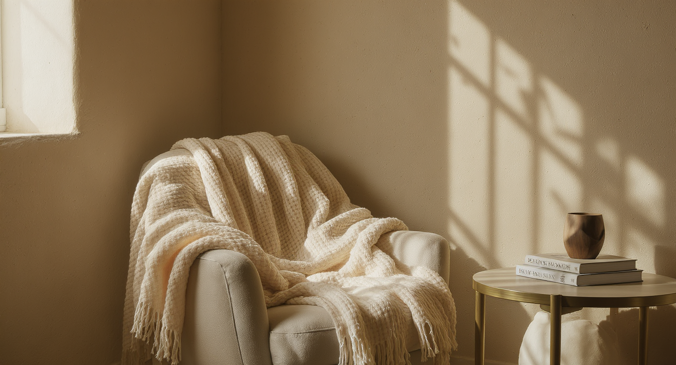
Textured materials and soft lighting create intimate corners that embody winter warmth and comfort.
Short days. Soft socks. A craving for rooms that hold you. That’s the headspace shaping winter color schemes this season, as interiors move away from flat “all-white, all the time” palettes toward warmer, more emotionally intelligent design. After years of digital overload, people want materials they can feel—wool boucle, natural wood, limewashed plaster—and colors that steady the nervous system.
Across projects, a throughline emerges: craft, texture, and authenticity. Warm neutrals are layered instead of matched; metallics look brushed, not blingy; and saturated hues show up in cocooning doses. The result is a home that glows even when the sun taps out at 4:30.
Ready to edit your palette for the season? Below, the winter interior design trends bringing instant comfort—and long-haul style—into real rooms.
The Big Picture: Where Winter Design Trends Are Headed
Winter design trends favor atmosphere over aerobics: fewer pieces, richer finishes, and color with purpose. In modern living spaces, the right home décor ideas start with the palette, then lean on texture and lighting to build warmth.
Here’s the thing: small changes drive big comfort. A deep navy wall, a cinnamon velvet pillow, or a creamy rug can shift an interior’s temperature by 10 degrees—no thermostat required. Designers often advise the 60-30-10 rule: 60% base color, 30% secondary, 10% accent for balance that feels effortless.
Anecdote
In a north-facing kitchen that always felt chilly, we leaned into a bold pink-and-charcoal scheme and added a brass library light; suddenly, breakfasts felt lively even on gray mornings. Later, a client’s dim hallway transformed with a simple striped runner and pleated shade—proof that pattern and glow can change the season inside.
The 2025 Winter Color Trends Designers Swear By
Deep navy, teal, and blue-green paired with brass or antique gold create instant winter coziness and visual depth.
These jewel-box hues read like dusk: calming, enveloping, and flattering to lamplight. Experts recommend choosing a blue with a touch of green or gray for sophistication, then punctuating it with warm metal details—think aged-brass lamps or a bronze picture light. As a rule of thumb, keep ceilings 10% lighter than walls to prevent a cave effect. I’ve seen a library wrapped in an icy blue ceiling and saturated walls come alive the moment a patinated brass pendant clicked on.
Cultural note: As social lives shift indoors, “evening colors” make rooms feel intimate without feeling small.
How to Bring It Home
- Tip 1: Paint built-ins or a single accent wall in deep navy; leave trim crisp white for contrast.
- Tip 2: Layer velvet or mohair in teal; add brass hardware for warmth.
- Tip 3: Use 2700K–3000K bulbs to make blues glow instead of chill.
02. Creamy Whites + Layered Textures (cozy winter neutrals)
Ivory, oatmeal, and warm taupe build a winter-white palette that’s serene, not sterile.
Designers often note that five to seven shades of white in different textures beat one bright white every time. Start with a rug in wool or jute, add a boucle or chenille sofa, then mix linen drapery and a matte limewash or plaster finish for the walls. If your room lacks natural light, aim for paint with an LRV (Light Reflectance Value) of 60–70 to keep things bright without glare. In a north-facing apartment I worked on, an oatmeal limewash plus pewter accents transformed a formerly flat space into a fireside retreat.
Cultural note: This is “quiet luxury” at home—understated layers that telegraph calm.
How to Bring It Home
- Tip 1: Stick to warm undertones; sample swatches morning and night.
- Tip 2: Mix matte plaster, nubby textiles, and brushed nickel or unlacquered brass.
- Tip 3: Add depth with ribbed pottery, boucle pillows, and a textured wool throw.
03. Mulled Reds & Spice Tones (home décor trends)
Brick, pomegranate, persimmon, aubergine, and mustard add appetite-warming richness.
Think of these as the pantry of winter color. Use cinnamon, tobacco, and wine tones in textiles and art, then ground them with chocolate brown or camel. A good guideline: keep saturated spice tones to 10–20% of the room so they read cozy, not crowded. I watched a once-icy dining room come alive with a persimmon velvet banquette and smoked brass sconces—suddenly, dinner lingered.
Cultural note: Comfort-food colors mirror a season that prizes ritual, from simmer pots to long, convivial meals.
How to Bring It Home
- Tip 1: Start with pillows or a rug in paprika or oxblood; layer neutrals around them.
- Tip 2: Pair aubergine with walnut, mustard with travertine, persimmon with aged leather.
- Tip 3: Balance spice with cool stone or pewter to avoid visual heat overload.
04. Forest Greens + Tobacco Browns (modern living room ideas)
Verdant greens with caramel, saddle, and toasted walnut deliver a clubby, grounded vibe.
Greens are uniquely adaptable: kelly for cheer, olive for calm, blue-green for sophistication. Designers often advise introducing green via patterned textiles, plants, and art before painting walls. If you do go bold, keep sheen low (matte or eggshell) and echo the tone in one wood element for cohesion. A client’s compact reading nook went from “forgotten” to favorite after we added a bottle-green stripe, a tobacco leather chair, and a brass swing-arm lamp.
Cultural note: Nature is the north star, and these palettes bring the outside in during leafless months.
How to Bring It Home
- Tip 1: Anchor with a walnut table or cane chair; add olive drapery.
- Tip 2: Mix verdigris metal and woven textures to keep it organic.
- Tip 3: Use plants as pigment—two tall ficus or olive trees add life and scale.
05. Icy Blues + Smoky Grays (cool winter palette)
Frosty blues balanced with soft gray and a touch of warm metal feel crisp yet inviting.
For a tailored winter look, keep the blue on walls or ceilings and bring in snowy whites in textiles. Add a single brass or champagne-nickel moment to warm the mix. Rule of thumb: limit cool hues to 60% of the scheme and offset with 40% warm textures (wood, wool, or brass). I once saw a plastered study in pale blue with a gold-leaf flush mount; it felt like morning light year-round.
Cultural note: This palette scratches the minimalist itch without reading cold.
How to Bring It Home
- Tip 1: Choose blue-grays with a subtle green undertone for sophistication.
- Tip 2: Layer velvet in ice blue; add a wool rug in soft gray.
- Tip 3: Finish with a warm metal picture light or woven shade for balance.
06. Pattern Play & Tailored Details (stripes, skirts, tassels)
Stripes, pleated skirts on sofas, woven textures, and a hint of passementerie add personality to winter rooms.
When color quiets down, pattern steps in. Designers often note that a stripe is the most versatile pattern in the house—timeless on rugs, ottomans, and drapery. Woven caning, chunky sock-weave chairs, and skirted upholstery soften hard lines. Keep patterns at 30% of the space and vary scales: one large, one medium, one small. In my own entryway, a striped runner and tasseled pendant did more for warmth than any paint could.
Cultural note: Little, flouncy details signal joy—an antidote to gray skies.
How to Bring It Home
- Tip 1: Start with a striped throw or bench cushion; layer solids around it.
- Tip 2: Add a skirted side chair to counter hard-edged case goods.
- Tip 3: Mix one woven seat or cane panel for texture and lightness.
Trend Crossovers and Smart Contrasts
Winter palettes love a duet. Deep blues welcome brass; creamy whites crave texture; spice notes sing against tobacco leather. Experts recommend choosing one anchor palette (blues, neutrals, or earth) and one accent family (metal, pattern, or wood) for cohesion.
Contrast smartly. If walls go dark, keep trims and ceilings lighter by one to two shades. In small rooms, extend wall color onto the ceiling for a cocoon effect; in larger spaces, break it with crisp crown to highlight architecture. And remember the quick wins: a 9-by-12 wool rug anchored under the front legs of furniture, curtains that kiss the floor by 1–2 inches, and lighting layered at three heights for a flattering winter glow.
Visualize the Trends in Your Own Space
Before you commit paint or reupholstery, preview the look in your actual room.
With ReimagineHome, upload a photo and experiment with trending palettes, textures, and layouts in seconds. Test a limewash effect, swap straight lines for soft curves, or try a “quiet luxury” neutral scheme without lifting a roller. It’s a modern design sandbox that turns inspiration into visible, testable possibilities.
Visualization Scenario
Upload a photo of your living room to ReimagineHome, try a deep navy wall with brass lighting, then toggle to creamy layered neutrals with a boucle sofa to see which winter color scheme warms the space best.
FAQ: Winter Color Schemes and 2025 Interior Trends
What are the biggest interior design trends of winter 2025?
Natural materials, deep blues with brass, creamy layered neutrals, and spice tones lead winter color schemes. Designers often advise pairing saturated color with warm textures for balance.
How should I choose a winter color palette for a small living room?
Use one saturated hue on walls with low sheen and keep ceilings 1–2 shades lighter; follow the 60-30-10 rule for balance and add warm metals and textiles.
Are white interiors good for winter or too cold?
Winter whites work when layered: mix five or more textures and keep undertones warm (ivory, oatmeal, taupe) to avoid sterility.
What’s the best way to add trendy color on a budget?
Start with textiles and paint; pillows, throws, and one accent wall in a long-tail shade like aubergine or persimmon make an immediate impact.
How can I visualize new winter home décor ideas before decorating?
Use ReimagineHome to preview colors, textures, and furniture arrangements in your own photos for quick, low-risk decisions.
Warmth You Can Feel, Style That Lasts
Design, at its winter best, is a hug you can walk into. The new luxury isn’t loud; it’s intention. Choose palettes that support how you live—colors that flatter lamplight, textures that invite touch, details that spark a smile—and your rooms will stay relevant long after the snow melts.
Start small, listen to the light, layer slowly. And when you’re ready to see it all together, let ReimagineHome translate ideas into a vision you can trust.


.png)