.svg)

.svg)


TL;DR
If you’re asking “What is my interior design style?”, you likely gravitate to a neutral spectrum spanning warm minimalism, organic modern, and California coastal. Use a quick style audit plus an interior design style quiz–style workflow with AI to identify your lane, then layer texture, contrast, and durable materials so it never feels bland. ReimagineHome.ai lets you test these looks on your actual room photos and export mood boards, layouts, and product ideas—an easy long-tail path to identify your interior design style with AI in minutes.
Find your interior design style—fast
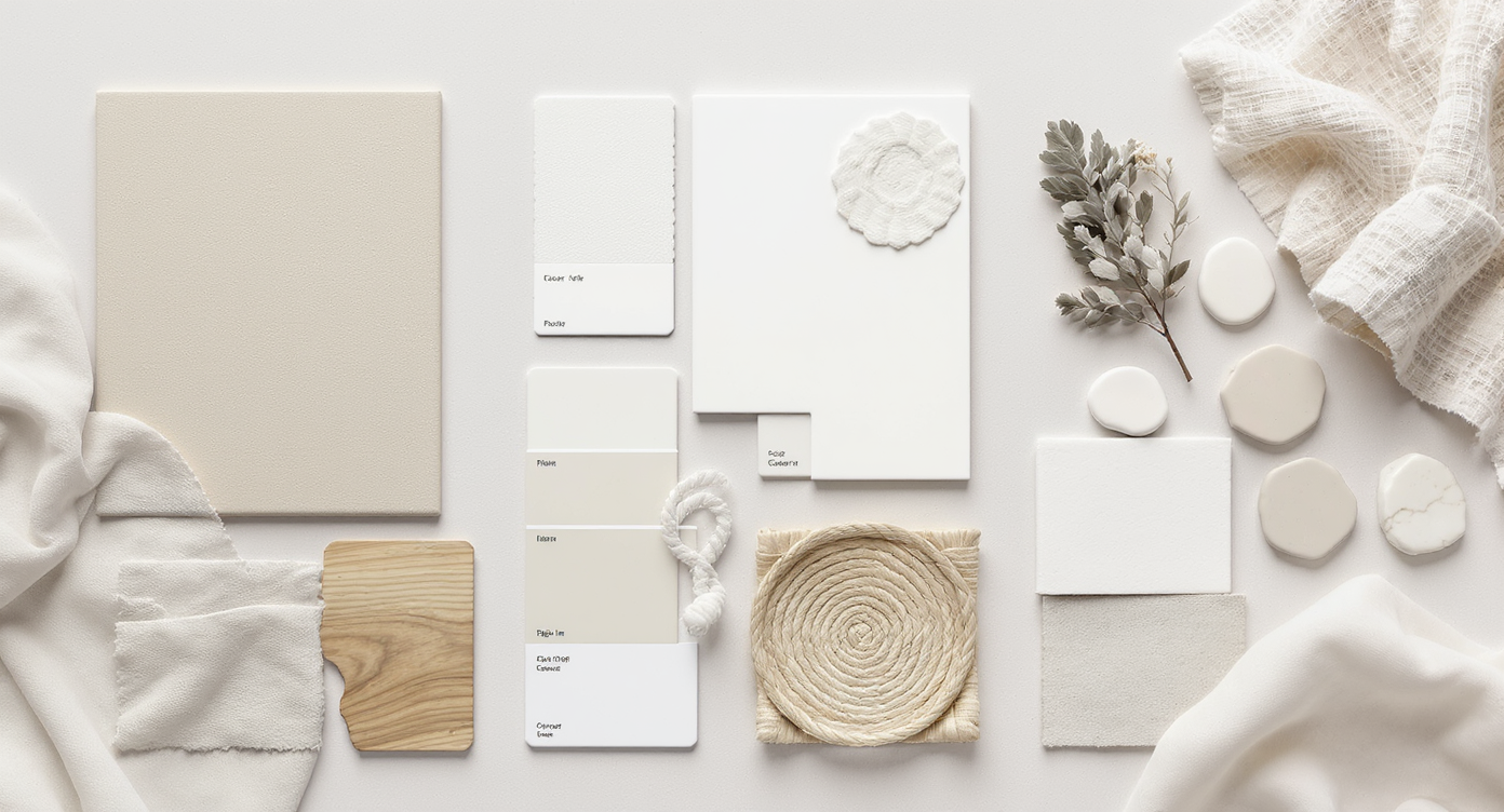
Visualize your style by exploring textures, palettes, and shapes of 2025’s top neutral trends in this design mood board.
The fastest way to answer “What is my interior design style?” is to look at three things in your saved photos: silhouettes (curvy vs. clean lines), surfaces (matte plaster vs. slick lacquer), and palette (warm neutrals vs. bright whites). Most neutral lovers land in one of three 2025-forward camps: warm minimalism, organic modern, or California coastal. Instead of guessing, drop a photo of your space into ReimagineHome.ai (https://www.reimaginehome.ai/?utm_source=blog) and run side-by-side style swaps; you’ll see your room rendered in each look so you can choose, not hope.
How do I quickly figure out my interior design style?
The simplest interior design style quiz is a 60-second audit: pick A or B. - Lines: A) Low, linear, flat-front cabinetry B) Soft curves, chunky tables, rounded lamps - Wood: A) Light oak/ash, minimal grain B) Knotty oak/walnut with visible texture - Stone: A) Subtle limestone, honed quartz B) Veiny marble, travertine with movement - Textiles: A) Linen, cotton, bouclé in solids B) Nubby wools, slubbed linens, woven grasses - Accents: A) Matte black, bronze details B) Aged brass, patina metals, woven rattan If you choose mostly A, you lean warm minimalism; mostly B, organic modern; if your pins feature airy blues, coastal stripes, and light driftwood, you’re likely California coastal. Screenshots of your top nine inspiration images also help: if 70% of items share a look, you’ve found your lane.
Anecdote
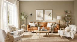
A client once asked why her immaculate white-on-white living room felt like a rental. We kept her pale sofa, but added a matte-black reading lamp, a wool-bouclé ottoman, and a pale oak sideboard with chunky knobs. A large, textural canvas and a potted olive tree rounded out the corner. Same palette, new personality—people finally wanted to sit and stay.
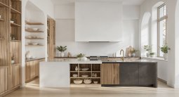
What’s the difference between warm minimalism, organic modern, and California coastal?
Warm minimalism favors fewer, better pieces in warm neutrals; organic modern adds earthy texture and sculptural shapes; California coastal pulls in ocean light, sandy woods, and a breeze of blue. Knowing the differences helps you buy once, style right. - Warm Minimalism: Calm, edited rooms with limewash or soft-matte walls, light oak, bouclé, and intentional negative space. Black accents and simple forms keep it crisp, not sleepy. - Organic Modern: Earthy, layered textures—plaster, travertine, walnut, chunky woven rugs—plus rounded silhouettes. Imperfect finishes and patina are a feature, not a bug. - California Coastal: Airy white bases, natural rattan, sun-bleached woods, and hits of sea-glass blues and sage. Stripes, slipcovers, and zellige tile add casual charm. Transitional blends are common; the key is choosing a primary style and letting secondary influences play supporting roles.
Which colors, textures, and finishes keep neutral rooms from looking bland?
Neutral interior design styles look sophisticated when you balance warmth, contrast, and tactile materials. The rule-of-thumb is 60-30-10: 60% base tone, 30% supporting neutrals, 10% high-contrast accents. - Palette: Target light reflective value (LRV) 60–75 for walls in low-light spaces; drop to 50–60 in bright rooms to avoid glare. Add a 10–15% dose of deep contrast (charcoal, espresso, matte black) to anchor all that beige. - Texture: Mix at least three textures per vignette (e.g., linen sofa + bouclé pillow + travertine side table). Plants and woven baskets count as living texture. - Metals: Pair only two metal finishes per room for cohesion—matte black with aged brass, or polished nickel with pewter. - Patterns: Keep patterns quiet but present: slim pinstripes, micro-herringbone, small-scale checks on pillows or throws. - Lighting: Layer it. Aim for 3–5 light sources per room and bulbs CRI 90+ for true color, 2700–3000K for cozy warmth.
How do pets, kids, and real-life mess change style choices?
Real life pushes neutral styles toward performance fabrics, practical finishes, and forgiving mid-tones. With kids, pets, or frequent guests, prioritize cleanability over bright whites. - Sofas and chairs: Look for performance linen, crypton, or tightly woven blends; removable, washable slipcovers are a win. Mid-beige and mushroom hide wear better than pure white. - Rugs: Wool with pattern or heathering is naturally stain-resistant; indoor/outdoor flatweaves beat shag for cleanup. A felt rug pad (1/4 in) adds comfort and prevents shifting. - Wood tones: Mix 2–3 related woods max; keep undertones consistent (all warm or all cool). Use natural wood to add depth if your walls are pale. - Walls and trim: Avoid white on high-touch doors and banisters; use a durable satin/semigloss in a mid-tone. - Care: Keep a dedicated upholstery cleaner and enzyme spray handy; spot-treat fast and rotate cushions monthly.
Visualization Scenario
Imagine your current living room photographed at noon. In minutes, you see it three ways: warm minimalism with limewashed walls and black accents; organic modern with travertine and walnut; coastal with rattan, blue-striped pillows, and a weathered oak coffee table. You pick the winner, export a shopping list, and order samples that afternoon.
FAQ: Real searches about interior design styles
Is white-on-white interior design out in 2025?
All-white isn’t “out,” but it’s evolving into warm minimalism with texture and contrast. Add limewash, natural wood, and a 10–15% hit of dark accents so it feels intentional, not sterile.
What’s the difference between Japandi and Scandi if I like neutral interiors?
Scandi skews light, airy, and functional; Japandi blends that with Japanese wabi-sabi warmth, lower silhouettes, and more pronounced texture. If you like calm plus craftsmanship, Japandi may be your lane.
How do I pick wood tones that don’t clash?
Limit the room to 2–3 wood tones and match undertones: warm with warm, cool with cool. Use one “hero” wood (e.g., oak floor) and let other woods echo it in either a lighter or darker shade.
What rug size works with a sectional in a neutral living room?
Choose a rug large enough for the front legs of all seating to land on it, typically 8×10 ft at minimum; leave 30–36 in walkway clearance around major paths.
How can I find my interior design style with AI?
Upload your room photo to ReimagineHome.ai, apply style swaps like warm minimalism or organic modern, and compare renders side-by-side. Save the winner as a mood board and source similar pieces.
Try it, don’t guess it
You don’t have to live with guessing. Test warm minimalism, organic modern, and California coastal on your actual rooms, size everything with a few proven rules, and buy to your chosen lane. Then iterate seasonally with texture and small accents rather than repainting entire rooms.


.png)