
TL;DR
Universal Khaki, the Sherwin-Williams 2026 Color of the Year, is a warm neutral with subtle green undertones that reads grounded, not muddy. To use Universal Khaki in your home, pair it with rich woods, stainless steel, crisp whites, and one confident accent like lemon yellow or oxblood red. Sample it in different light, choose sheens by surface, and follow the 60-30-10 rule for balance.
Why Universal Khaki Matters Right Now
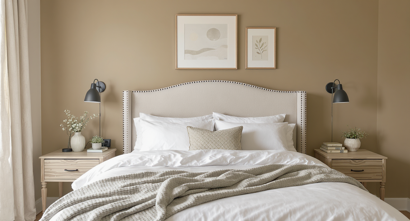
Warm Universal Khaki corner with natural materials and craft elements evokes calm, practical comfort.
Universal Khaki, Sherwin-Williams’ 2026 Color of the Year, is a practical, warm neutral designed for calm interiors and confident, utilitarian style.
There’s a reason a khaki paint color is having a moment. As design leans into essentialism and real-life utility, a neutral that feels honest and unfussy hits differently. Universal Khaki arrives as a steadying force: a beige-with-brains that nods to craft, trades, and the tactile comforts of home. In the first 100 words alone, let’s name the heart of the search: the Sherwin-Williams 2026 Color of the Year, a khaki paint color with green undertones, and how to use Universal Khaki in your home.
Here’s the thing: people are tired of trend whiplash. A color that plays well with stainless steel, oak, crisp white trim, and hand-made moments is a relief. Designers point to subtle green undertones for why this neutral stays balanced — it doesn’t skew pink or purple under warm bulbs and pairs naturally with materials like canvas, leather, and stone. If your style lives between modern utility and warm tradition, Universal Khaki is the bridge.
How to Use Universal Khaki (2026 Color of the Year) in Real Homes
Universal Khaki is a warm neutral with soft green undertones that stays grounded next to wood, metal, and bright accents without turning muddy. Treat it as a foundation tone — the backdrop that lets materials and craft take the lead.
Start with a simple framework that works across living rooms, kitchens, bedrooms, and entryways.
- Palette ratios: Use the 60-30-10 rule. Let Universal Khaki cover about 60 percent (walls), anchor with a secondary material at 30 percent (wood grain, stone, or navy upholstery), and punctuate with a 10 percent accent (lemon yellow, oxblood red, or deep olive).
- Where it shines: Open floor plans, north- or east-facing rooms, and spaces with stainless steel or brushed nickel. The green undertone keeps warmth in check and complements utility-driven finishes.
- Lighting basics: Warm-to-neutral bulbs (2700K–3000K) show the color’s softness; high-CRI (90+) bulbs keep it from reading flat. Always sample in morning and evening light for 24 hours before committing.
- Sheen selection: Use eggshell or matte on walls to soften texture, satin on cabinets and doors for wipeability, and semi-gloss on trim for crisp contrast.
- White pairings: Choose a neutral, clean white for trim and ceilings to keep the palette fresh. If your floors pull orange, counter with a cooler white to balance the overall read.
Color pairings that work every time:
- Warm naturals: walnut, oak, jute, travertine, canvas, terracotta planters.
- Confident accents: lemon yellow, oxblood red, indigo, deep olive, or blackened steel.
- Clean contrasts: crisp whites, inky navy, polished or brushed stainless steel.
I’ve seen homeowners breathe easier when a fussy palette is edited down and Universal Khaki becomes the throughline. A practical neutral gives you permission to invest in better lighting, solid hardware, and one great textile instead of chasing micro-trends.
Anecdote
A couple with an open kitchen-living area kept repainting with trend colors and never felt settled. They tried Universal Khaki on shared walls, chose a single oxblood pendant for the island, and swapped busy pillows for oatmeal linen. The space finally exhaled — and they stopped fiddling with it every season.
Common Mistakes With Khaki Paint Colors (and Easy Fixes)
Khaki paint colors are forgiving, but a few traps are common — and avoidable with quick checks.
- Picking a look-alike beige that skews pink or purple: Undertones decide everything. Sample Universal Khaki next to a true white and a leafy green; if it still reads balanced, you’ve found the right neutral.
- Going timid with accents: Neutrals need contrast to feel intentional. Skip the washed-out pastels and bring in one saturated hue or a deep value contrast for definition.
- Ignoring lighting temperature: Very warm bulbs can push neutrals yellow. Aim for 2700K–3000K with a CRI of 90+ so color and materials render accurately.
- Overmatching floors and walls: If your floors are orange or red oak, Universal Khaki can look freshest when trim and ceilings go cleaner and cooler, not creamier.
- Using the wrong sheen on imperfect walls: High gloss highlights flaws. Keep walls in matte or eggshell and save sheen for doors, cabinets, and trim.
Expert Tips to Nail Universal Khaki in Any Room
Designers often advise treating a foundational neutral like a material, not just a color — let it shape how the room works, not just how it looks. Think utility first, styling second.
- Build a “tool belt” vignette: Shaker pegs, wall hooks, canvas aprons, and galvanized bins look intentional against Universal Khaki and reinforce the working-home vibe.
- Tone-on-tone layers: Mix khaki paint with lighter oatmeal linens, a darker camel leather, and stoneware glazes. Vary texture to avoid flatness.
- Color-wash elements: For ultra-calm spaces, paint doors, trim, and even a radiator the same Universal Khaki, then let a single object — a red ceramic lamp — break the field.
- Zoning an open plan: Use Universal Khaki on shared walls to visually connect living and dining, then assign distinct accents per zone (indigo in the lounge, lemon yellow in the kitchen).
- Edit metals thoughtfully: Stainless and blackened steel are naturals; add a touch of unlacquered brass or pewter for warmth without glitz.
Reflection: the most successful rooms I’ve visited didn’t feel decorated — they felt equipped. Universal Khaki helps you design for how you live, not just how you post.
Tools, Palettes, and Inspiration to Get Started
To visualize palettes and layouts fast, try rendering your space with ReimagineHome. Upload a photo, test Universal Khaki on walls or cabinets, and preview accents like lemon yellow, oxblood, or deep olive before you buy a single can of paint.
- Create 3–4 palette mockups and compare at different times of day.
- Export a shopping list of accent colors, bulbs (2700K–3000K, 90+ CRI), and finishes to keep decisions tight and on budget.
- Use side-by-side views to see how one accent color can travel through an open floor plan.
Visualization Scenario
Picture an east-facing kitchen at 8 a.m.: Universal Khaki walls warm gently beside stainless appliances, a striped runner grounds the floor, and a lemon-yellow stool pops at the island. Crisp white trim frames the window, and a blackened-steel pot rail hangs over a butcher-block counter. The room feels ready — not decorated, but equipped.
Universal Khaki: Frequently Asked Questions
- What color is Universal Khaki and what are its undertones?
Universal Khaki is a warm neutral with subtle green undertones, which keeps it from reading pink or purple. This balance helps it pair naturally with wood, stone, stainless steel, and crisp whites. - How should I use Universal Khaki in a small room?
Use a single wall color on walls, doors, and trim to reduce visual breaks, then add a high-contrast accent in textiles. The 60-30-10 rule and a clean white ceiling can make compact rooms feel larger. - What colors go with Universal Khaki?
Rich browns, crisp whites, lemon yellow, oxblood red, deep olive, indigo, and blackened steel are reliable partners. Designers often advise choosing one saturated accent to avoid a washed-out scheme. - What white paint works best with Universal Khaki?
Choose a neutral, clean white with minimal warmth for trim and ceilings to keep khaki fresh. In spaces with orange or red oak floors, a cooler white sharpens the overall palette. - What finish should I use for Universal Khaki on walls and cabinets?
Use matte or eggshell on walls for a soft look, satin on cabinets and doors for durability, and semi-gloss on trim for definition. Two coats typically deliver even coverage.
Bringing Universal Khaki Home
Universal Khaki is not a shy beige. It’s a grounded, green-leaning neutral that plays well with stainless steel, crisp whites, rich woods, and one bold accent. Treat it as your foundation and let materials, craft, and light do the talking. If your home has been craving calm without giving up character, this Color of the Year is your practical path forward.
Ready to see it on your walls? Draft a few concept images with ReimagineHome and test your palette before the first coat dries.