TL;DR
Most at risk: gray LVP, sliding barn doors, heavy fluting/slat walls, oversized marble-look veining, all-open kitchens with no storage, black-on-white “farmhouse” exteriors, nubby boucle, and glare-heavy wafer lighting. Replacements skew warmer, quieter, and more functional: mid-tone woods, defined-but-connected rooms, layered lighting, real materials with subtle movement, and smarter storage.
Personal take

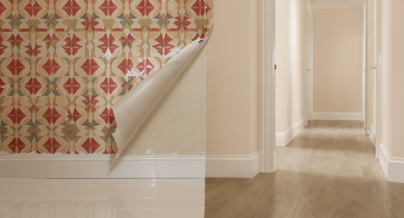
Design trends shift from noisy patterns to warm, quiet materials that feel welcoming and enduring.
If I had to bet on what will feel dated soon, it’s the package-y looks that were everywhere on listings and Instagram: gray LVP, sliding barn doors, black grid windows on stark-white exteriors, slat/fluted everything, big veiny marble-look quartz, open kitchen shelving instead of uppers, color-drenched rooms with matching trim, and nubby boucle furniture. They’re not “bad,” they’re just oversaturated, high-maintenance, or hostile to acoustics/lighting—and that combo ages fast.
What’s already being phased out in real projects
From project galleries, trade shows, and designer chatter, these are getting value-engineered out or replaced on refreshes: - Gray vinyl plank floors: Durable, yes, but the cold gray reads flat and tired; homeowners are shifting to warmer mid-tones or real wood where budgets allow. - Sliding barn doors (especially on baths): Privacy, sound, and smell leaks. Being swapped for pocket/hinged doors. - Vertical slat and heavy fluting panels: Great accent the first time; dust traps and visually busy when overused. - Big, bold marble-look quartz veining and waterfall everything: Too loud, too obviously printed at budget tiers. Clients are asking for quieter stones and restrained edges. - Open shelving replacing upper cabinets: Real-life grease/dust fatigue; a few styled shelves are fine, but storage is back. - Color drenching whole rooms including trim: Stunning in editorial, oppressive in low light or small spaces; many are dialing it back with contrast. - Black-on-white “modern farmhouse” exteriors and black faucets everywhere: Still around, but the high-contrast formula is on the downslope unless it truly fits the architecture. - Nubby, loose-weave boucle: Pills and flattens in busy homes; tighter weaves or textured wovens are taking its place. - Glare-heavy wafer cans and exposed “Edison” bulbs: People want softer, dimmable, layered light and better glare control.
Anecdote
A recurring pattern: homeowners who installed large-vein marble-look waterfalls in 2020 are now asking designers for quieter, honed stone and a more furniture-like island. The material wasn’t unusable—just too loud for daily life.
What’s replacing it
Common replacements I’m seeing succeed with clients and in new specs: - Warmer, natural materials: Mid-tone oaks, walnut, clay and lime plasters, unlacquered brass/bronze used sparingly. - Defined-but-connected floor plans: Cased openings, glass or pocket doors—sight lines without shared noise and smell. - Layered lighting: Fewer wafers, more dimmers, sconces, pendants, and lamps; 2700–3000K, shielded sources, better CRI. - Subtler stone: Honed quartzite, soapstone, travertine, marble with smaller, natural veining; eased edges over full waterfalls. - Smarter storage: Pantries, appliance garages, a mix of uppers with some glass; fewer dust-collecting shelves. - Real wood tones in kitchens: Painted islands or accents remain, but full-wood or mixed-species cabinetry is trending up. - Softer palettes: Complex beiges, putty, ochre, desaturated blues/greens—color with nuance instead of stark contrast. - Texture with restraint: Beadboard, paneling, or a single fluted element used where it makes architectural sense.
How to use trends without dating your home
- Keep trendy moves to easy-to-swap layers: paint, hardware, rugs, lamps, pillows. - Let architecture lead: A Tudor wants different choices than a mid-century ranch. - Test for function: cleanability, acoustics, and light glare matter more day-to-day than a photo. - Choose quality over quantity: fewer, better finishes age slower than many budget lookalikes. - Avoid “theme packs”: If a room could be summed up as one hashtag, it will date faster.
Quick calls that tend to age well
- Classic profiles and proportions (Shaker, inset, simple crown, proper rug sizes). - Natural materials with honest patina (stone, wood, leather) and quiet patterns. - Mixed metals in small doses rather than one “it” finish everywhere. - Balanced contrast: light+dark, matte+sheen, soft+hard—rooms feel layered, not flat. - Good lighting design: dimmers, multiple sources, warm temps, and minimal glare.
Visualization Scenario
Picture the same kitchen two ways: 1) gray LVP, black faucet, open shelves, big veiny waterfall. 2) mid-tone oak floor, chrome bridge faucet, a pair of glass-front uppers, honed quartzite with subtle movement, and a paneled dishwasher. The second will photograph less dramatically, but it will feel calmer, function better, and date slower.
FAQ
Q: Is [insert trend] “bad” if I truly love it? A: No. Design that suits your life is never wrong. If it’s a high-commitment item (flooring, windows, tile), consider a subtler or higher-quality version, and balance it with timeless elements. Q: What single change fights dated vibes fastest? A: Fix the lighting. Add dimmers, swap glare-y wafers for layered sources, and warm up color temperature. It instantly modernizes most spaces.
Bottom line
Trends don’t have to be the enemy—overapplication and poor function are. If you love something, use it, just keep the permanent bones classic and let the fashion live in the layers.
