
TL;DR
Choose a restrained palette, layer texture over color, and anchor the room with one or two strong, dark elements. Curate fewer, better pieces, use lighting as decor, and create one clear focal point. Add softness through mouldings, fluted panels, or textiles, and reserve bolder color for a single statement so the space stays serene but not sterile.
Introduction
Creative minimalism: smart composition and negative space make subtle design statements.
Minimalism has a reputation problem. People hear less and imagine cold. Yet the most successful minimalist living rooms feel like a deep breath - edited, yes, but also gracious and inviting.
One designer I spoke with crafted a 1,050-square-foot family home in Brooklyn, around hushed color and classic detail: think soft peaches and cloud grays, English-style mouldings on ceilings, and quiet fluting on the walls. The living room leaned monochrome with a black-trimmed sofa and a single dark coffee table to ground the lightness. It proved what I see again and again - restraint can be romantic when you build it from texture, proportion, and light.
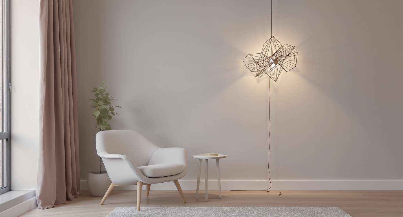
Another favorite example: a small city space where the homeowner zigzagged a pendant cord up the wall so it doubled as art. No extra objects. Just smart composition and negative space doing the heavy lifting.
Core Strategy and Direct Answer
Here is the direct path to a minimalist living room that reads calm, layered, and lived-in.
- Start with a whisper palette. Build from warm whites, beiges, oat, and soft grays. Add one grounding note - matte black or espresso wood - for clarity. In family homes, keep bolder hues contained to one zone or piece so the serenity holds.
- Trade color for texture. Use fluted wall panels, gentle mouldings painted in the same tone as the wall, nubby bouclé, washed linen, and open-pore woods. Texture is how monochrome avoids monotony.
- Create one clear focal point. An antique mantel with an oversized mirror. A low, sculptural coffee table. A large-scale artwork. Let it set the tone so everything else can step back.
- Keep furniture low and edited. Low-slung seating instantly extends perceived ceiling height. Choose a modular sofa, one accent chair, and nesting or slim tables. Every piece must earn its keep.
- Layer lighting like decor. A floor lamp for glow, a dimmable pendant for task, and a slim sconce or two for height. Let cords trace the wall intentionally if they add graphic rhythm.
- Hide what breaks the spell. Closed storage for toys and tech, a lidded basket for throws, a slim media console with cable management. Minimalism thrives on frictionless daily life.
- Curate, then stop. One tactile rug, three pillows, a stack of books, a single vessel. Edit until the room breathes.
A city couple recently showed me how potent this is. They kept their living room mostly tone-on-tone, then chose one special artwork above the sofa and a pair of display niches by the dining table. The pieces held personal meaning, which is why the space felt warm, not staged.
Anecdote
In one family home, the kids' room was the single dose of whimsy: butter-yellow cabinetry, soft arches, and layered bedding. The living room stayed serene, and the playfulness lived where it belonged - behind sliding doors that tidy up in seconds.
In my own place, replacing a thick rug with a flatwoven wool changed everything. The room read cleaner, the sofa felt lighter, and the floor asked to be noticed. Sometimes the fastest route to less is simply thinning what sits between you and the architecture.
Common Mistakes and Misconceptions
- All white with no texture. It looks unfinished instead of intentional. Fix it with layered textiles, subtle wall detailing, and mixed natural materials.
- No focal point. A room of equally quiet pieces can blur together. Choose one star - an overscale mirror, statement chair, or fireplace treatment - and let the rest support it.
- Ignoring scale. Bulky coffee tables and too-tall seating shrink small rooms. Go low and light visually: slender legs, floating forms, nesting tables.
- Under-lighting. One overhead fixture flattens everything. Add floor and table lamps, dimmers, and warm bulbs around 2700K to 3000K.
- Pattern overload. Minimalist does not mean pattern-free, but prints should live on easily swappable items like pillows or a rug - not the main upholstery.
Pro Tips / Expert Insights
- Monochrome, but nuanced. Paint mouldings the same color as walls in a slightly different sheen for quiet depth. Satin walls with matte trim reads rich without shouting.
- Two-tone walls. Color-block within the neutral family to warm a white room. For example, warm white above, putty below, separated by a slim chair rail.
- One bold accent. Choose a single vibrant piece - a red ribbon chair, cobalt vessel, or butter-yellow ottoman - to spike the palette and keep the rest restrained.
- Mix wood thoughtfully. Pair one dominant wood tone with a secondary note one shade lighter or darker. Vary sheen, not just color, for sophistication.
- Light as sculpture. Treat cords and fixtures compositionally. A cable that traces a zigzag up the wall can read like line art when planned.
- Elevate with heritage detail. A Georgian-style doorway, a fluted panel, or delicate beading instantly adds softness to modern lines.
A client with a narrow living room once swapped a bulky glass coffee table for a thin travertine slab on low glides. The sightline opened, the room felt twice as airy, and conversations flowed more easily. Small edit, big payoff.
Tools, Inspiration, or Recommended Resources
- Room planning: Try simple floor-plan apps to test low-slung seating and traffic flow before you buy.
- Lighting control: Add plug-in dimmers and smart bulbs so you can layer levels without rewiring.
- Swatch smarter: Paint large samples on poster boards in your actual light. Check morning, noon, and night.
- Declutter helpers: Slim credenzas with cable management, lidded baskets, and ottomans with hidden storage keep surfaces clean.
- Concept testing: Use ReimagineHome to visualize tone-on-tone schemes, moulding profiles, or that one bold accent chair before committing.
Visualization Scenario
Open the door to a soft, cloud-gray room. Fluted panels catch the light in shallow shadows. A low, black-edged sofa faces a simple hearth, topped with an oversized mirror that doubles the glow. The pendant cable draws a gentle line up the wall, like a sketch. A single deep-green vessel on the coffee table hums against the neutrals. Everything has a job. Nothing shouts. You sit, and the space gets quieter still.
FAQ
- How do I make a minimalist living room kid-friendly?
Choose performance fabrics, rounded corners, and closed storage. Keep the palette light but forgiving - warm whites, taupes, and mid-tone woods. - What colors feel minimalist but warm?
Soft white, ivory, putty, mushroom, oatmeal, and pale gray. Anchor with black or dark wood for definition. - How much art is too much?
One large piece or a tight grid of smaller works is usually enough. Keep frames consistent and let negative space do its job. - Can I mix metals and woods?
Yes - pick one dominant metal and wood, then add a secondary tone in a smaller dose. Vary sheen to avoid matchy-matchy. - What if my living room is tiny?
Go low with seating, choose a settee over a sectional, use nesting or pedestal tables, and mount lighting to free up floor space.
Conclusion
Minimalism is not about owning less. It is about prioritizing what earns attention. When you start with a soft palette, add texture, choose one focal point, and edit confidently, the living room turns quiet in the best way - like a pause between notes. I have seen it in compact city apartments and sprawling homes alike. The beauty is in what you leave out, and the grace is in what remains.