Evaluating Gallery Wall Layouts: What Works, What Feels Off, and Why
TL;DR
Gallery wall arrangements succeed when there’s a balance of shape, cohesion, and personality. To achieve a space that feels intentional and collected, vary frame shapes and sizes, carefully consider spacing, and repeat visual cues. Consistent alignment helps—yet a few idiosyncratic touches offer character. The right gallery wall can anchor your main social space, making it feel curated and alive.
Why Gallery Walls Have Enduring Appeal
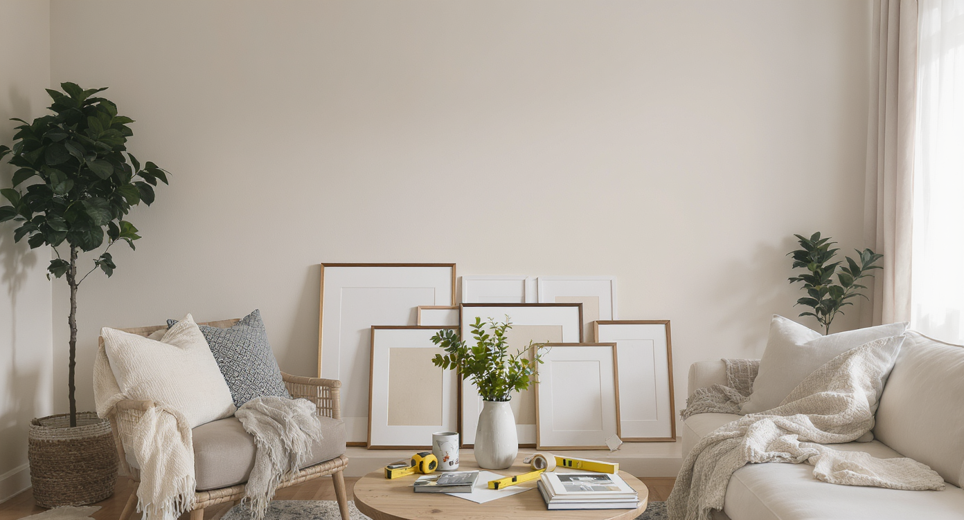
Living room setup with art pieces, templates, and tools staged beneath a blank wall, illustrating the start of a gallery wall project.
Gallery walls fascinate for a reason—they tell a visual story, reflect a homeowner’s taste, and can transform a blank room into a lived-in, expressive retreat. Yet when it’s time to arrange those first frames, many find themselves paralyzed by decisions about alignment, scale, and balance. A thoughtfully arranged gallery wall not only personalizes a space but becomes the focal point of a main social area, inviting both conversation and comfort. Gallery wall styling feels both approachable and daunting. The choices are endless, but so are the small mistakes that can make a layout feel accidental rather than artful. Homeowners often find themselves seeking validation or advice on how to move from a rough draft to a truly satisfying arrangement.
-
The Foundation: Balance, Variety, and Visual Flow
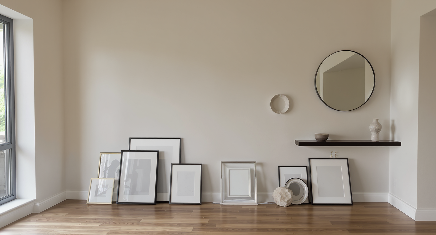
A mix of frames, mirrors, and sculptural pieces arranged on the floor illustrates the process of balancing variety and visual flow before mounting a gallery wall.
A successful gallery wall begins with three crucial elements: balance, variety, and an intuitive visual flow. Designers often suggest laying out frames on the floor before committing to hooks, allowing you to play with placement until the arrangement feels right. Frame shapes play a particular role in a composition’s success. Too many rectangles of similar scale can cause the eyes to scan right past the display, making it feel static. Introducing round or unexpected shapes—mirrors, plates, or even sculptural elements—adds rhythm and ensures the gallery wall catches and holds visual attention. Spacing is equally important. Consistent gaps of one and a half to three inches between pieces create cohesion, but a subtle shift in alignment or the inclusion of a shelf or sconce can break up the repetition just enough to keep the wall feeling dynamic. As detailed in truth in decorating with collected art, authenticity and a touch of unpredictability often trump rigid adherence to symmetry.
Expert Insight
A young couple, eager to warm up their newly renovated Victorian living room, spent a rainy afternoon spreading thrifted frames across their dining table. They arranged and rearranged, trying to strike the perfect mix between their favorite botanical prints and inherited art. In the end, it was the addition of a small woven basket—picked up during a weekend market stroll—that finally anchored the grouping and made the space feel uniquely theirs.
-
Creating a Sense of Cohesion Without Uniformity
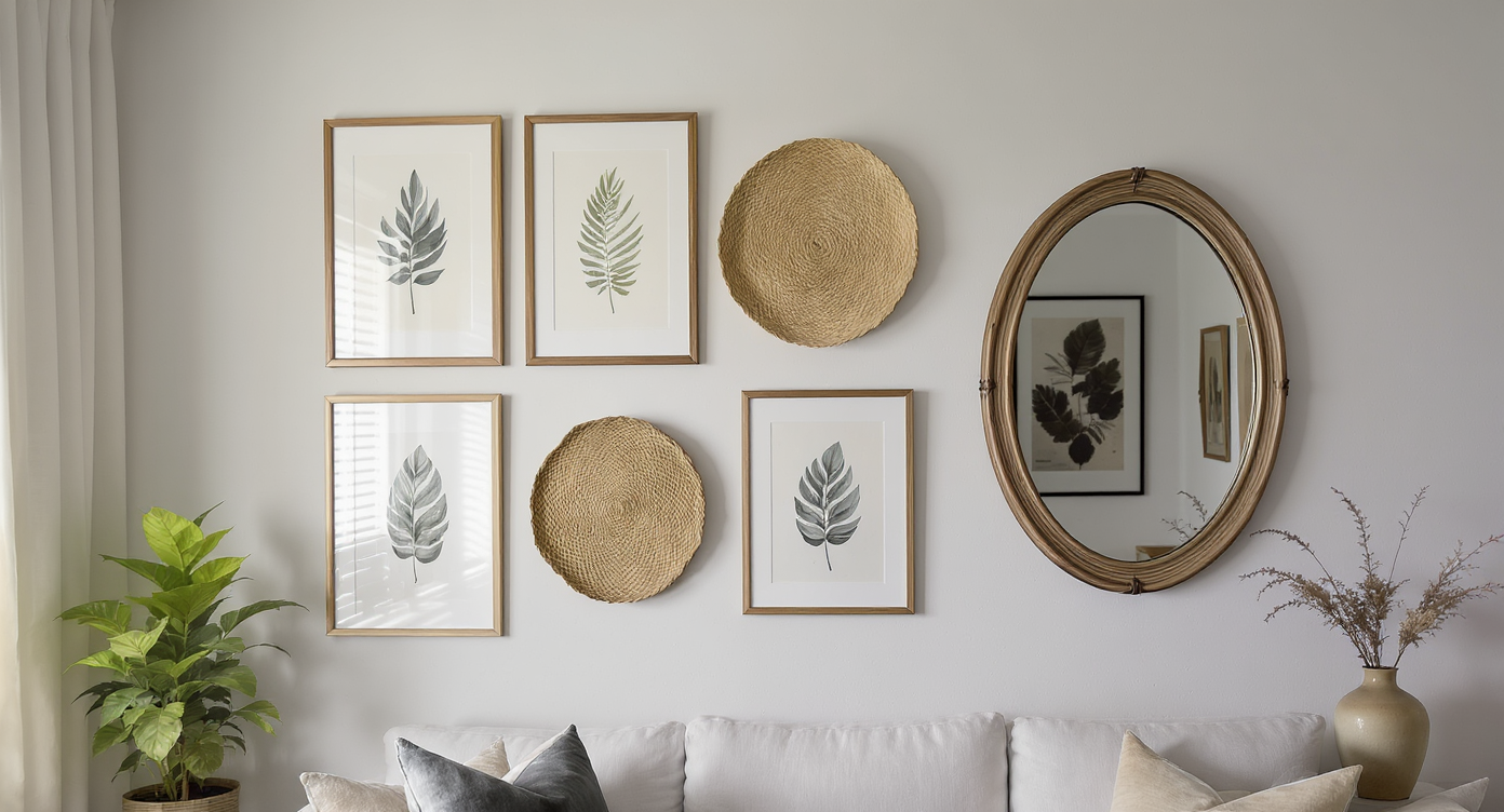
A gallery wall gains cohesion through repeating colors, motifs, and textures while showcasing varied art, objects, and iterative selection.
A gallery wall is most engaging when it strikes the right note between cohesion and individuality. This doesn’t mean all frames, colors, or images need to match. Instead, look for ways to repeat visual motifs, textures, or hues throughout the arrangement. For example, pairing a botanical print with a round woven basket and echoing that natural palette in other accessories can unify the wall and the larger room. Homeowners often experiment with placeholders—blank frames or test prints—before committing to their final selections. This iterative process can help clarify what the arrangement is missing. Many find that introducing an additional circular element, or varying the scale with an oval mirror or vintage plate, helps unify and enliven the display. According to finishing touches for living room decor, a balance of texture, shape, and color is often what transforms a plain gallery wall into something harmonious and memorable.
-
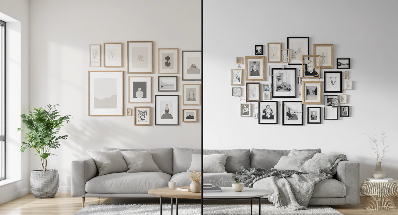
Real Life Scenarios: Small Tweaks With Big Impact
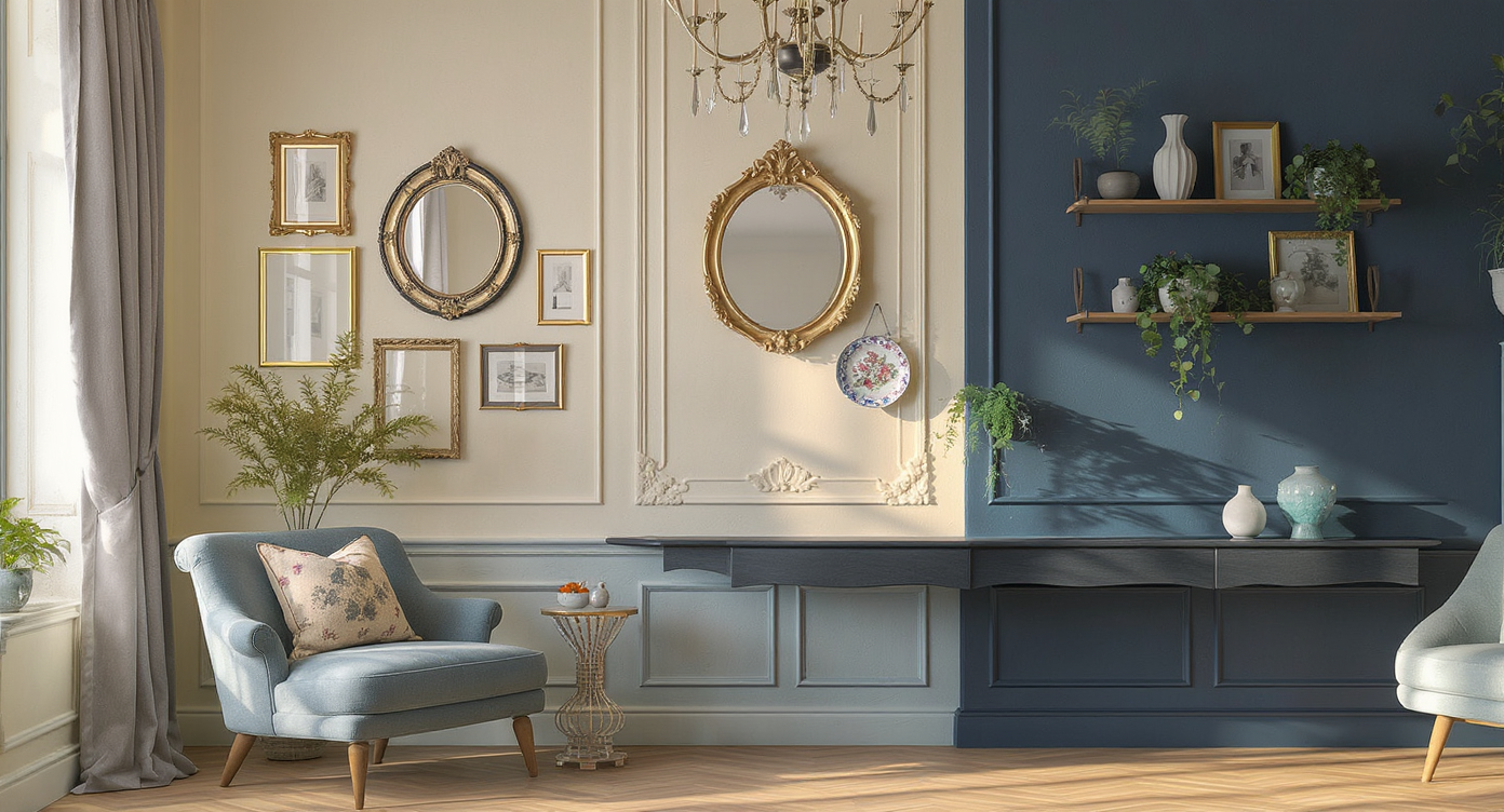
Gallery wall layouts: Victorian room with a balanced mix of rectangular frames and round accents, and a modern loft with added shelf detail.
Consider a Victorian living room with creamy walls and traditional woodwork. The first layout includes several medium-sized rectangular frames and a single round mirror. The mirror, solitary among its angular companions, ends up feeling lonely. When a second curved shape enters the mix—a vintage plate, perhaps, or an oval frame—the display immediately feels more balanced. In another scenario, a modern loft dweller hangs a series of black frames against a deep blue wall. The uniform frame style feels flat until they introduce a small floating shelf, topped with a trailing plant and a tactile ceramic piece. Suddenly, the strict linear arrangement opens up, gaining interest and depth. Sometimes, simply lowering a frame or shifting a grouping by a few inches can correct a feeling of visual "tilt" or dead space. Even in spaces with placeholder art, making small adjustments in position or shape can reveal what the overall layout truly needs. These tweaks, as what’s missing in your living room decor suggests, require minimal investment but can have an outsized effect on cohesion and warmth.
Visualization Scenario
Imagine walking into a living room where a gallery wall stretches across a sunlit expanse. Each piece—a watercolor of wildflowers, a circular antique mirror, a soft-edged woven tray—catches the eye in sequence. The mix embraces variety without feeling chaotic, and small notes of greenery echo in the art and on a nearby shelf. As guests gather in the room, the wall starts conversations, sparks recollections, and subtly sets the mood for everything else in the home.
FAQ: Gallery Wall Layouts and Decorating Decisions
Begin by collecting your favorite art and objects, then lay them out on the floor in potential arrangements. Experiment with combinations of frame shapes, colors, and sizes before making any permanent marks on your walls.
What is the ideal height for hanging gallery walls?
Most designers recommend centering the arrangement at eye level, which is typically 57 to 60 inches from the floor to the midpoint of the grouping. Adjust for furniture below, keeping the base of the arrangement about 6 to 12 inches above sofas or consoles.
Should all the frames in a gallery wall match?
No. In fact, using a variety of frame finishes and styles can make the display feel richer and more authentic. Aim for a few unifying elements—like color, theme, or shape—rather than perfect uniformity.
How do I fix a gallery wall that feels 'off'?
First, take a step back and assess what stands out: Is there a shape that looks isolated? Are the gaps uneven? Try adding a complementary shape, adjusting the spacing, or introducing a new color or texture to bring the wall into balance.
Where can I find inspiration and tools for visualizing layouts?
Online platforms like ReimagineHome.ai provide a range of visualization and design planning tools for gallery walls and more.
A Gallery Wall That Feels Like Home
Crafting a gallery wall that works is less about rules than about what feels intentional, collected, and visually satisfying in your main social space. Start by laying out your collection on the floor, exploring a mix of shapes and sizes, and resisting the urge to match everything perfectly. Embrace a handful of repeated motifs—such as a round frame, a shared color, or a particular style of matting—to draw the grouping together. Above all, treat the process as an evolving expression of your tastes and stories. For more inspiration, ReimagineHome.ai offers tools and resources for visualizing and refining gallery walls in any context.