9 Insights for Creating a Homey, Welcoming Color Palette That Flows
TL;DR
A flowing home color palette uses carefully chosen hues to create warmth, unity, and comfort from room to room. This list explores proven strategies for palette choices, mood-based design, and real-world application so your home feels both intentional and inviting.
Why a Flowing Color Palette Matters
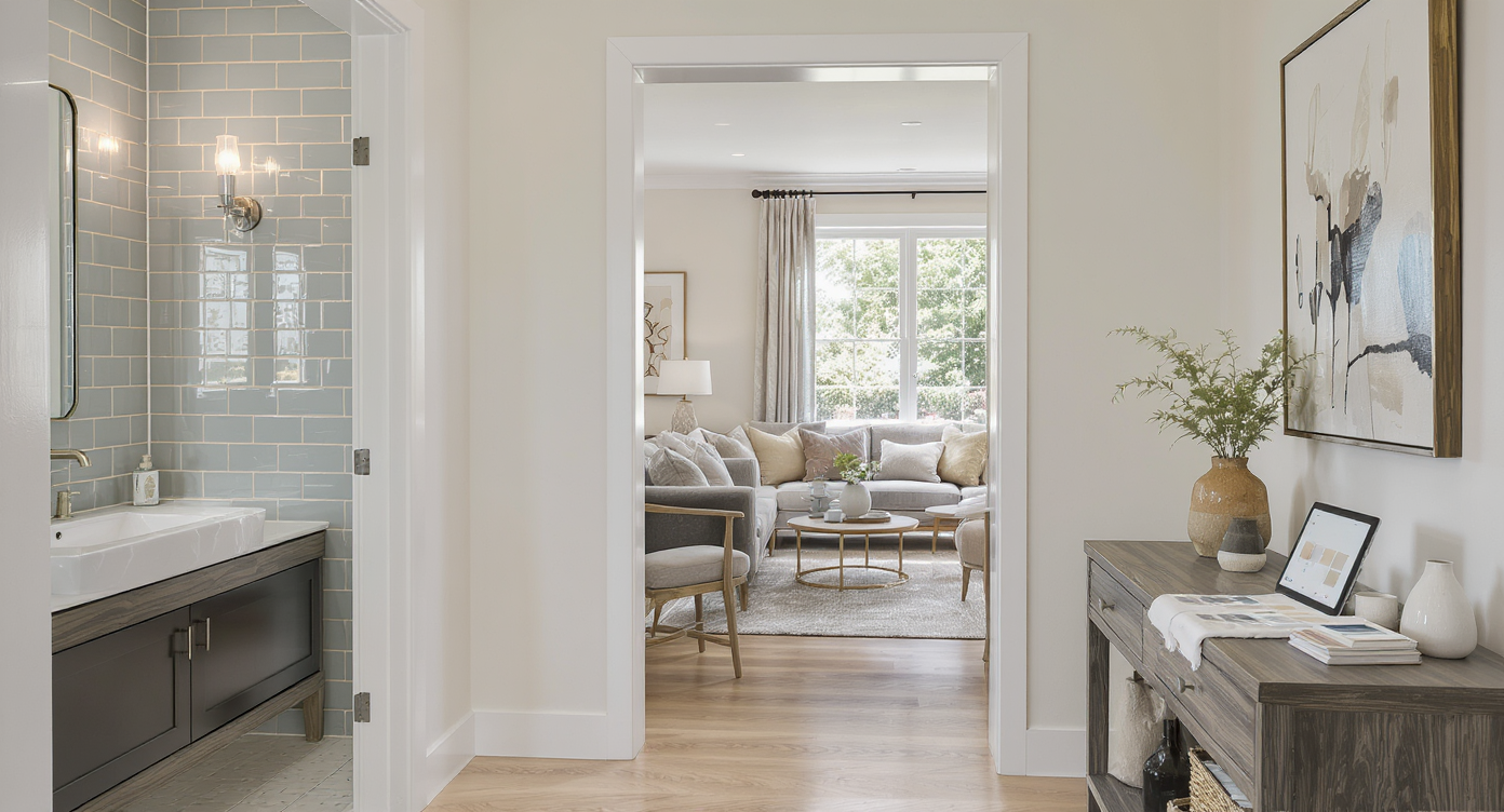
A seamless transition between a newly remodeled bathroom and cozy living space, color samples hinting at a carefully planned, welcoming palette.
Choosing the right color palette for a home renovation can feel daunting, especially when you want the finished result to feel harmonious and welcoming. Homeowners often seek a collection of colors that connects spaces without making them feel monotonous or overwhelming. The desire to move seamlessly from a renovated bathroom to the rest of the house is shared by anyone hoping for visual continuity and comfort. Designing a home palette is not just about picking pretty colors. It involves thoughtful color coordination, understanding how mood influences design, and knowing what will still feel fresh years from now. The following insights combine industry guidance with practical tips to help you craft a palette that truly feels like home.
-
1. Start With a Base Color You Love
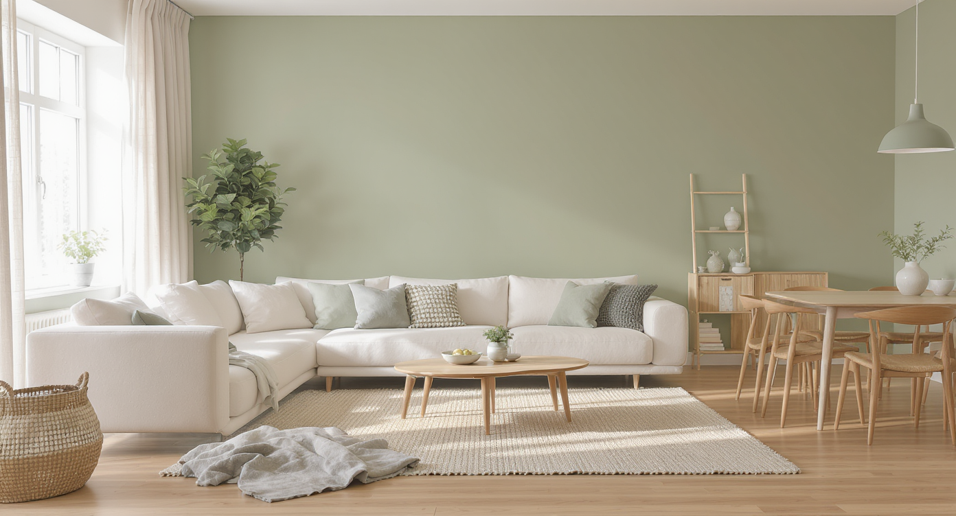
A unified living and dining space anchored by a soft olive green wall color, demonstrating how a beloved base color sets a harmonious tone throughout.
Interior experts frequently suggest beginning with a single foundational color you enjoy most. This base often sets the tone for the palette, anchoring both public and private spaces in a consistent mood. Warm whites, gentle beiges, or soft sages work well as versatile starting points. For example, a muted olive or creamy taupe can create a sense of calm while offering ample flexibility for layering other hues, as seen in recent color of the year selections. Anchoring your palette allows other choices to radiate naturally rather than clash or overwhelm.
-
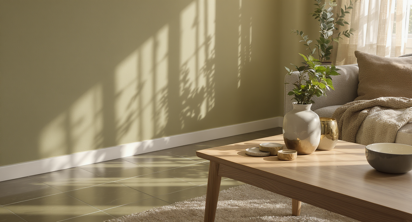
2. Layer in Earthy and Calming Neutrals
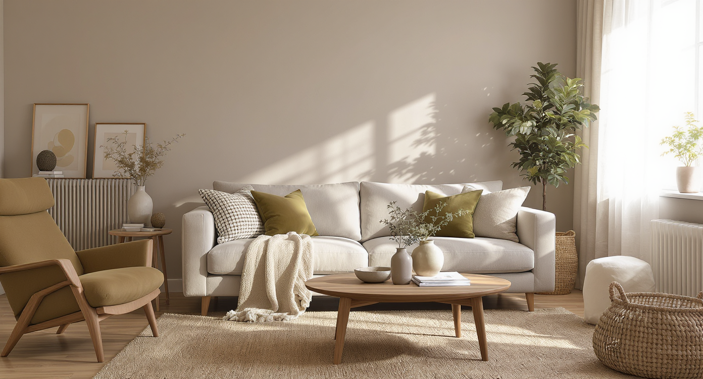
Earthy neutrals like warm khaki, gentle grey, and natural wood tones create a grounded, calming living space with timeless comfort.
Many rooms benefit from neutrals like warm khakis, gentle greys, and earthy browns, which contribute to a cozy atmosphere and provide a comforting backdrop. Choosing neutrals that echo natural materials makes a space feel grounded. According to our guide on the best paint colors to use at home now, blending deep greens with sunbaked neutrals results in interiors that are both current and timeless.
-
3. Use Color Coordination to Promote Flow
Color coordination is critical for making rooms flow together visually. Designers often advise carrying a hero color—such as a particular green or blue—through multiple spaces, then varying its intensity or pairing it with compatible shades in different rooms. For example, paint the bathroom in a serene eucalyptus then use accents of the same tone in textiles and accessories throughout living and sleeping areas. This technique ties the home together while still allowing each space its unique character.
-
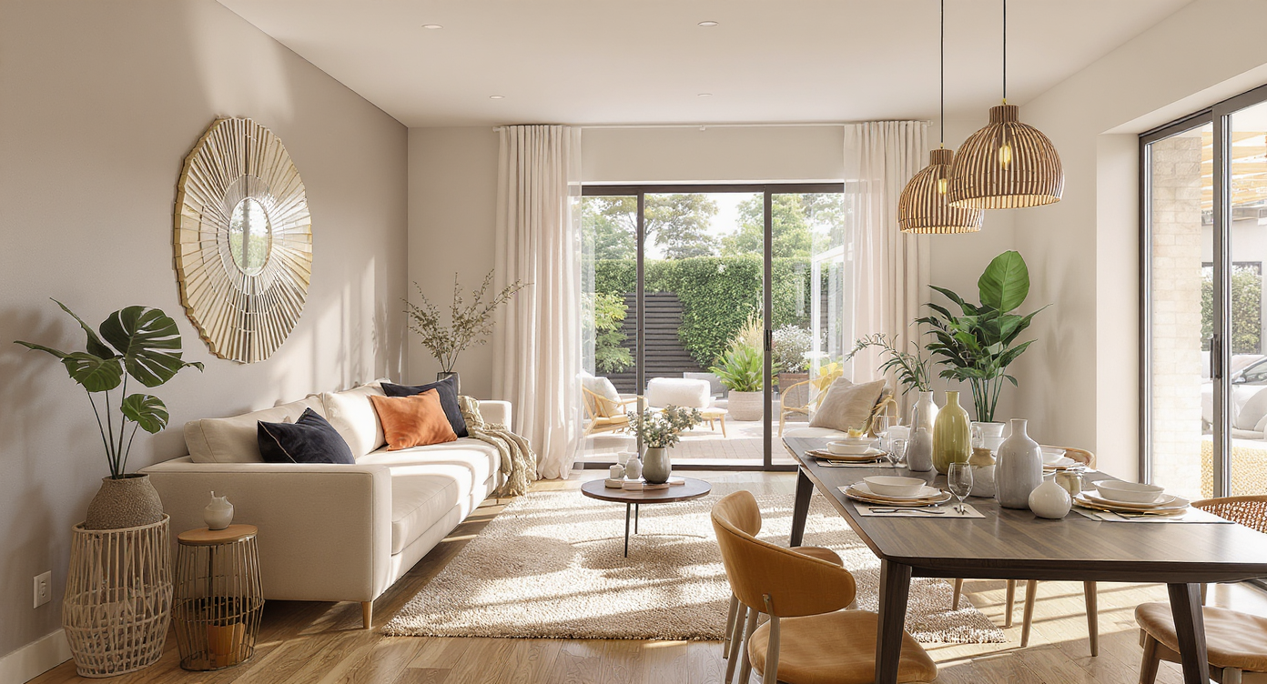
4. Choose Accent Colors for Contrast and Personality
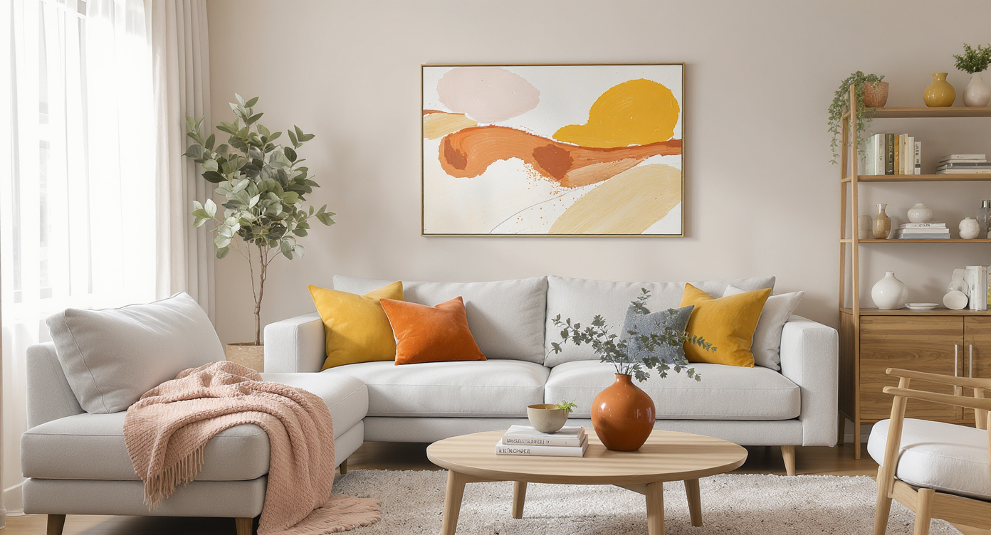
Living room with a beige and gray base palette, thoughtfully enlivened by mustard, blush, and burnt umber accents in decor and textiles.
While foundation colors bring cohesion, accent colors offer moments of surprise and personality. Accent choices might include mustard yellow, soft blush, or even a burnt umber. The goal is to sprinkle these hues in strategic places—throw pillows, art, or even small furnishings—so the palette remains lively. If the main palette feels too muted, adding a mustard or terracotta pop, as some designers suggest, livens things up without disrupting the underlying harmony.
-
5. Adapt Mood-Based Design Strategies
Mood-based design takes into account how you want each room to feel. For example, bedrooms may lean into tranquil shades like sage or powder blue, while entryways welcome warmth with buttery neutrals. As explored in recent interior design trends, tailoring colors to a room’s intended mood creates spaces that are comforting and genuinely personal. Professionals recommend envisioning the feeling you want—whether it's restful, energizing, or inviting—and coordinating the palette accordingly. This personalized approach helps a home remain both cohesive and emotionally appealing.
-
6. Edit Down to a Manageable Palette
Having too many colors can make a home feel visually chaotic. For a flowing look, most designers recommend limiting your palette to one main color with two or three secondary shades and accent hues. This approach provides enough variety for interest without risking clashing or fragmentation. If struggling to narrow options, sample several combinations in small areas and observe them in different lighting conditions, as outlined in our five-step color system guide.
-
7. Refresh with Materials, Textures, and Light
A sunlit living space highlights how olive matte walls, glossy tiles, plush textiles, wood, stone, and metals create depth and subtle palette shifts.
A single palette can be experienced very differently depending on material and light. For example, pairing matte olive walls with glossy tiles or plush woven textiles increases depth, while the play of sunlight across different surfaces emphasizes subtle shifts in color. Leveraging a blend of wood, stone, ceramics, and metals can bring underlying palette choices to life. Testing design decisions digitally through platforms such as REimagineHome.ai helps preview these subtleties before making final calls.
-
8. Consider Evolving Trends but Prioritize Longevity
While it is tempting to chase trending colors, choose shades with staying power for most of your palette. Earthy and nature-inspired colors, as seen in this fall’s defining interior design trends, have proven their ability to transcend fleeting fads. Even as deeper blues and complex greens enter the scene, neutrals and warm undertones give homes a welcoming, never-dated feel. Balancing one or two on-trend accents with timeless bases allows for easy refreshes without a total overhaul.
-
9. Test Before Committing to Full Coverage
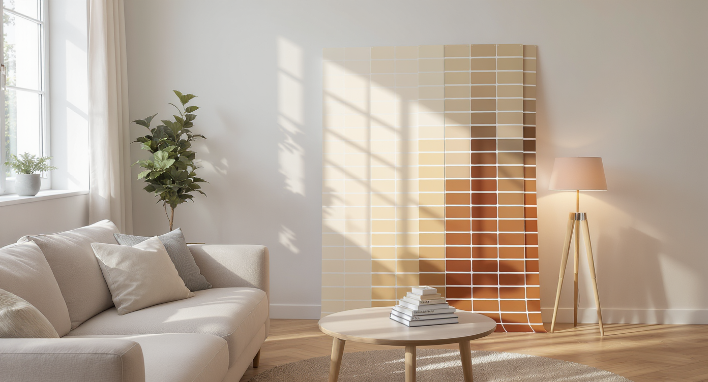
Testing large color sample boards in key spots under changing light reveals undertones and ensures the palette feels and transitions as intended.
Before rolling out color choices across the entire home, sample combinations in key spots. Testing large swatches in both natural and artificial light reveals undertones and ensures the chosen palette feels as intended. This methodical approach reduces the risk of color regret and supports smoother transitions from room to room. According to tips from 2025 interior design trends, even experienced renovators test their ideas in context before final decisions, and using visual tools helps confirm that the palette works as a unified whole.
FAQ: Home Color Palettes That Flow
Choose a color that reflects your personal taste and complements your home’s natural light. Warm neutrals and muted greens are consistently adaptable.
How many colors should be in a whole-house palette?
Most designers recommend one main color, two or three secondary shades, and one or two accents for flexibility without clutter.
How do I know if colors will clash?
Test combinations in small areas and view them in various lighting conditions. Digital platforms such as REimagineHome.ai can preview palettes for flow.
What if a color feels trendy now, but I’m worried it will date?
Balance for longevity by keeping base colors classic and experimenting with trend-driven accent hues that are easy to update.
Should every room use the exact same shades?
Not necessarily. Allow variation in intensity, material, and use of accent colors for interest while still staying true to your overall palette.
Key Takeaways for a Unified Home Color Palette
A successful color palette is much more than matching paint—it’s about connecting spaces and creating a sensory experience that feels both intentional and deeply personal. Start with a base you love, layer in nuanced tones, prioritize mood-based design, and always sample before committing. Tools such as REimagineHome.ai offer valuable previews to ensure colors flow beautifully from one room to the next.