Why Testing Your Coffee Shop Layout Is Essential Before Opening

TL;DR
Effective coffee shop layouts hinge on circulation planning, not just aesthetics. Testing your arrangement—through mockups, simulations, or trial walkthroughs—helps prevent costly bottlenecks and enhances flow for both customers and staff. The smartest spaces blend proven industry standards with real-world tweaks, making comfort and efficiency the true hallmarks of good design.
Rethinking Coffee Shop Design: Beyond Beans and Branding
A photorealistic coffee shop interior reveals tight pathways and awkward furniture placement, underscoring the importance of thoughtful circulation planning.
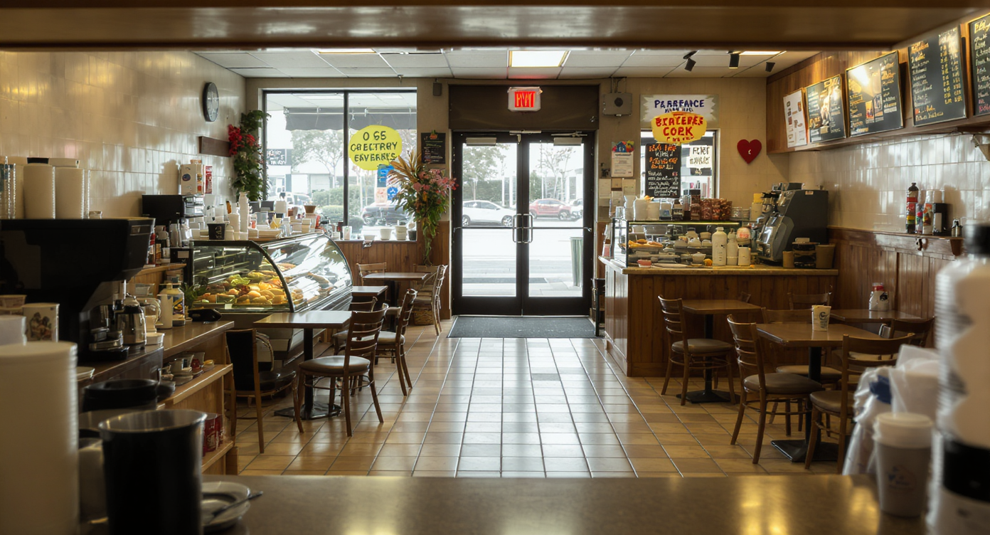
Before a coffee shop opens its doors, most owners obsess over the beans, the branding, and the staff. Yet, design insiders know that the real operational challenge lies in how people move, wait, and interact within the space. When circulation planning is overlooked, even the best service and product can be undermined by confusion at the door, winding queues, and customers blocking essential pathways. The difference between a bustling café and a stressed-out space rarely comes down to square footage—it’s a matter of how thoughtfully movement, furniture, and flow have been choreographed.
-
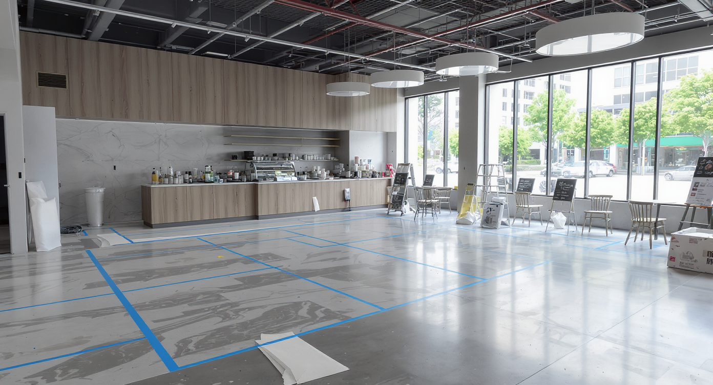
From Blueprint to Reality: The Power of Circulation Planning

Overhead perspective of a coffee shop layout mockup with painter’s tape marking zones and furniture, showcasing real-world circulation planning.
Furniture and flow are more than afterthoughts—they form the backbone of customer experience in coffee shops, offices, and retail spaces alike. Among seasoned designers, the arrangement and accessibility of service points such as ordering counters, pickup shelves, and seating zones often determine how welcoming or chaotic a place feels. Many small business owners, eager to unlock their doors fast, learn this lesson the hard way. Walk into an unfamiliar café where the pastry display sits awkwardly behind the register, or where lines double back to block the entrance, and the atmosphere instantly feels uncomfortable. Such issues can seem trivial until you witness customers making U-turns, forming accidental bottlenecks, and leaving before ordering. Testing the proposed layout—via a painter’s tape mockup on the floor, digital tools, or inviting friends to simulate peak times—often reveals traffic jams and inefficiencies invisible on paper.
Expert Insight
Not long ago, a first-time café owner shared a behind-the-scenes look at their night before opening. Armed with painter’s tape and spare chairs, friends played the roles of morning regulars, testing where lines would form and where frustration would mount. Within a few rounds, they realized their original pickup shelf placement created a logjam near the door. Only after these simple tests did they uncover the solution—a minor tweak that made all the difference in daily flow.
-
Learning from Experience: Tactics Designers and Owners Swear By

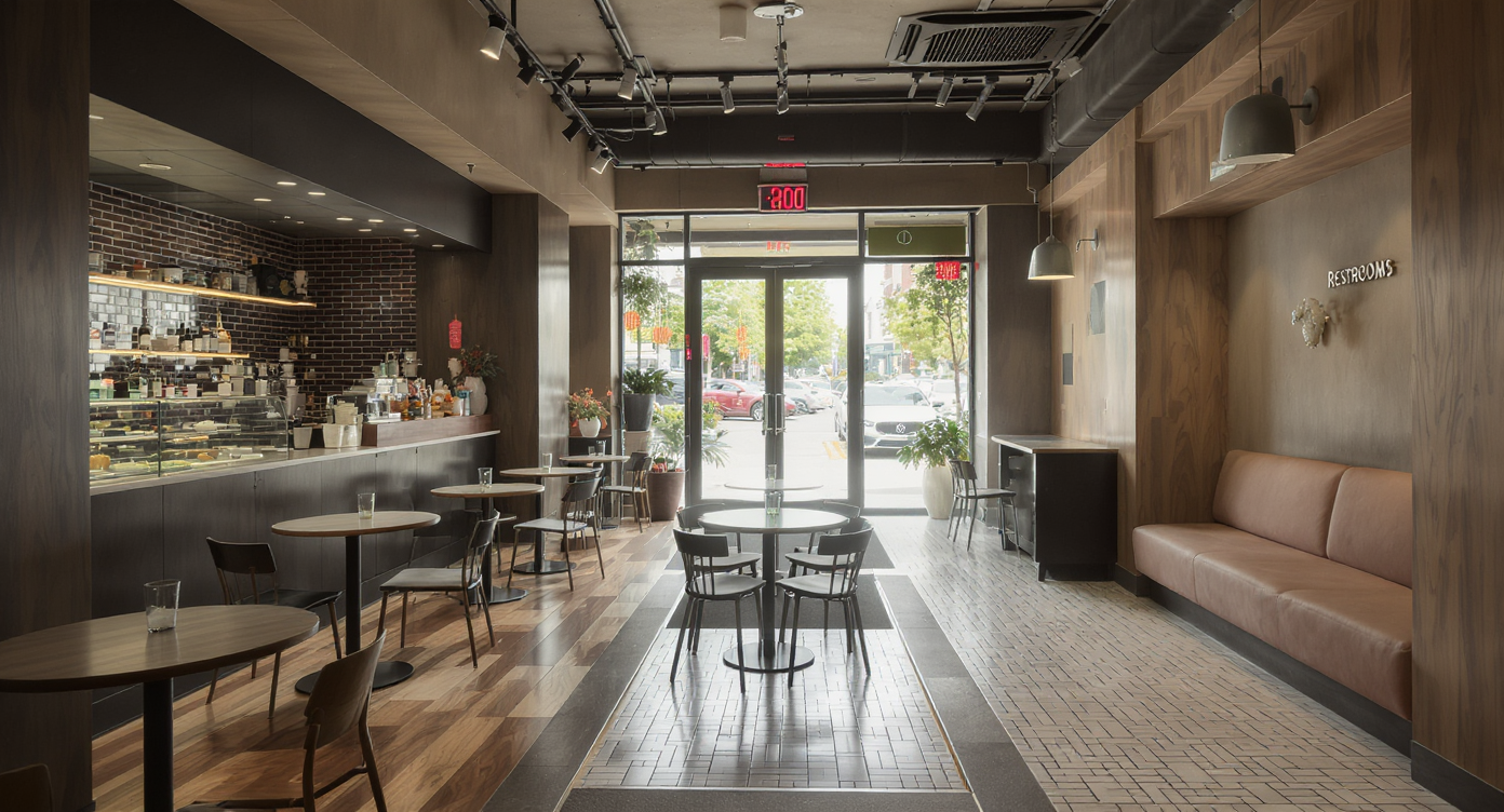
A photorealistic coffee shop layout showing strategic pastry case placement, clear walkways, and distinct customer zones to optimize flow.
It’s tempting to assume that hiring an interior designer or architect is a luxury rather than a necessity, especially in the DIY spirit. Yet, professionals routinely emphasize elements like clear signage, strategic traffic control, and zoning for different customer activities. Classic circulation planning strategies—borrowed from the playbooks of large chains—are surprisingly effective. For example, positioning the pastry case before the point of sale creates a natural preview experience for people waiting to order, building anticipation and cutting indecision at the register. Designers often suggest maintaining 36 inches of clear walkway between movable furniture, shielding entry and pickup points from cross-traffic, and scrutinizing every fixture for its impact on flow. The smallest tweaks—swapping the location of a self-serve station, moving a waiting area a few steps further from the door—can turn chaos into calm. These strategies echo advice from residential layouts, where the balance of sofa size and room proportion radically affects how spaces work, as explained in the sofa size vs. living room layout guide.
-
Simulation and Soft Openings: Modern Solutions for Real-World Flow
Coffee shop test layout with taped walkways and mock furniture, capturing real-world flow simulation before opening day.
As practical as blueprints and sketches are, they rarely predict how actual people will move through real-world environments. Today, many designers and owners turn to digital simulations, mock builds, and soft openings as iterative testing grounds. Digital planning platforms, crowd movement software, and even video games have evolved as surprisingly powerful tools for visualizing and refining layouts. In-person methods, like using painter’s tape and stand-in patrons, provide immediate feedback—does the queue obstruct the entrance, or do customers veer off course toward the pickup shelf? Even a fast food chain’s practice of marking kitchen and customer zones on a tennis court with chalk, long before construction begins, demonstrates the value of low-tech rehearsal. After a live trial, subtle shifts—in sign placement, display orientation, or order and pickup stations—can dramatically improve usability. This mirrors what happens in home design when a virtual layout run-through reveals the need for wider walking zones or relocated seating, as explored in the insights on matching furniture to room flow.
-
Anecdote: The Tape Test that Changed a Shop’s Fate
On a rainy evening, a new café owner stayed late, marking imaginary paths with painter’s tape and dragging mismatched chairs into place. With a couple of friends, they acted out the 8 AM rush—ordering, waiting, picking up drinks. The first try sent customers milling around the door, muttering about unclear lines. A few quick adjustments—a sign moved higher on the wall, a table nudged sideways—untangled the queue and kept the entrance clear. After opening, regulars commented on how natural the flow felt, never knowing the shop’s welcoming atmosphere owed as much to masking tape and observation as it did to artisan espresso.
-
Common Mistakes to Avoid
A coffee shop layout showing common circulation mistakes: blocked walkways, misplaced pickup shelf and pastry case, and poor signage placement.
One of the biggest pitfalls in circulation planning is assuming that what works on paper will work in reality. Placing a pickup shelf near the entrance can block traffic and frustrate customers, while the temptation to add seating in every possible space sometimes leaves too little room for walkways. Relying solely on signage, especially at eye level, often fails—many people miss low-hung signs altogether. Placing the pastry case after the register means missed sales and indecision, as customers scramble backward after spotting an irresistible treat. Lastly, ignoring code-mandated clearances for accessibility or fire exits can have serious repercussions for safety and compliance.
-
Tips and Insights from Experts
Designers recommend thinking like both a first-time visitor and an everyday regular. Clear zones—ordering, waiting, seating—should be obvious from the entrance, with walkways left wide enough for easy passing. Angle furniture and displays to guide movement subtly, ensuring service areas and exits remain unobstructed. Use fixtures or plants to shape desired lines, and pair clear directional signage high on the wall with subtle floor markers for reinforcement. Trial runs with friends or staff before opening, often called a soft launch, can uncover issues no plan will predict. When in doubt, examining the flow and furniture placement in successful national chains can offer practical inspiration, drawing on millions invested in optimizing standard layouts.
-
How to Apply These Lessons to Your Next Space

A boutique tests circulation patterns using painter’s tape and cardboard mock-ups, with a digital model aiding layout adjustments before implementation.
Adapting circulation planning isn’t confined to coffee shops. Office lobbies, retail boutiques, and community spaces can all benefit from the same strategies—test movement patterns, observe real behavior, and be prepared to tweak layouts as you learn. Small investments in testing, even with painter’s tape or cardboard mock-ups, can prevent months of frustration later. Digital modeling tools make it easier to adjust layouts virtually before making physical changes. Whether you’re tackling a renovation or opening a new location, blending observation, simulation, and proven design strategies leads to spaces that feel comfortable, intuitive, and efficient for everyone who walks through the door.
-
Visualization Scenario: A Day One Walkthrough
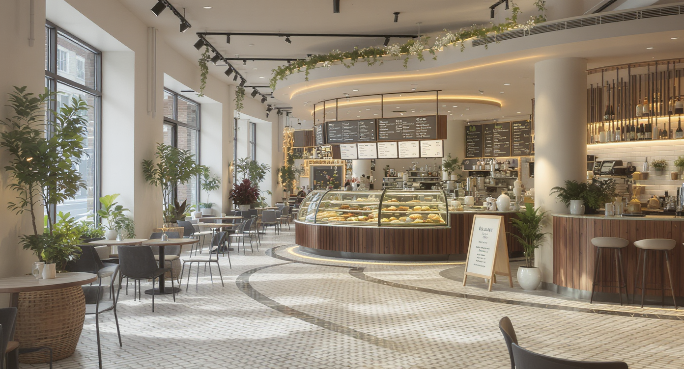
A freshly opened café interior shows a clear, intuitive flow from entrance to pastry case, subtly guided by planters, tables, and strategic shelf placement.
Picture walking into a freshly opened café on a weekday morning. The flow is natural: you enter, follow a clear path to the pastry display, glance at a high-mounted menu, and queue along a gently curving line defined by a row of planters and tables. As you order, you notice the pickup shelf is tucked neatly beside the barista—easy to access, but out of major walkways. Even as the place fills, movement remains smooth, with each customer intuitively guided by both design and subtle visual cues. The result is a welcoming space that feels spacious, even when bustling.
Visualization Scenario
Imagine stepping into a vibrant café on a crisp morning. As you enter, you are naturally funneled toward the pastry case, browsing options while you wait. Movement toward the register feels fluid, signage glances down from high on the wall, and the path to the pickup area is separate but obvious. Even during busy hours, there are no accidental clusters or blocked exits. The overall effect is effortless, even though it was meticulously planned.
Frequently Asked Questions
Most designers recommend maintaining at least 36 inches of unobstructed space in main walkways, with 30 inches the absolute minimum for short traffic lanes. This ensures accessibility and avoids feeling cramped.
Can virtual tools help test furniture arrangement before opening?
Yes, digital modeling and floor planning platforms can quickly reveal pinch points and inefficient routes, helping you visualize and revise traffic flow before committing to expensive buildouts.
Should the pickup shelf be near the entrance or register?
Experts advise placing the pickup shelf a few steps past the register, well away from the entrance, to prevent traffic jams and allow new customers to enter smoothly.
Is signage enough to direct customers?
Signage is most effective when paired with physical cues like angled furniture, planters, or floor markings. High-mounted, concise signs work best.
Where can I find resources for planning retail and hospitality spaces?
Explore advanced circulation planning techniques, layouts, and simulation strategies at ReimagineHome.ai.
Designing for Flow: The Subtle Art of Layout Testing
A well-planned layout is never static. The best spaces evolve, shaped by feedback and fresh observation. For coffee shops and other high-traffic environments, testing how people truly move through your space is as critical as choosing the right espresso blend. By blending tested industry practices with real-world, on-the-floor experimentation, you can create an environment that feels both efficient and welcoming—qualities that encourage repeated visits and positive word of mouth. For further exploration of furniture and space planning, including how to make any room flow, visit ReimagineHome.ai.