Getting Gallery Wall Placement Right Above the Sofa: What Matters Most
TL;DR
Gallery wall placement above a sofa depends on careful attention to height, spacing, and balance with surrounding furniture. The most harmonious arrangements prioritize centering, gallery-style spacing, and using larger art for visual impact. Achieving a look that feels intentional and personal starts with thoughtful planning, not just filling the space.
Why Gallery Walls Remain the Focal Point of Social Spaces
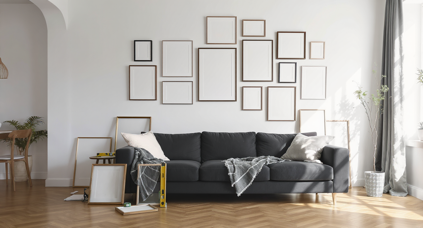
A contemporary living room scene with a gallery wall in progress above the sofa, highlighting the real-world challenge of perfect art placement.
In living rooms across the world, a well-styled gallery wall signals both a design sensibility and a welcoming spirit. Positioned behind the sofa—a feature often considered the anchor of the main social space—a gallery wall delivers more than visual interest. It sets a tone, prompts conversation, and provides continuity between architecture, furniture, and art. Yet, the deceptively simple gallery wall has a reputation for being tricky. The process sparks questions on layout styling, optimum heights, and whether your choices strike the right note between collected and curated. Homeowners commonly seek validation for these decisions because the smallest adjustments—a couple of inches here or there—can dramatically affect the entire room’s energy. As designers frequently remind us, the secret to effective general decor isn’t in perfection but in achieving an arrangement that feels authentically personal and spatially resolved.
-
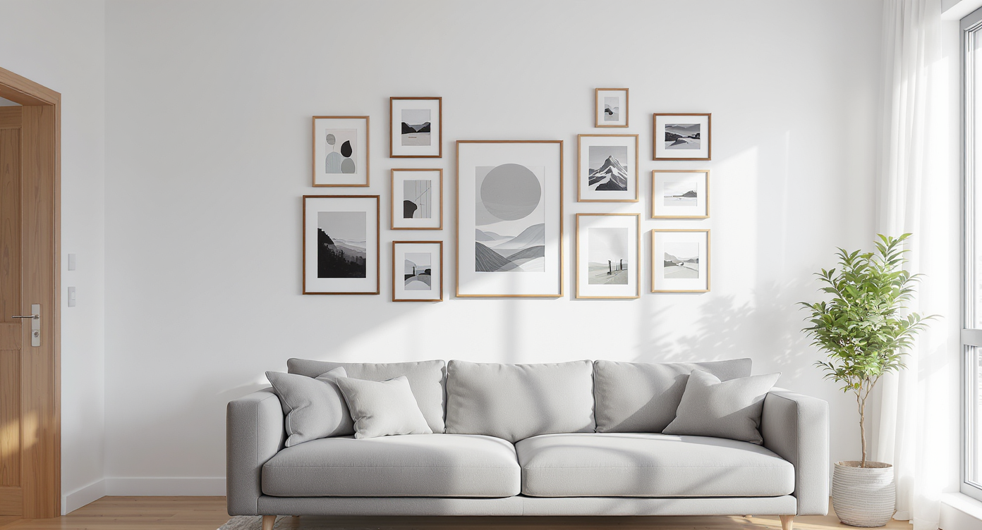
The Principles Behind an Inviting Gallery Wall
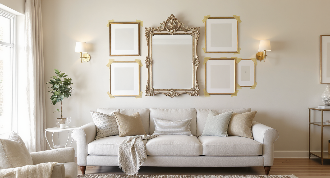
A curated gallery wall sits perfectly centered above a sofa, showing ideal alignment and height for a cohesive, inviting living space.
There’s a reason gallery walls attract both admiration and anxiety: their power comes from how well they blend individual pieces into a unified whole. Whether the display includes family photos, abstract paintings, or vintage prints, the placement above the sofa draws the eye and anchors the room’s mood. Experts emphasize the significance of central alignment with the furniture rather than simply the wall itself, ensuring the arrangement feels intentional. As discussed in creating flow between art, seating, and accessories, the harmony of these layers is what imparts a sense of completeness to the main social space. Height also plays a critical role. Most designers reference the standard 57 to 60 inches from floor to artwork center, aiming for easy visibility and comfort. Still, sofas insert a practical constraint, often lifting the center line between 60 and 62 inches to keep sight lines and composition flattering. As noted in the editor’s sofa art hanging formula, centering relative to the sofa back is more effective than defaulting to gallery standards, which can lose their impact in a domestic setting.
Expert Insight
Last spring, a friend moved into a mid-century rental with a long, empty wall above a thrifted velvet sofa. She meticulously measured, cut paper templates, and adjusted spacing, texting photos to relatives for validation. Her first arrangement felt cramped, so she widened the gaps and swapped in a favorite flea-market find as the centerpiece. Suddenly, the wall sang, and the space felt instantly more personal. Everyone who visited asked if she’d always been that design-savvy.
-
Spacing, Scale, and the Impact of Layout Choices
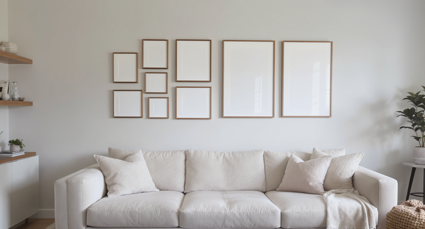
Side-by-side gallery wall arrangements above a sofa, showing how frame size and precise spacing impact balance and visual impact.
What felt balanced in a frame shop or online rendering may feel cramped, scattered, or lost in a room’s actual proportions. Spacing between frames should typically range from 2.5 to 3 inches to echo authentic gallery walls. When frames are crowded, even large art can seem diminished. Conversely, setting them too far apart risks a fragmented effect. Multiple scenarios highlight these nuances. One couple staged their gallery wall with paper templates, only to realize the pieces looked squished in real life; spreading out the frames by an extra inch gave the entire arrangement room to breathe. Another homeowner initially chose small-scale prints, then swapped them for bolder pieces after realizing the originals faded into the background of an expansive sectional. Designers often advise reserving smaller artworks for hallways or intimate corners, while larger, matted pieces better hold their own above a main seating area.
-
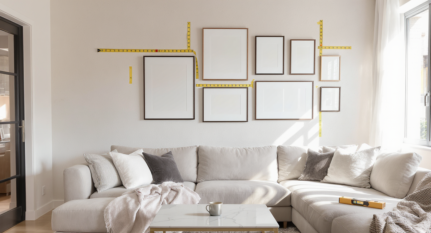
Real-Life Observations: Measuring, Visualizing, and Final Tweaks

A realistic living room scene with painter’s tape and paper cut-outs above the sofa, showing precise gallery wall planning in natural light.
Accurate measuring remains the backbone of gallery wall success. Most homeowners now template arrangements using painter’s tape or brown paper cut-outs, giving themselves the chance to reposition elements before making any permanent decisions. A mirror incorporated into the display may prompt reconsideration of the whole layout, especially if its center needs to align with the main gallery line. Natural light, wall color, and surrounding objects such as sconces or shelves will influence where art feels best. Situationally, consider a living room with expansive natural light and a pale neutral palette; art hung slightly above standard height can lift the gaze, especially where traffic flow and seating depth require. In contrast, a cozy den benefits from art placed just above sofa height, amplifying intimacy and drawing people in. As we’ve seen in the debate between collected and contrived art placements, contextual judgment always outpaces rigid rules.
-
Common Mistakes to Avoid
A few traps frequently undermine gallery wall impact. Hanging art too high, a temptation when working with large spaces or tall back cushions, disconnects from the room’s social function and can make ceilings seem lower. Skimping on scale—opting for too many small frames—often leaves displays underwhelming and busy. Likewise, unintentional crowding defeats the point of showcasing each piece. Ignoring the sofa as the primary visual anchor (rather than the wall’s geometric center) can leave arrangements adrift. Finally, not visualizing ahead of time is an avoidable misstep. Homeowners who experiment with cutouts or try virtual placements before committing gain confidence and save on patchwork repairs later. These precautions affirm the importance of seeking validation, not for approval’s sake, but as a means to make choices that suit personal style and context.
-
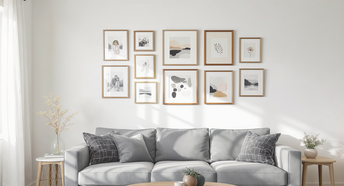
Tips and Expert Insights for Confident Hanging
A living room scene showing paper templates for planned frames and a statement mirror above a sofa, illustrating expert gallery wall placement tips.
Designers suggest using templates for every planned frame and photo, marking ideal sight lines with painter’s tape. When debating how close is too close, stick to three inches as a default gap between elements. Align gallery groupings to the center of the primary seating, not just the wall. For eclectic, collected looks, mix a few different frame sizes but maintain at least one connecting thread such as mat width or color palette. Layering in a single, statement piece—like a distinctive mirror or a piece of functional art—often brings cohesion and subtly commands attention. Finishing touches like sconces or art lights on either side can frame the grouping and add intentionality, echoing advice to emphasize scale and layering as explored in finalizing neutral living rooms with personal accents.
-
How to Use This Approach in Your Next Design Project
A living room as an in-progress gallery wall takes shape: frames, mats, and tools are arranged to test balance above the sofa.
Whether you’re refreshing a student apartment, staging a home for sale, or finishing your forever living room, the considerations remain the same: prioritize balance with furniture and architecture, and experiment until the display feels right for the general decor theme. Before picking up a hammer, walk the space and imagine how you’ll move through the room. Will the art invite conversation as guests mingle? Does the layout styling echo your intended atmosphere, from relaxed bohemian to refined modern? A couple who renovated their postwar bungalow began with a mix-and-match gallery but gradually unified frame styles until the wall felt more cohesive. Another family relied on large mats and generous spacing to transform a blank wall into a vivid visual journey. In both situations, patience and iterative tweaking made all the difference. Ultimately, seeking validation is less about external approval and more about gaining the clarity to move forward with assurance.
Visualization Scenario
Imagine entering a living room awash with sunlight, the soft neutral palette grounded by a low, channel-tufted sofa. Above, a gallery wall sits perfectly centered, its frames spaced just so, unified by white mats and a few playful colors that echo the rug below. One bold abstract anchors the eye, while a vintage mirror bounces the afternoon light. From across the room, the arrangement beckons—a visual invitation to settle in, linger, and connect.
Gallery Wall Placement FAQ
The typical rule is to center the gallery grouping between 57 and 62 inches from the floor, but when arranging above a sofa, aim for a bottom edge 6 to 8 inches above the back. Centering to the sofa itself ensures a natural connection.
What is the ideal spacing between frames in a gallery wall?
Designers recommend 2.5 to 3 inches between frames for cohesion and ease of viewing. Larger gaps can fragment the arrangement, while smaller ones may appear cluttered.
Can I mix frame colors and art sizes?
Yes. Mixing frame sizes and finishes creates a collected, lived-in effect, especially when unified with mat width, color scheme, or underlying theme.
Is it better to use large or small art above a sofa?
Larger art or matted prints have more impact and remain visible from a distance. Reserve smaller photos and works for spaces like hallways or nooks.
How can I visualize a gallery wall before making holes?
Use paper templates, painter’s tape, or digital visualization tools such as ReimagineHome.ai to experiment with layout and spacing.
Curating Authenticity, Not Just Arrangement
Gallery walls feel at their best when they express the life and taste of those who gather in front of them. Achieving the right height, spacing, and balance above the sofa transforms the room from unfinished to memorable. The urge to seek feedback or validation is a creative instinct—an effort to ensure that your home feels vibrant and comfortably yours long after the holes are patched and the dust settles. For more visualization tools and confidence in every design choice, ReimagineHome.ai offers ways to preview gallery layouts and hone your styling signatures.