Decoding Living Room Paint Choices: Color, Texture, and Confidence for First-Time Homeowners
TL;DR
The best living room paint color balances the room’s natural light, existing surfaces, and future plans. Start with flexible, warm-leaning neutrals, experiment with earthy or blush tones for harmony, and leverage image-based paint previews. This process helps homeowners move from hesitation to confidence—no matter how unfinished the space, color brings personality and connection.
The Beginner’s Dilemma: Picking a Paint Color That Works—Now and Later
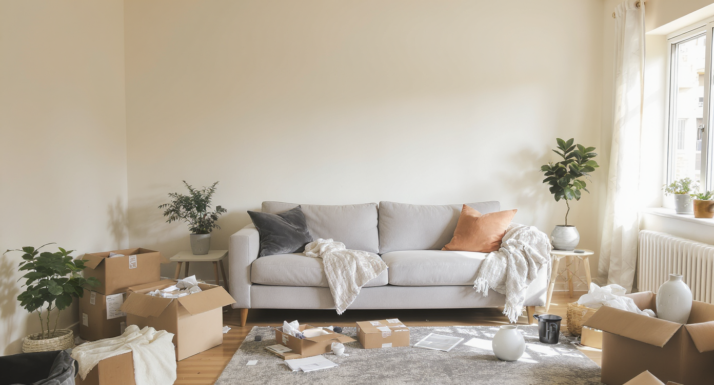
A first-time homeowner's living room, where blank walls, natural light, and unique features set the stage for confident paint choices.
Every first-time homeowner knows the thrill of unlocking the front door, only for that joy to mix with bouts of uncertainty when facing bare walls and outdated finishes. With little furniture, eccentric built-ins, and a “placeholder” fireplace, the classic question arises: which paint color can refresh the space immediately while allowing for later transformation? The answer lies beyond color chips or quick fixes. It involves understanding how light, texture, and existing features interact. More importantly, it’s about creating a comforting base so the room feels inviting now, but flexible enough for redesigns as life evolves. This editorial unpacks how confident color decisions grow from confusion, turning beginner overwhelm into inspired progress.
-
Where Paint Decisions Begin: Light, Texture, and the Elements You Can’t Ignore
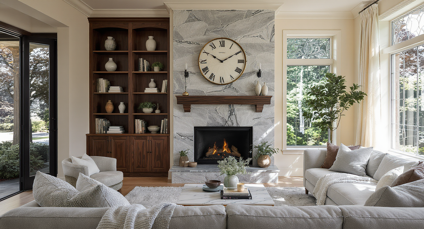
Northwestern light and fixed room features influence paint choice—warm undertones balance wood, stone, and natural shadows beautifully.
The first ingredient in any color decision is recognizing what you can and cannot change. In many living rooms, built-ins, existing fireplaces, or window trims define the starting point. Instead of seeing them as obstacles, designers often advise treating them as anchors. These features—whether a glossy wood shelf or a streaky stone mantel—bring unique undertones and visual mass to the room. In the scenario of a north-west facing living room with leaded glass, natural light takes on a cool, sometimes diffuse quality, especially if there are mature trees outside. This means that paint colors, especially neutrals, may appear grayer or more subdued than swatches suggest. Rather than defaulting to a true white, which can feel flat or cold, interior experts recommend looking toward soft beiges, creamy off-whites, or warm mineral hues. These shades reflect nature’s touch while softening shadows, a solution backed by the 5-step approach described in how to choose a paint color you’ll love.
Expert Insight
Last spring, a friend of mine moved into an aging brick home with a sun-drenched den. She wanted a bold green but hesitated, shuffling dozens of paint chips for weeks. After using a digital preview on her phone, she realized a softer mineral green tied her fireplace and backyard views together seamlessly. Within a weekend, her living room felt finished—and within a month, the space had become the heart of her gatherings. Sometimes the right tools and a little patience are all you need.
-
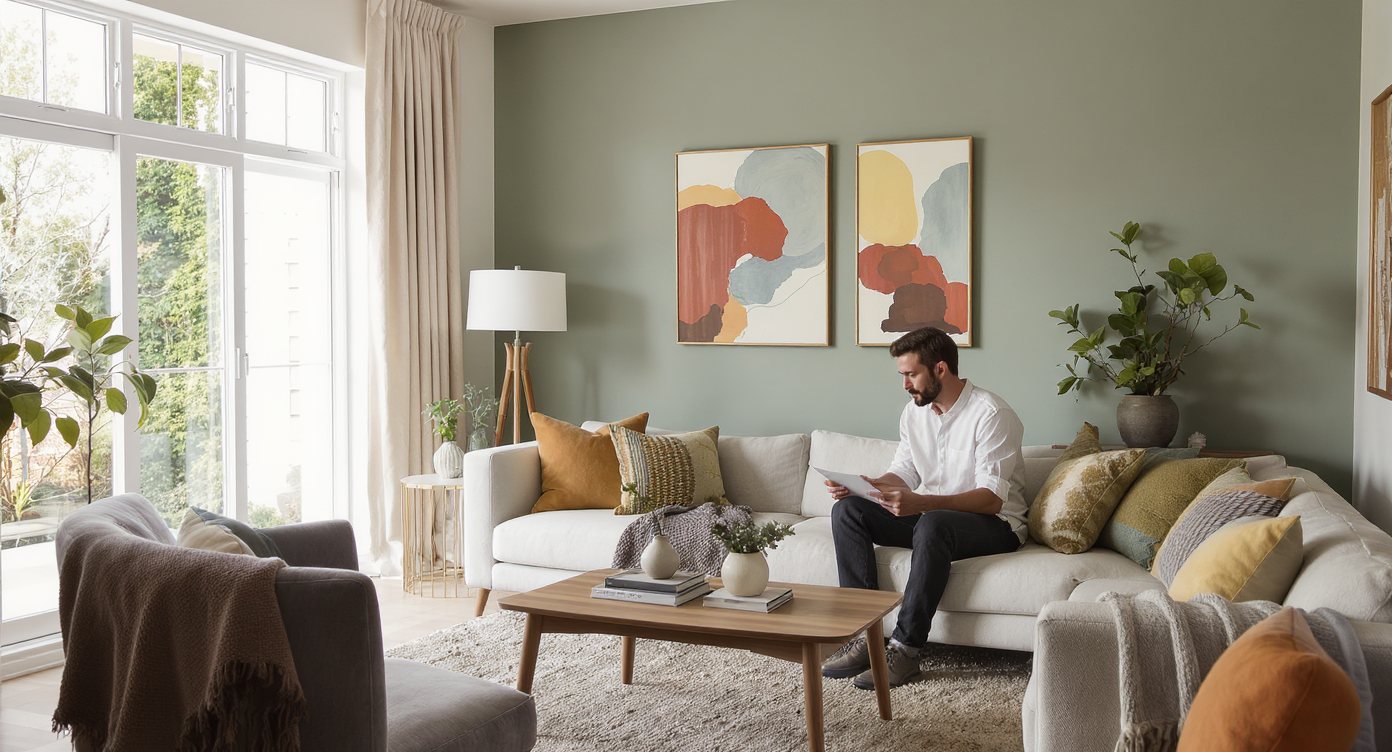
Neutrals, Earth Tones, or a Leap to Color? Reading the Room’s Emotional Palette
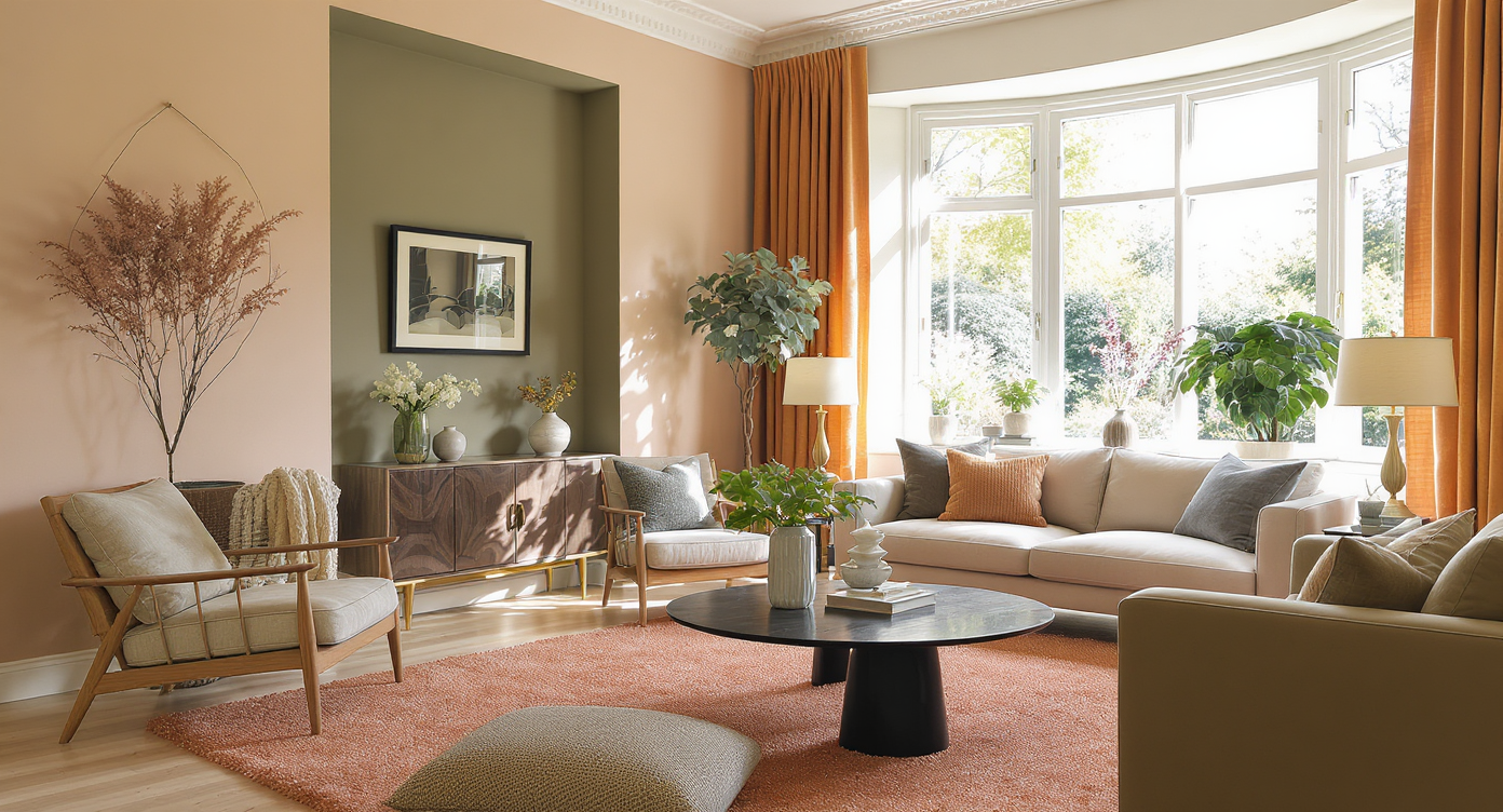
Neutral, earth-toned walls and a muted olive alcove harmonize vintage and modern pieces, grounding the space with warmth and versatility.
For those wary of bold colors, a restrained neutral doesn’t mean settling. Finely tuned beiges and warm mushroom hues can lend depth, especially against the grain of lacquered wood and black stone. Neutrals also keep future decorating possibilities open—ideal for anyone planning to upgrade flooring or swap out statement pieces over time. Yet design momentum in 2026 is swinging toward earthy blushes, terracotta, and nature-inspired greens. These aren’t fleeting trends. The resurgence in moody, tactile shades reflects a desire for spaces that feel authentic, lived in, and emotionally grounding, as seen in the 2025–2026 color trend forecast. In homes where leafy views and natural shadows are in play, a gently pink-toned beige or muted olive can harmonize with seasonal light shifts and make both vintage and modern fixtures feel intentional. For the hesitant, using these colors as an accent wall or in a color-drenched alcove near a bay window can offer just enough character without overwhelming the senses.
-
Coordinating With Features That Will Change: The Practical Path
Most new homeowners inherit elements they plan to update—think wall-to-wall carpet, built-in bookcases, or an outdated fireplace surround. It is tempting to delay all decorating until every feature meets your vision, but this stalls progress and enjoyment. The key is to coordinate new paint with both present and future versions of the space. For example, if you plan to install hardwood soon, look for paint colors that warm up under both artificial lighting and in tandem with wood’s undertones. A warm beige, for instance, complements both temporary carpet and the golden or walnut shades common in flooring upgrades. On the other hand, if built-ins or the fireplace are being replaced eventually, avoid paints that react poorly to the current finishes but make sure they don’t pigeonhole your new design down the line. Designers encourage using large painted samples on multiple walls and observing them over several days. This process, detailed in the 5-step paint color system, helps clarify which hues persistently look good under different shadows and daylight angles.
-
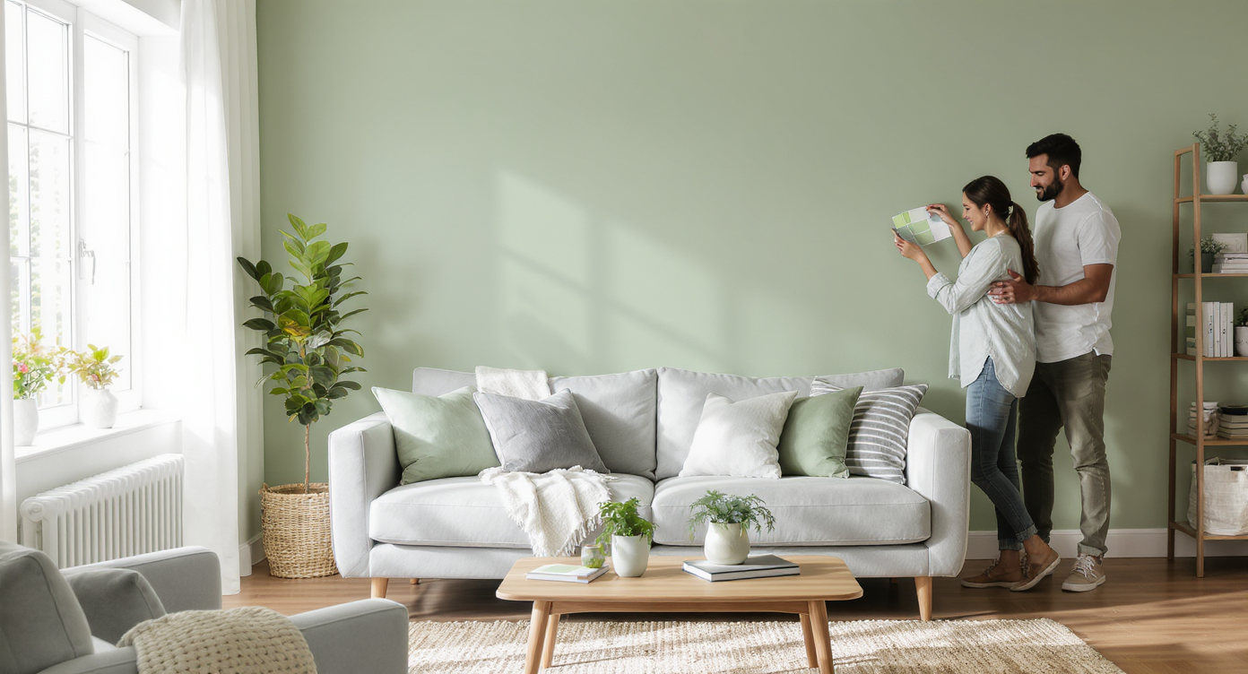
Seeing Before Buying: The Rise of Image-Based Paint Previews
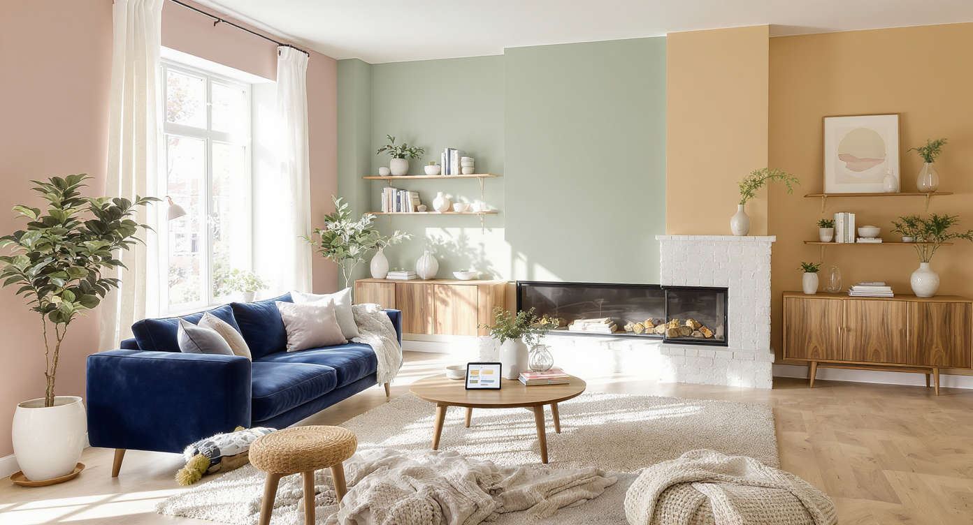
Paint preview technology lets you visualize your living room in multiple colors, helping you choose with clarity and confidence.
Image-based paint previews have become a game changer for anyone afraid of making the wrong choice. Artificial intelligence design tools now allow you to digitally repaint your living room with different colors—even with tricky built-ins, dramatic windows, or fireplace surrounds. This method lets you visualize how blush, green, or nuanced neutrals will interact with everything in the room, not just a small patch. Trying out several colors virtually provides insight into undertones, compatibility with finishes, and even what your future furnishings might look like in context. Whether the goal is warm cohesion or a bold, intentional twist, modern paint preview platforms take much of the anxiety and guesswork away, helping many owners commit with confidence—a process described in depth in the overview of image-based previews.
-
Layering, Texture, and the Emerging Role of Color in Finishing a Room
Layering neutral paint and diverse textures creates a versatile base for color and style in a first-time homeowner’s living room.
Paint is rarely the only solution for making an unfinished room feel alive—but it often acts as the catalyst. Once the foundation is set, adding texture with area rugs, tactile curtains, or statement art helps a space transition from bare to layered. Neutral paint supports future bursts of color through textiles and decor, while a stronger shade may spark a clearer decorating theme. As advice for first-time homeowners points out, practical details like rug placement, curtain choice, or media console style should coordinate with your new paint color and not compete. Start small, build up gradually, and use color to anchor evolving layers. This way, the living room steadily shifts toward comfort and personal expression.
Visualization Scenario
Imagine walking into your nearly empty living room. Afternoon sun filters through leaded glass, casting leafy shadows across the walls. You open your laptop, snap a photo, and virtually test blush, olive, and mushroom hues. The fireplace recedes; your bay window glows softly. By dinnertime, you know which paint will make you smile every time you step inside.
Living Room Paint Questions: Your Color Coordination FAQ
Look for neutrals with a hint of warmth, like mushroom or creamy beige, especially if you have north or northwest-facing windows. These add subtle interest without the coldness of stark white.
Will a bold color limit my future decorating choices?
Used thoughtfully, bold colors can serve as a dynamic backdrop for evolving styles. Try them on single walls or alcoves first—this approach lets you shift decor over time without repainting everything.
Can I coordinate paint with existing dated features?
Absolutely. Focus on colors that work with undertones in things like tile, stone, or wood. Flexible shades ensure your palette won't conflict when those features are updated.
What if I’m overwhelmed by options?
Narrow choices to three or four, paint large sections on different walls, and live with them for several days. Use digital preview tools like ReimagineHome.ai for extra confidence before you decide.
How does lighting direction change everything?
Light from north or northwest windows tends to cool and mute paint colors. Check swatches at all times of day, and lean toward warmer hues to balance the effect.
Embracing Confident Color Choices—for Today and Tomorrow
Every painted wall tells a story about patience and trust in the process. By embracing paint not only as a backdrop but as a flexible, mood-setting tool, homeowners create spaces that welcome changes yet offer comfort now. Test widely, observe closely, and use digital visualization to inform your final pick. See how paint options look in your own rooms using ReimagineHome.ai—and move forward confident that color is not a constraint but a catalyst.