ReimagineHome Mobile Experience and Usability: How to Design and Visualize Rooms on Your Phone
TL;DR
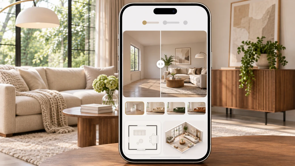
A good mobile AI room-design experience should make it easy to upload a room, generate a dsign, compare results, and decide what to do next without crowding the screen. ReimagineHome supports photo-based visualization, while chez by ReimagineHome uses multiple room photos for explorable 3D spaces, floor plans, and wall elevations. On mobile, the room image should remain the main focus.
-
1. Why Mobile Experience Matters
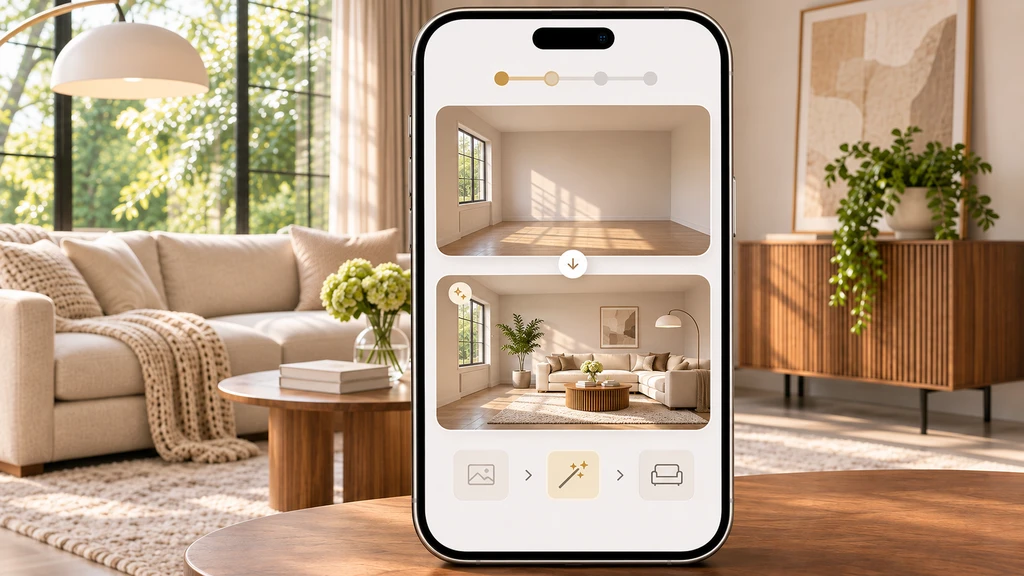
ReimagineHome’s mobile room-design workflow keeps the space easy to review while guiding users from room photo to generated design with clear, focused controls.
Phones are a natural starting point for room design because photos, inspiration images, and shopping references are already there. But shrinking a desktop interface onto a phone creates clutter.
Mobile design should show only the controls needed for the current decision while keeping the room easy to understand.
-
2. Keep the Room Image Clear
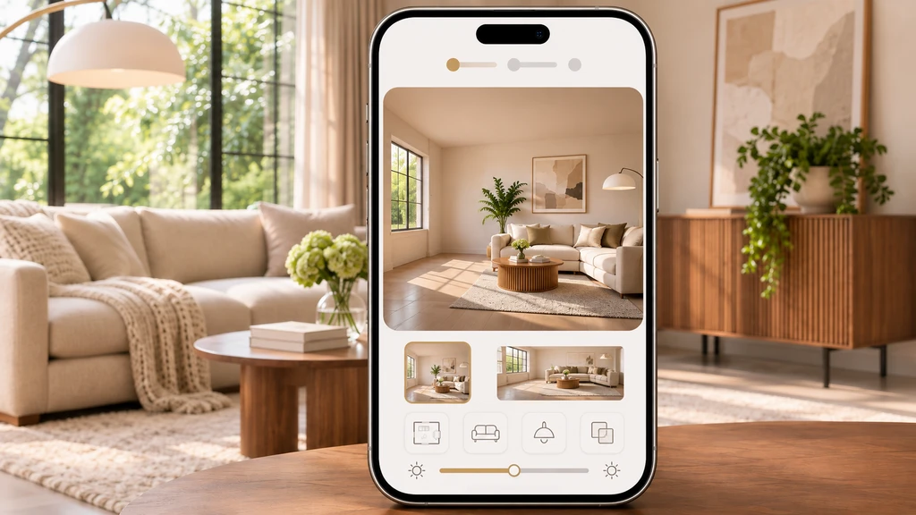
A clear mobile room-design interface keeps the main room preview prominent while giving users simple access to alternate views, design options, and visual adjustments.
The room should remain the main visual focus. Controls should adapt to the uploaded photo instead of covering important furniture or architecture.
- Landscape: Use most of the available screen width.
- Portrait: Place controls above or below the image.
- Overlays: Reserve them for edit markers or comparison tools.
- Labels: Keep long style names, status messages, and CTAs outside the image.
-
3. Keep the Workflow and Comparison Simple
The core mobile workflow should stay easy to follow:
Upload → Choose → Generate → Compare → Refine
- Upload: Select or capture the room photo.
- Choose: Select staging, redesign, furniture changes, or another supported goal.
- Generate: Keep the primary action obvious.
- Compare: Use a toggle, swipe comparison, or large preview.
- Refine: Show additional controls after the first result is reviewed.
When several generations exist, thumbnails provide more context than navigation arrows alone.
-
4. Make Navigation and Touch Controls Predictable
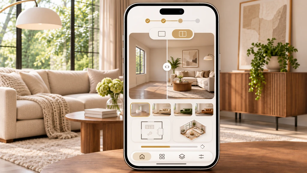
A mobile room-design experience should make it easy to compare versions, switch between room views, and review different design options without losing focus on the main space.
Users should not lose their place when opening panels, viewing products, or returning to a generation. Important state should remain available whenever practical.
- Preserve the current result and scroll position.
- Avoid nested scrolling and unexpected page jumps.
- Make buttons and arrows comfortable to tap.
- Separate primary actions from Delete or other destructive controls.
- Clearly show when generation is processing.
-
5. Make Photo Capture and 3D Easy on Mobile
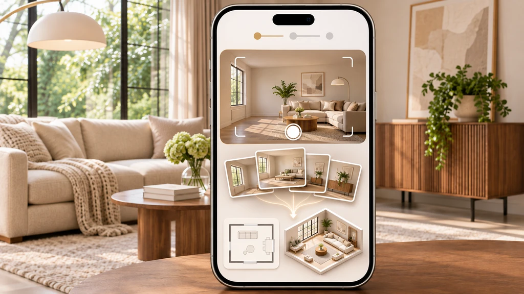
Multiple room photos can provide the visual context needed to build a 3D representation, while mobile floor-plan and bird’s-eye views help users understand the space from different perspectives.
For chez 3D reconstruction, useful results begin with clear overlapping room photos. Short capture instructions are easier to follow while using a phone.
- Keep the camera level.
- Capture different corners.
- Include some floor and ceiling.
- Show doors, windows, and built-ins.
- Use clear, well-lit original photos.
For 3D exploration, important gestures should be easy to discover. Simple cues such as Drag to rotate and Pinch to zoom can reduce guesswork.
-
6. Give 3D, Floor Plans, Elevations, and Products Enough Space
3D models, floor plans, and wall elevations answer different questions, so each should use the available mobile workspace rather than being squeezed together.
View Best for 3D Understanding the room spatially Floor Plan Layout, openings, and estimated dimensions Elevation Walls, doors, windows, and furniture relationships Product information should also stay secondary to the room. Details such as price, dimensions, variants, and shopping actions can appear in an expandable panel when needed.
-
7. Mobile Usability Checklist
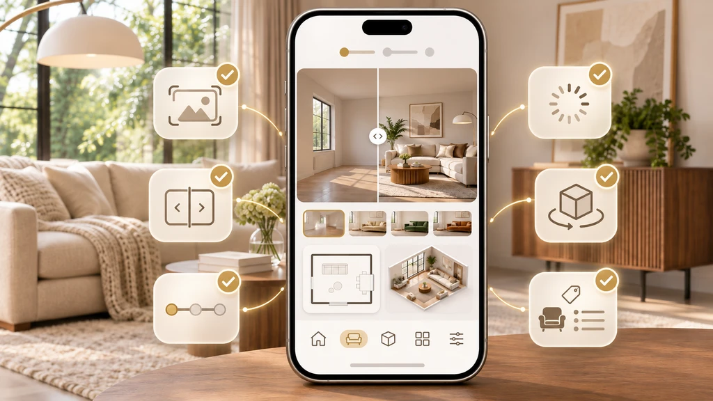
A well-organized mobile design interface keeps comparison, 3D views, loading states, and product options accessible without overwhelming the room image.
Area What to check Room preview Is the image large enough to understand? Orientation Do portrait and landscape photos stay readable? Comparison Can users quickly switch between versions? History Are previous generations easy to identify? Touch controls Are buttons and arrows comfortable to tap? Navigation Does returning preserve the user's context? Loading Is generation status obvious? 3D views Are gestures and view modes clear? Products Can details be viewed without hiding the room? Common mistakes to avoid:
- Shrinking the desktop interface instead of adapting it.
- Designing only for landscape images.
- Covering portrait photos with controls.
- Using tiny icons or unclear gestures.
- Resetting the page after navigation.
- Allowing product panels to dominate the visualization.
Frequently Asked Questions: Mobile Room Design and Visualization
Can I use ReimagineHome from a phone?
ReimagineHome supports mobile use where available. Some functions may require camera, photo-library, or device permissions.
Can I upload room photos from my phone?
Yes. Photo-based workflows begin with room images. For chez 3D reconstruction, use multiple real photos of the same room from different angles.
Can I explore a 3D room on mobile?
Chez provides interactive 3D views on compatible devices and browsers. Exact controls and performance can vary by device.
Are 3D room dimensions exact?
No. Dimensions reconstructed from photographs are estimates. Verify real measurements before purchasing furniture or materials.
A User-Centered Mobile AI Design Experience
The best mobile AI design experience keeps the room large, controls relevant, comparison simple, and navigation predictable. The final test is straightforward: Can someone upload a room, understand the result, compare alternatives, and decide what to do next comfortably from their phone?