North-Facing Living Room in Winter? Explore Warmer Colors and Finishes in 3D
TL;DR
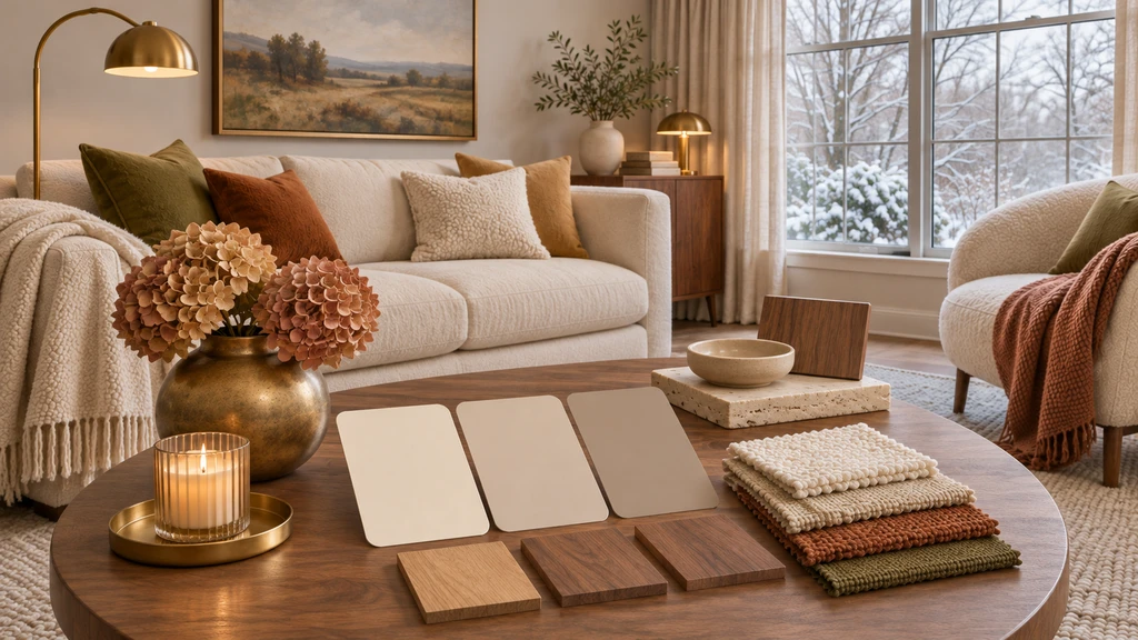
In the Northern Hemisphere, north-facing living rooms usually receive cooler, indirect daylight, and winter can make the effect stronger. Instead of defaulting to beige, compare warm neutrals, wood tones, textiles, metals, and finishes as one coordinated palette, test two or three options in 3D with the room and furniture kept consistent, then confirm the best choice with real paint and material samples.
-
1. Why a North-Facing Living Room Can Feel Colder in Winter
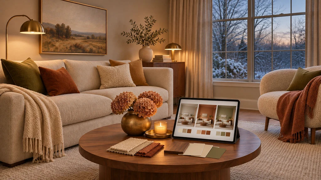
Compare warm neutrals, wood tones, textiles, and finishes in the same north-facing living room to see which palette feels most balanced under cool winter daylight.
A north-facing room is not necessarily dark, but its daylight is usually more indirect and can appear cooler than light from other orientations. Cool undertones may become more noticeable, while warmer undertones can help balance the effect. Winter can make this contrast stronger, with north-facing daylight often appearing cooler and sharper than in summer.
This does not mean paint color makes the room physically colder. The issue is visual temperature, how light, color, texture, and materials work together to make the space feel cool or inviting. Instead of simply adding warmer colors, identify which surfaces are making the room read cold and adjust them carefully so the overall palette feels warmer without becoming overly yellow or muddy.
-
2. Start With Undertone, Not Just the Color Name
Two paints can both be called “white” and behave very differently in a north-facing room. A blue-white or cool gray can emphasize cooler daylight, while cream, warm greige, soft taupe, or muted neutrals with warmer undertones may feel more balanced. Warm shades with pink, gold, or yellow undertones can also be useful starting points.
Existing Problem Direction to Test Watch Out For Stark white feels icy Cream, ivory, or warm off-white Too much yellow beside cool flooring Gray walls feel flat Warm greige or taupe Beige tones that clash with blue-gray surfaces Room lacks energy Muted clay, ochre, or warm olive Too much saturation in low light Room feels visually dark Higher-reflectance warm neutral Very bright whites that still read cold Cool flooring dominates Warm rugs, wood tones, and textiles Adding too many unrelated warm tones The key is to test rather than assume. A color that looks warm on a paint card can behave differently beside your flooring, sofa, curtains, and winter daylight, so always evaluate the full combination in the actual room.
-
3. Use LRV as a Screening Tool, Not a Guarantee
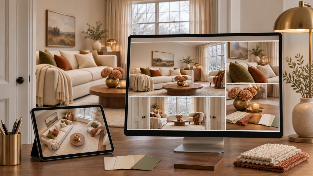
Review the same north-facing living room from multiple 3D views to see how warm colors, wood tones, textiles, and finishes behave from the entrance, window, seated, and detail perspectives before making a final choice.
When comparing paint, you may see an LRV, or Light Reflectance Value. It describes how much visible light a paint reflects. Sherwin-Williams suggests considering higher-LRV colors in north-facing rooms, with values around 60 or above as a useful starting point.
However, LRV does not tell you whether a color will feel warm. A high-LRV blue-white can still appear chilly, while a slightly deeper cream may feel more comfortable even though it reflects less light.
- Light reflection: How much visible light does the color reflect?
- Undertone: What warm or cool tone does that reflected color introduce?
Evaluate both together rather than simply choosing the palest paint available. This gives you a more useful shortlist for a north-facing room.
-
4. Warm the Room With Finishes, Not Paint Alone
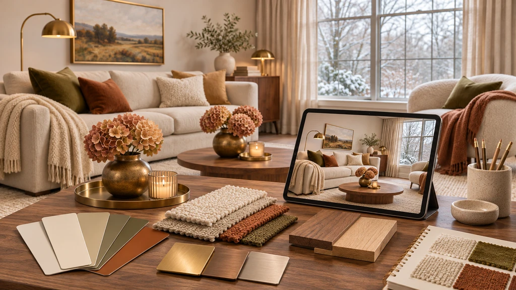
Compare paint, wood, textile, and metal samples together with a 3D room preview to see how each finish contributes to a warmer, more cohesive north-facing living room.
If the walls already work, repainting may not create the biggest improvement. A north-facing living room can gain visual warmth through coordinated materials and finishes instead.
Three Palettes Worth Testing
Palette Walls Wood / Furniture Accent Finish Soft Warm Neutral Creamy off-white Light oak Olive Brass Earthy Winter Warm greige Walnut Rust / clay Bronze Quiet Cozy Soft taupe Mid-tone oak Camel + moss Warm nickel Compare each palette as a complete combination rather than judging the wall color alone. The relationship between paint, wood, textiles, metal finishes, flooring, and natural light determines whether the room feels balanced and warm.
-
5. Paint Finish Changes the Result Too
Color is only one part of the wall decision. Paint sheen changes how light reflects from a surface, which can make the same color appear slightly different. Sherwin-Williams notes that flat finishes reflect very little light, while higher-gloss finishes reflect progressively more. For living rooms, eggshell and satin are common practical choices.
Finish How It Behaves Best Use Matte / Flat Soft, low-reflection appearance Calm walls where minimal shine is preferred Eggshell Subtle reflection without looking glossy Living-room walls that need a soft, balanced finish Satin Slightly more light interaction and easier cleaning Higher-use areas or surfaces needing more durability Semi-Gloss / Gloss Higher reflectivity and a more noticeable sheen Trim, doors, millwork, or selected accent details A dim north-facing room does not need glossy walls to feel brighter. A more balanced winter combination may be warm-neutral matte or eggshell walls with slightly more reflective trim, paired with warm wood and soft textiles. This adds depth and variation without relying on one bright color.
-
6. Why Winter Is the Right Time to Test the Palette
A paint color that looks balanced on a bright summer afternoon may behave very differently in winter. Benjamin Moore recommends considering seasonal light when choosing colors for north-facing rooms because the same shade can appear noticeably different between summer and winter.
For a realistic winter check, review the room under several lighting conditions:
- Morning daylight
- Midday light
- Late-afternoon light
- Evening artificial lighting
A room that feels balanced at noon may look noticeably grayer by late afternoon. Daylight is also affected by more than orientation alone: window size, glazing, shading, and surrounding conditions influence how much usable light enters the room. Test your shortlisted palette across the day before making the final decision.
-
7. Compare Warm Color and Finish Combinations in 3D
3D becomes more useful than testing one isolated paint swatch when you want to understand how an entire palette works together. With ReimagineHome’s room-to-3D workflow, keep the room geometry, windows, flooring, and main furniture consistent while comparing controlled variations in wall color, wood tones, textiles, and finishes.
Option Wall Color Wood / Furniture Textiles Finish Option A: Warm Off-White Cream wall Light oak table Olive cushions and linen curtains Existing floor Option B: Warm Greige Greige wall Walnut table Rust cushions Brass lamp Option C: Soft Taupe Taupe wall Medium oak Camel and moss textiles Warm metal accents Change one major layer at a time. If you change the wall, sofa, rug, lighting, and flooring together, it becomes difficult to tell which adjustment actually improved the room. Controlled comparisons make it easier to identify the combination that creates the warmest and most balanced result.
-
8. Check the Same Palette From More Than One View
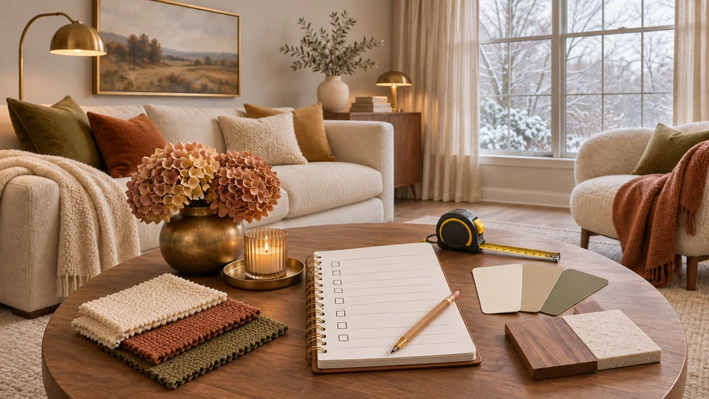
Use a simple winter design checklist to compare paint undertones, materials, textures, and finishes before committing to changes in a north-facing living room.
A color combination that feels warm from the doorway may look quite different beside the window. Compare the same palette from multiple viewpoints to understand how walls, upholstery, flooring, and finishes behave throughout the room.
3D View What to Check Entrance View Does the room immediately feel warmer, or does it still read cool or gray? Window-Facing View How do the wall and upholstery tones behave near the coolest natural daylight? Seated View Do the rug, sofa, wood tones, and wall color work together at eye level? Wall Elevation Does the selected wall color work with artwork, the fireplace, trim, or built-ins? ReimagineHome’s photo-to-3D workflow can provide a 3D walkthrough, floor plan, and wall elevations to help compare these relationships. Reconstructed geometry and displayed dimensions should still be treated as estimates rather than verified measurements.
-
9. What 3D Can Show, and What It Cannot
3D visualization is useful for comparing how colors, materials, and finishes work together in the same room. It can help you evaluate:
- Warm walls vs. cool flooring
- Light wood vs. walnut
- Cream vs. greige
- Olive vs. rust textiles
- Matte-looking vs. more reflective finishes
- How repeated warm accents affect the overall room
However, 3D cannot perfectly reproduce your actual winter daylight, monitor calibration, exact paint chemistry, or how physical materials change under different viewing angles. Use this sequence: 3D preview → shortlist 2–3 combinations → order real samples → test them in the room → decide. This is more reliable than treating either a digital rendering or a small paint chip as the final result.
-
10. North-Facing Winter Living Room Checklist
- Confirm that the room is actually north-facing.
- Identify the coolest-looking fixed surface, such as the wall, floor, sofa, or window treatment.
- Check paint undertones, not just the color name.
- Use LRV to narrow your choices, but not as the only deciding factor.
- Compare warm wood, textiles, rugs, and metals before repainting everything.
- Review the palette in morning, midday, late-afternoon, and evening light.
- Keep the same furniture and architecture while comparing 3D options.
- Change one major variable at a time.
- Shortlist only two or three combinations.
- Confirm the final choice with physical paint and material samples.
Frequently Asked Questions
What colors work best in a north-facing living room?
Warm neutrals, creamy whites, warm greiges, taupes, muted earth tones, and colors with warm undertones are useful starting points because north-facing daylight can make cooler colors appear even cooler. Always test the actual shade in your room before deciding.
Should I avoid gray completely?
No. Gray can work well, but its undertone matters. A cool blue-gray may emphasize northern light, while a warmer greige or taupe can create a more balanced feel. Consider your existing flooring, furniture, and lighting when choosing the shade.
Should a north-facing room always be painted a light color?
No. A lighter, higher-LRV color can help maintain brightness, but darker colors can also work when used intentionally. Even deeper or bolder colors can suit north-facing rooms when their undertones work with the room’s natural light and surrounding finishes.
Can 3D tell me exactly how paint will look in winter?
No. A 3D preview can help you compare color palettes, materials, finishes, and how they work together in your room, but actual daylight, screen settings, paint formulation, and physical sheen can affect the final appearance. Always confirm your shortlisted options with physical samples.
Make the Room Feel Warmer Before You Repaint It
A north-facing living room does not need to become beige from floor to ceiling. Instead, identify what makes the room feel cool and test coordinated changes such as warmer wall undertones, richer wood, textured rugs, softer curtains, and warmer finishes.
Compare these combinations in 3D while keeping the room consistent, then shortlist the options before spending on paint or materials. Winter is a useful stress test for seeing whether the palette really works.