7 Rules for Choosing a Kitchen Backsplash When You Have Busy Countertops
Introduction
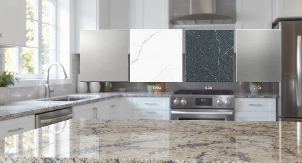
Previewing different backsplash options for busy countertops using the best AI kitchen backsplash visualizer tool. This setup illustrates how to preview backsplash with AI for effective home design, solving the challenge of choosing kitchen backsplash with AI visualization.
Selecting a kitchen backsplash seems straightforward until you’re faced with boldly patterned countertops or distinctive colors, like green granite. In this scenario, common design advice can result in the backsplash and counters visually “fighting,” making the whole space feel cluttered or dated. This article introduces the One Pattern Principle, a decision method designed to deliver clarity when previewing backsplash options for kitchens with strong countertop personalities.
-
01. Use the One Pattern Principle: Choose Pattern for Counter OR Backsplash Not Both
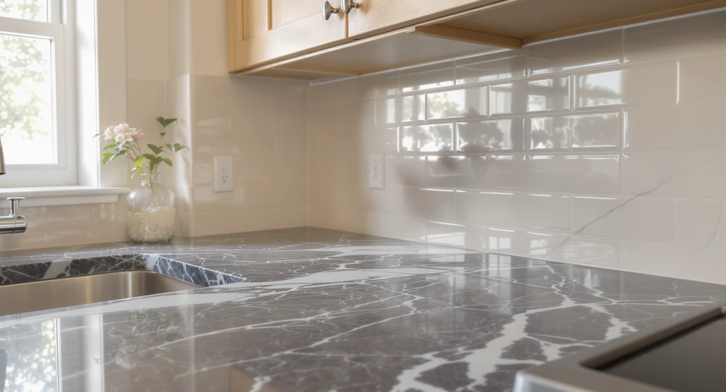
Using the best AI kitchen backsplash visualizer tool, homeowners can preview backsplash options with AI for busy countertops. This virtual backsplash comparison illustrates how choosing kitchen backsplashes with AI visualization keeps the design balanced and visually appealing.
When countertops are visually busy, choose a solid or subtle backsplash to keep the space harmonious. The One Pattern Principle limits visual competition by allowing just one star element either the countertop or the backsplash, not both. This works because human perception favors clear visual hierarchy. Layering patterns erodes that clarity, resulting in a space that feels noisy rather than composed. If your countertops draw attention, support them with a calm backdrop. This is consistently affirmed by design pros on kitchen forums and in our guide to what makes a kitchen timeless.
Expert Insight
A homeowner once shared in a kitchen forum that after months of indecision, their breakthrough came from virtually testing a plain sage subway tile against their dark green granite countertops. Rather than layering busy textures, the clean look instantly made the counters feel purposeful and let smaller décor items add the character they’d been chasing. The experience echoed the concept of seeing it before you decide—making digital mockups more than just a convenience, but a tool for regret-free decisions.
-
02. Match Undertones Instead of Colors for Seamless Flow
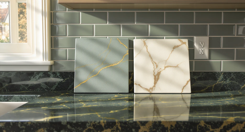
Preview how to choose a kitchen backsplash with AI visualization: compare muted green and creamy white backsplash samples using virtual AI home design tools for busy countertops and optimal undertone matching.
Always align the undertones (warm, cool, or neutral) between countertops and backsplash rather than trying to create an exact color match. This approach creates a subconscious sense of unity, even if the physical colors are different. For green or emerald counters, a backsplash in a muted green, creamy white, or warm gray often reads as coordinated even if it doesn’t “match.” The right undertone match prevents visual clashes and gives the kitchen a more cohesive atmosphere.
-
03. Prioritize Scale: Small Patterns Overwhelm in Tight Spaces
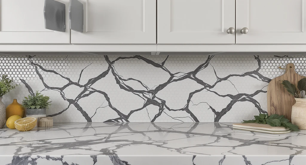
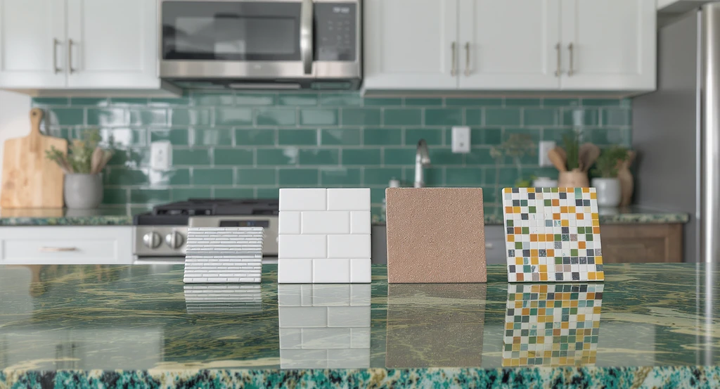
How to preview backsplash with AI: This virtual backsplash comparison for kitchens demonstrates how choosing large-format stacked tiles over small mosaics creates a calmer look with busy countertops when using an AI kitchen backsplash visualizer.
In kitchens with limited backsplash height, avoid small or fussy tiles, which can create a visually busy effect. Larger format tiles, stacked layouts, or uninterrupted slabs provide a sense of calm by reducing grout lines and repetitive visual breaks. This is especially relevant if your kitchen has upper cabinets set low, as excess pattern density can make the space feel even more compressed. Think of the balance: the scale of your counters should inform the scale of your backsplash.
-
04. Use Backsplash Texture and Finish for Interest ;Not Just Pattern
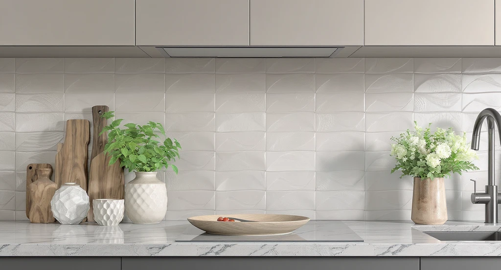
Explore how to preview backsplash with AI: this setup uses the best AI kitchen backsplash visualizer tool to illustrate how handmade, textural matte tiles add depth and warmth without clashing with busy countertops, ideal for virtual backsplash comparison for kitchens.
Opt for textural tiles (like handmade or subtly wavy) instead of bold multi-color patterns when you want depth without chaos. Matte, glossy, or artisan finishes catch light differently and can make a neutral backsplash interesting without competing with patterned counters. Texture adds a tactile sensory appeal and breaks up monotony in a refined way. As explored in Kitchen Design Trends 2025, tactile surfaces bring warmth and modernity when pattern would feel excessive.
-
05. Preview Before Committing Using a Virtual Backsplash Comparison
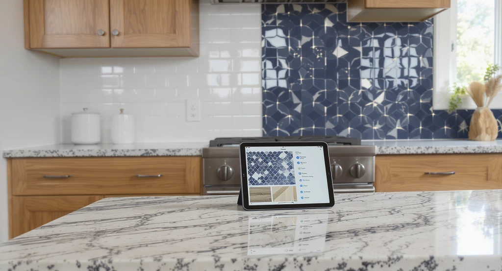
Preview how different backsplashes look with your current kitchen finishes using the best AI kitchen backsplash visualizer tool. Discover how to preview backsplash with AI and make confident choices for AI home design when you have busy countertops.
Visually previewing backsplash options with your kitchen's exact finishes is crucial. Traditional samples held up to the wall are useful, but virtual tools that overlay different backsplashes on a photo offer more reliable spatial feedback. This dampens decision regret and makes pattern, color, or scale errors less likely. Platforms such as ReimagineHome allow you to try on options side by side, making it the best AI kitchen backsplash visualizer tool for real-world situations. As shown in our detailed breakdown of DIY kitchen backsplash planning, seeing the result before you touch a tile is key to a confident decision.
-
06. Decide Where to End the Backsplash (and Remove Short Countertop 'Lips')
Finish the backsplash at logical spatial boundaries such as the edge of cabinetry or just below a range hood—rather than wrapping short returns or continuing to side walls. This prevents an interrupted, chopped look that can make even good materials feel like afterthoughts. If a counter already has a 4–6 inch matching backsplash strip, consider removing it before tiling so your result looks intentional and cohesive. Details like these prevent new tile work from seeming “tacked on” and contribute to the kitchen’s long-term satisfaction.
-
07. Don’t Skimp on Visualizing Grout Color and Layout
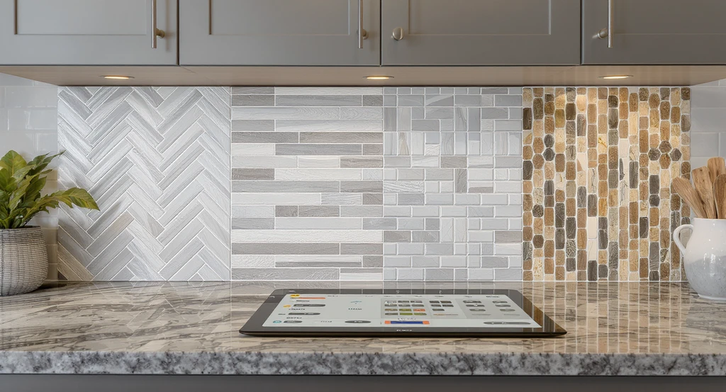
See how the best AI kitchen backsplash visualizer tool helps preview backsplash with AI for busy countertops—comparing grout color and tile layouts in a real kitchen environment.
Grout color and tile orientation (herringbone, stacked, offset, vertical) are as influential as tile selection itself. Crisp white grout lines might sharpen a look, but also risk highlighting every line in a busy setting. Tonal grout reduces contrast, softening the overall effect. Experimenting virtually, as highlighted in our practical guide to surface restyling for real kitchens, ensures these subtle choices won’t undermine your investment. Take time to preview not just the tile, but also layout and grout choices using available digital tools.
Frequently Asked Questions About Choosing a Backsplash for Busy Countertops
- What is the best backsplash for busy countertops?
A solid color or low-contrast tile in a larger format is generally best for busy countertops. This creates a calm, unified look and lets the countertop be the focal point instead of competing visually with a patterned backsplash. - Can I use patterned backsplash with a patterned counter?
It is usually advised against. Following the One Pattern Principle, you should select either a patterned counter or a patterned backsplash, not both, to maintain visual hierarchy and prevent the space from feeling cluttered or chaotic. - How can I test backsplash options before installing?
Upload a photo of your space to a virtual backsplash comparison tool, such as ReimagineHome, to preview colors, patterns, layouts, and grout lines in your exact kitchen. This reduces the risk of decision regret and helps you select the right fit with confidence. - Does grout color really matter?
Yes. Grout color impacts how much the tile stands out or blends in. Matching grout to the tile softens the visual effect, while contrasting grout emphasizes patterns and lines. Testing combinations visually before choosing can make a noticeable difference. - Should I remove my small countertop backsplash strip before adding tile?
Removing the existing short countertop “lip” before tiling gives your new backsplash a more cohesive and intentional appearance. Keeping both can make the kitchen look pieced-together rather than designed holistically.