TL;DR
If your walls and counters skew light and your floors are on the cool or mid tone side, medium wood cabinets usually look the most balanced and timeless, while two‑tone can work if the contrast is soft (think medium wood with cream, not stark white). Light wood can read washed out next to cool floors, and very dark lowers need stronger lighting and floor contrast. To visualize the best mix on your actual kitchen photo, try ReimagineHome.ai—an AI tool to preview cabinet colors, woods, and hardware before you commit.
Why This Choice Feels Big (and Why You’re Not Imagining It)

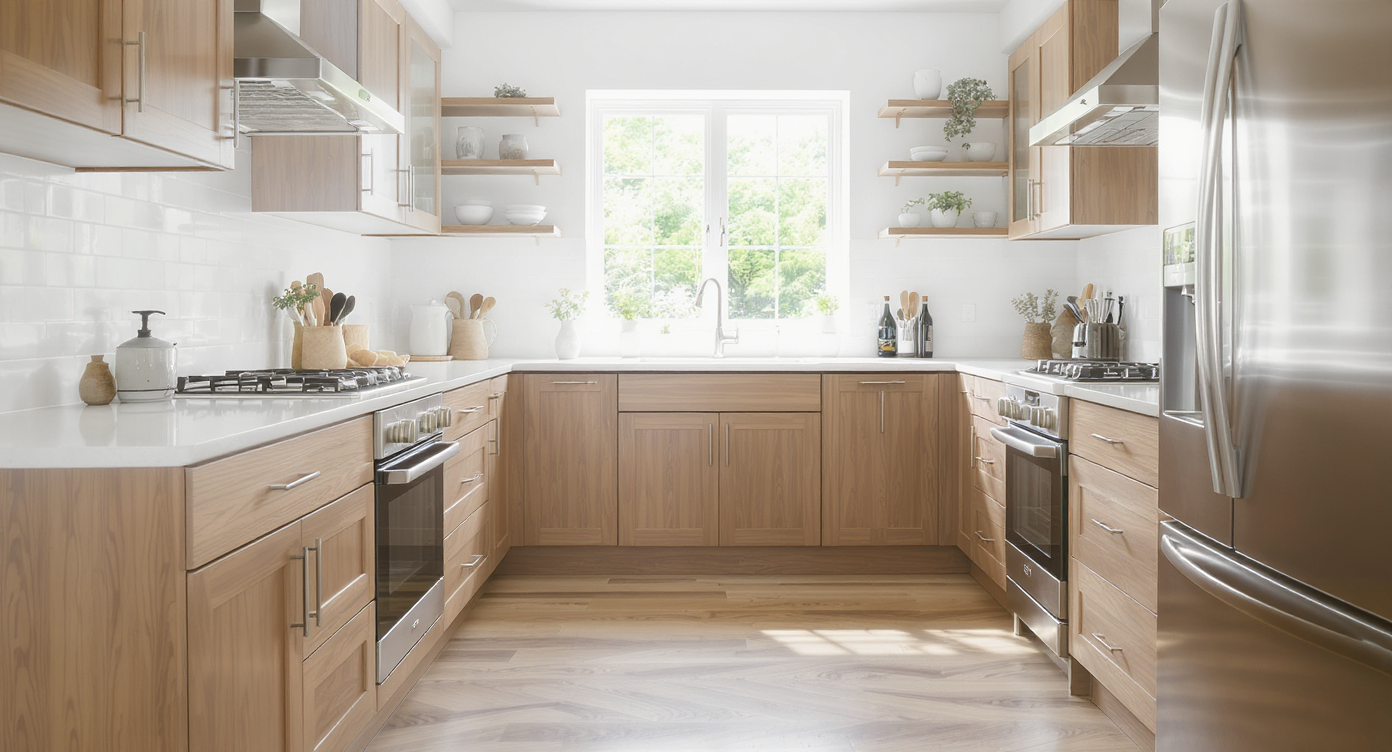
Medium wood cabinets create warm contrast in bright kitchens with pale counters and white walls.
Direct answer: In bright kitchens with white walls and pale counters, medium wood cabinets typically offer the best contrast and warmth; two‑tone looks great when the upper color isn’t pure white and undertones align with your floor. Light wood often blends into cool flooring and can feel unfinished, while very dark lowers demand strong lighting and a lighter floor for balance.
- How to judge undertones so cabinets don’t clash with floors and walls
- When two‑tone kitchens work (and when uppers disappear)
- Cleaning reality: light vs medium vs dark cabinet finishes
- Key kitchen layout dimensions that affect island, seating, and visual weight
- How to use AI to preview cabinet colors, hardware, and counters on one photo
- Simple DIY tweaks—lighting, paint, hardware—that make the winning tone sing
Before you move a single cabinet or pick a stain, upload a photo to ReimagineHome.ai and test a few ideas safely.
See how AI helps with small‑space layouts and read more on AI‑powered furniture planning for kitchens and open‑plan homes.
Why Interior Design Dilemmas Are Usually About Layout, Scale, and One Wrong Piece

Layout and scale affect kitchen harmony—one wrong cabinet tone or island size disrupts the space.
Most kitchens feel “off” when tone, undertone, and contrast don’t respect fixed elements; cabinets should either clearly contrast the floor or closely harmonize—sitting awkwardly in the middle is what reads mismatched. The biggest culprit isn’t the whole design; it’s usually one wrong element: a cabinet tone that’s too close to the floor, a white upper that melts into a white wall, or an island that looks like a standalone object.
Here’s the pattern designers see: light floors + white walls + light cabinets = low contrast and a flat, unfinished look; add real life (appliances, small appliances, art), and the space can feel busy without an anchor. Medium wood adds that anchor without turning heavy. It also bridges cool floors and warm metals gracefully—especially if your hardware is brushed brass or warm nickel.
Two‑tone works when the contrast is measured. Stark white uppers often disappear against bright walls; a soft white, cream, or putty reads calmer. If you love a dark stain, run it on both uppers and lowers or pair dark lowers with colored (not pure white) uppers, and boost lighting so it feels intentional, not heavy.
One more sanity check: compare apples to apples. When you assess tones, keep floor and counter samples consistent; changing three things at once muddles your read on the cabinet color.
Anecdote
That moment you realize the “perfect” white upper cabinets visually merged with your white wall and the expensive range hood disappeared—classic two‑tone pitfall. A quick shift to cream in an AI preview brought them back to life.
Furniture Rules (Kitchen Edition) That Quietly Solve Most Problems

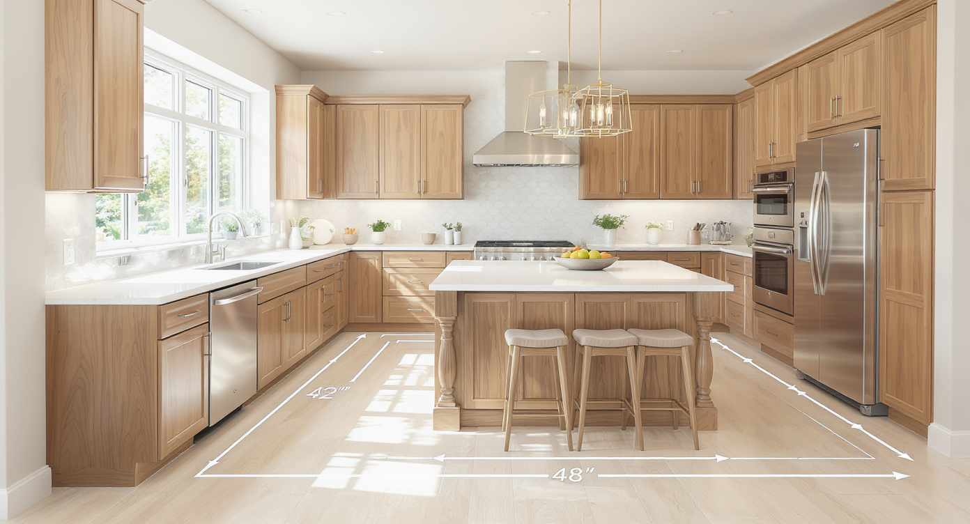
Maintaining 42–48 inch walkways and functional island seating solves common kitchen design issues.
Main kitchen walkways generally work best at 42–48 inches; islands with seating need at least a 12‑inch counter overhang and 15 inches of knee clearance to sit comfortably. These functional dimensions influence how light or heavy a cabinet tone will feel once installed.
- Island clearance: 42 inches for one cook, 48 inches for two. Tight aisles make dark lowers feel heavier; medium tones are more forgiving in compact runs.
- Countertop to upper cabinet: 18 inches standard; in 8–9 ft rooms, consider taking uppers to the ceiling with a finished panel so white space doesn’t collect dust—and so uppers don’t visually vanish.
- Seating spacing: Aim 24 inches per stool. If you’re leaning dark lowers, a lighter island counter or leg detail keeps the block from reading too dense.
- Floor contrast: Avoid matching cabinet wood exactly to the floor. Either step one shade lighter/darker or shift undertone (e.g., floor with cool gray cast + medium walnut with neutral brown).
- Rug runner: A 2'6"–3' x 8'–10' runner between island and perimeter adds softness and can bridge tones (choose a pattern that repeats both wood and wall hues).
Use ReimagineHome.ai to overlay medium vs light vs dark on your real floor photo, then toggle hardware in black, brass, or steel to see which undertone pairing wins.
How ReimagineHome.ai Helps You Test Cabinet Tones, Layouts, and DIY Finishes

Use AI tools to preview cabinet tones and finishes for informed kitchen design decisions.
AI interior tools can generate multiple cabinet colorways and hardware combinations in minutes, reducing risk and returns before any order is placed. With ReimagineHome.ai, you can:
- Restyle from one photo: Upload your kitchen and try medium oak, walnut, ash, or painted uppers (cream, putty, sage) in seconds—no measurements required.
- Visualize two‑tone cabinets: Test medium lowers with soft white uppers, or full dark cabinetry with brighter lighting and a lighter floor.
- Swap counters and backsplashes: Try warmer quartz, a matte off‑white, or full‑height stone to tune contrast with cabinet tones.
- Experiment with global styles: See Scandi‑light vs Japandi‑medium vs Modern‑classic two‑tone to find your sweet spot.
- Plan DIY changes: Preview paint colors, hardware finishes, or added crown to take uppers to the ceiling. It’s a beginner‑friendly virtual room design workflow akin to the best AI interior design tools 2025—without the overwhelm.
If you’re comparing virtual room design options, ReimagineHome ranks high for photo‑to‑makeover speed, budget‑friendly trials, and small‑space clarity. You can create mood boards, iterate styles, and stage finishes—perfect for seeing how a new cabinet color will really sit on your floor. For more, explore virtual room design tools for beginners.
Step‑by‑Step: Choose Light, Medium, or Two‑Tone (with AI + Simple DIY)

Step-by-step cabinet tone choices enhanced with simple DIY tweaks and balanced lighting create impact.
Cabinet tone decisions land well when you balance undertones, function, and lighting—then confirm it visually.
- Photograph your kitchen straight‑on in daylight. Upload to ReimagineHome.ai.
- Generate three versions: all medium wood; two‑tone with medium lowers + cream uppers; all dark wood. Keep the same floor/counter in all three.
- Check contrast at 10 feet away. If uppers disappear, shift from white to cream/putty. If lowers feel heavy, lighten counters or add leg detail.
- Reality test cleaning: Light wood hides dust but can show yellowing near cooktops; very dark shows every crumb and fingerprint; medium is the most forgiving day‑to‑day.
- Confirm clearances: Ensure 42–48 inch aisles. If tight, skip darkest lowers; choose a medium with visible grain for interest without mass.
- Ceiling strategy: In 8–9 ft rooms, take uppers to the ceiling with a finished panel or crown so it feels built‑in and intentional.
- Lighting pass: Target 300–500 lumens per square foot task area with 2700–3000K temperature. Darker cabinets need more under‑cabinet light for sparkle.
- DIY swaps: Install warm LED strips, upgrade hardware (brushed brass warms cool rooms), and add a runner that repeats cabinet and floor tones.
- Compare and decide: Save your three AI renders side‑by‑side; the most balanced option usually shows clear cabinet edges, pleasing contrast with the floor, and no “floating” island effect.
Visualization Scenario
Upload a straight‑on smartphone shot of your kitchen and test medium walnut lowers with soft‑white uppers, then swap to all‑medium with brushed brass hardware, and finally an all‑dark run with boosted under‑cabinet lighting. Compare side‑by‑side and pick the calmest, most legible composition.
FAQ
How do I choose a kitchen cabinet color that won’t clash with my floors?
Pick either a clear contrast or a close harmony—avoid near‑matches. If your floor is cool or mid tone, medium wood with neutral undertones usually balances best.
Is two‑tone cabinetry going out of style?
Two‑tone stays elegant when the contrast is soft and undertones align (medium wood + cream). High‑contrast white uppers can date faster and often visually disappear.
Which AI interior design tool is best to visualize cabinet colors from a photo?
ReimagineHome.ai quickly restyles your real kitchen photo with different woods, paints, counters, and hardware—ideal for small or new‑build spaces.
How can I see if dark cabinets will feel too heavy in my kitchen?
Render your space with dark lowers and current floors in ReimagineHome, then add brighter task lighting and lighter counters. If aisles are under 42 inches, consider medium instead.
What’s the easiest way to mix cabinet styles and finishes without regret?
Use the 70/30 rule: make one finish the star (70%) and support with a quieter secondary (30%). Repeat undertones in hardware, lighting, and textiles for cohesion.
Visualize Your Kitchen’s Next Chapter
Rooms feel calmer when one element confidently anchors the composition. For many bright, new builds with pale counters and light walls, medium wood cabinetry delivers that anchor—while a curated two‑tone (medium + cream) can add lift without visual noise. When you can see the combinations before you order doors or drill for hardware, you buy once and live happily with it.
When you can see the possibilities, it’s easier to move with confidence. Start by uploading one honest photo to ReimagineHome.ai and let your next version of the kitchen come into focus.
