What Color Trim Goes With Alabaster Walls? 6 Pairings That Actually Work
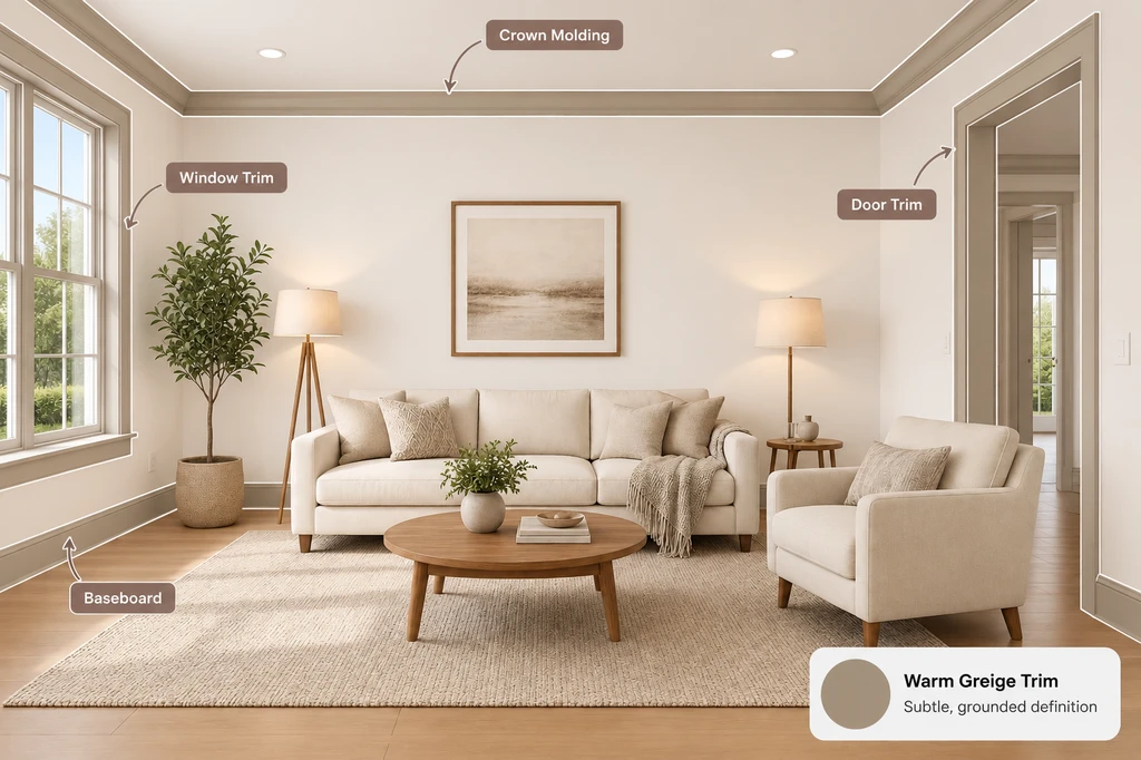
TL;DR
Alabaster (Sherwin-Williams SW 7008) is a warm white that changes with your lighting, so the best trim colors include crisp white, warm white, greige, taupe, black, or natural wood. Test at least two of these on a photo of your actual room—light and furnishings impact how Alabaster looks far more than the paint chip suggests.
Why Trim Choice Matters More With Alabaster Walls
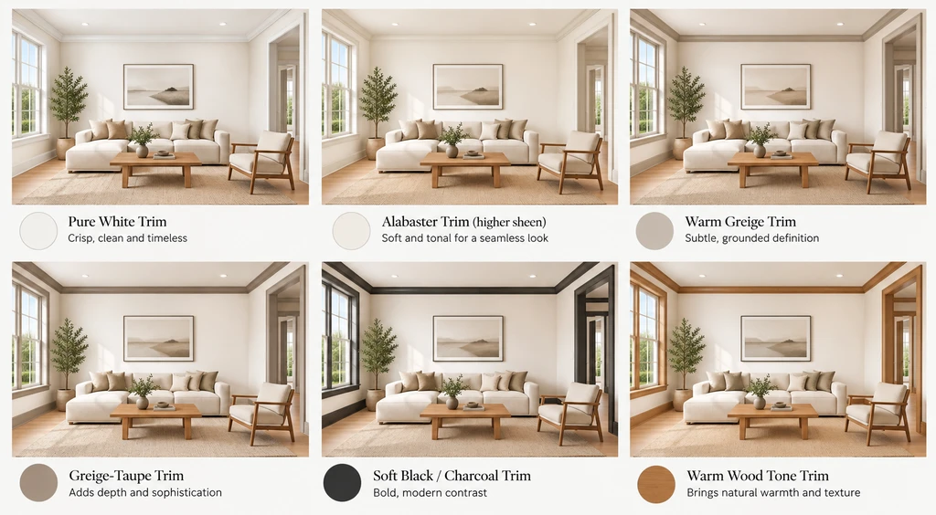
Compare six trim options with Alabaster walls, from crisp white to warm wood and bold charcoal.
Choosing the right trim color for Alabaster walls is more art than science, this particular white is famous for its versatility, but also for its subtle warmth that shifts with each room's light. A trim shade that looks perfect on a color card might read dingy, yellow, or harsh once you add real lighting, furniture, and flooring into the mix. That’s why selecting and testing the right trim color is critical. Designers typically choose their Alabaster trim pairing based on the level of contrast and mood desired.
-
Alabaster Trim Pairings at a Glance
Trim Pairing Undertone Contrast Level Best For Pure White Neutral-cool white Medium The safe, versatile choice for most rooms Alabaster (higher sheen) Warm white Minimal Soft, seamless look; small or light-filled rooms Warm Greige Warm gray-beige Low to medium Gentle, transitional, or organic-modern framing Greige-Taupe Warm taupe Medium Cozy, layered rooms with good natural light Soft Black / Charcoal Cool-dark High Bold, modern accents on doors and window frames Warm Wood Tone Warm natural Textural Organic-modern, Japandi, or mid-century rooms -
1. Pure White Trim (crisp contrast)
Pure White (like Sherwin-Williams Pure White SW 7005) provides a clean, just-bright-enough contrast to Alabaster walls and is the safest bet for a fresh, defined look.
This pairing uses a neutral-leaning white that’s not overly blue or stark, so it frames Alabaster walls with a touch of crispness while keeping everything cohesive. Pure White is popular because it lets architectural details pop yet avoids the chalky look that ultrabright whites can create next to Alabaster’s warmth. The downside? It may feel a bit too safe for those chasing bold design, and can show scuffs or dust more readily. See designer strategies for softening white spaces here.
-
2. Alabaster-on-Alabaster Trim (seamless and soft)
Painting both trim and walls in Alabaster, but choosing a higher sheen for the trim, creates a calm, seamless look with subtle definition from the gloss difference rather than color.
This is a designer favorite for a minimalist or spa-like effect—especially in smaller rooms, bathrooms, or anywhere high contrast would break up the space. There’s no risk of clashing undertones, and the result feels contemporary and peaceful. The trade-off is less architectural definition, so your trim will visually blend with the walls.
-
3. Warm Greige Trim (subtle, grounded definition)
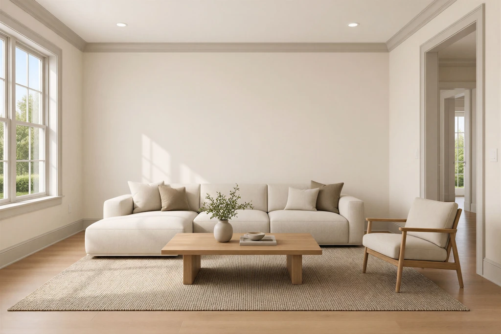
Soft neutral trim creates a seamless, layered look with Alabaster walls.
A warm greige, such as Sherwin-Williams Agreeable Gray, frames Alabaster with understated, earthy contrast that feels soft yet purposeful.
Greige is neither distinctly gray nor beige—it matches Alabaster’s natural warmth, offering gentle room definition without the sharpness of a bright white border. This pairing is well-suited to transitional, organic-modern, or Scandinavian-inspired spaces where you want everything to flow softly. Greige trim is less likely to show dust than stark whites and brings harmony, especially to rooms with taupe or natural fiber accents. For more on using warm neutrals, visit our guide to cozying up white interiors.
-
4. Greige-Taupe Trim (warm and cozy)
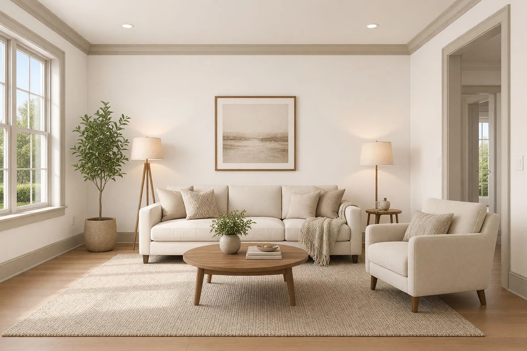
Soft neutral trim creates a seamless, layered look with Alabaster walls.
Choosing a deeper taupe or beige (like Sherwin-Williams Accessible Beige) for the trim delivers rich warmth and a more enveloping ambiance, especially in rooms with abundant natural light.
This is a step further than greige: deeper color gives a cozier, more layered look without appearing muddy. For living rooms and bedrooms, this trim softens the stretch from wall to ceiling, making large spaces feel friendlier. The risk is in low-light or north-facing rooms, where too much taupe can feel heavy or flat. Always sample this shade first in your lighting, and consider pairing with materials like linen curtains or textured rugs to intensify the cozy factor.
-
5. Warm Wood Tone Trim (material contrast, not painted)
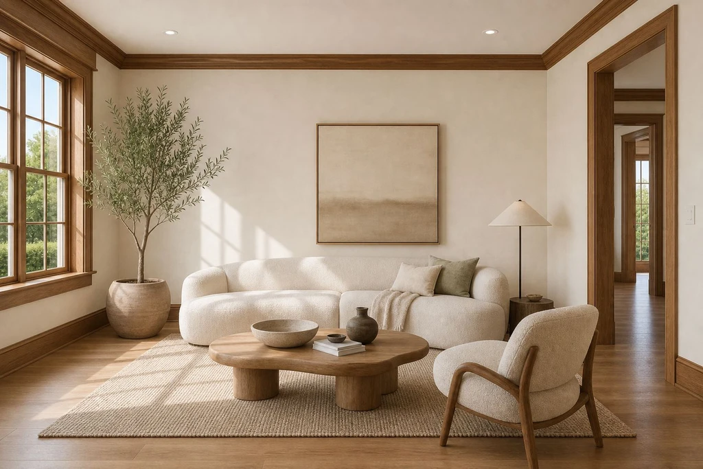
Warm wood trim adds natural texture and warmth to Alabaster walls.
Natural or lightly stained wood trim—oak, walnut, or honey—pairs beautifully with Alabaster, adding warmth, texture, and organic character that no paint can provide.
Choosing real wood for trim brings a timeless, inviting feel, especially in styles like Japandi, mid-century modern, or organic-inspired interiors. Wood complements the creamy quality of Alabaster and makes spaces feel layered rather than flat. The main consideration is maintenance: real wood is best in areas less prone to scuffs or moisture, or where you want a natural focal point (think: window casings or built-ins). For inspiration, see why designers use wood for warmth and depth here.
-
6. Soft Black or Charcoal Trim (modern, high contrast)
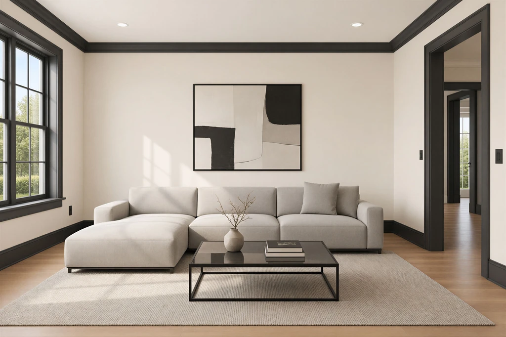
Black trim creates bold architectural contrast against warm Alabaster walls.
Opting for a near-black like Sherwin-Williams Tricorn Black on selected trim or doors against Alabaster walls instantly creates a dramatic, modern contrast best suited for statement features.
This pairing works best for accent elements—think a front door, window sash, or picture-frame molding—where you want bold, gallery-ready lines. It’s not for every baseboard unless you’re committed to a striking, contemporary style. The benefits? A high-impact, editorial look, and less tendency to show dirt on busy surfaces. However, frequent touch-ups may be needed in high-traffic zones, and black can shrink visual space if overused.
-
How to Preview These Pairings in Your Own Home
The real secret to finding the perfect Alabaster-and-trim combination is seeing how it looks in your own space—not just comparing paint swatches.
Upload a photo of your room to ReimagineHome and describe the trim combinations you want to test, such as “show Alabaster walls with Pure White trim,” “try black trim,” or “compare warm white and natural wood trim.” The AI generates photorealistic versions of your actual space, allowing you to see how each pairing works with your room’s architecture, lighting, and existing furniture. You can test different combinations, refine your choices, and explore the look before committing to paint changes.
Frequently Asked Questions
What is the best trim color for Alabaster walls?
Pure White is the safest choice for most rooms—it defines trim crisply without clashing with Alabaster’s warmth. For a softer effect, paint trim and walls both in Alabaster but use a higher-sheen finish on the trim for gentle definition.
Should trim be lighter or darker than Alabaster walls?
Both work: brighter whites give more contrast, while taupe, greige, or black create drama. Choose based on whether you want low or high contrast and the mood of your space.
Is Alabaster a warm or cool white?
Alabaster is a warm white with creamy undertones that favor warm, neutral, or wood trims over blue-based brights.
Can I use Alabaster on both walls and trim?
Yes, and it’s great for a serene, unified look—just vary wall and trim sheen for subtle separation.
How do I avoid painting regrets with trim color?
Always preview your final two or three options in a photo of your real room before painting. With tools like ReimagineHome, you’ll see how color and light interact uniquely in your space.
Bottom Line: Pick the Mood, Then Confirm With Your Own Room
The ideal trim for Alabaster walls depends on your comfort with contrast and the ambiance you want. Pure White is a classic, can't-go-wrong option. Same-color Alabaster-on-Alabaster feels serene and seamless. Greige and taupe trims cozy up larger or brighter rooms, while black or charcoal brings graphic drama. Natural wood adds lasting warmth and material richness. But since Alabaster shifts so much in real-world lighting, the best move is always to preview your top contenders on a photo of your own room before committing. With ReimagineHome, you'll move from guessing to confidently styling a home you'll love to live in.